ROC Curve & AUC Explained with Python Examples
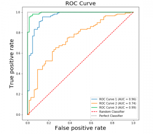
Last updated: 8th Sep, 2024 Confusion among data scientists regarding whether to use ROC Curve / AUC, or, Accuracy / precision / recall metrics for evaluating classification models often stems from misunderstanding ROC Curve / AUC concepts. The ROC Curve visualizes true positive vs false positive rates at various thresholds, while AUC quantifies the overall ability of a model to discriminate between classes, with higher values indicating better performance. In this post, you will learn about ROC Curve and AUC concepts along with related concepts such as True positive and false positive rate with the help of Python examples. It is very important to learn ROC, AUC and related concepts as it …
Accuracy, Precision, Recall & F1-Score – Python Examples
Last updated: 27th Aug, 2024 Classification models are used in classification problems to predict the target class of the data sample. The classification machine learning models predicts the probability that each instance belongs to one class or another. It is important to evaluate the model performance in order to reliably use these models in production for solving real-world problems. The model performance metrics include accuracy, precision, recall, and F1-score. In this blog post, we will explore these classification model performance metrics such as accuracy, precision, recall, and F1-score through Python Sklearn example. As a data scientist, you must get a good understanding of concepts related to the above in relation to …
Logistic Regression in Machine Learning: Python Example
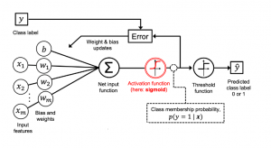
Last updated: 26th August, 2024 In this blog post, we will discuss the concepts of logistic regression machine learning algorithm with the help of python example. Logistic regression is a parametric algorithm which is used to estimate the probability of an event occurring. For example, it can be used in the medical field to predict the probability of a patient developing a certain disease based on various health indicators, such as age, weight, and blood pressure. It is often used in machine learning applications. What is Logistic Regression? Logistic regression is a type of supervised learning classification algorithm that is adept not only in binary classification but also in multinomial …
Reducing Overfitting vs Models Complexity: Machine Learning
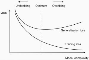
Last updated: 25th August, 2024 In machine learning, model complexity and overfitting are related in that the model overfitting is a problem that can occur when a model is too complex for different reasons. This can cause the model to fit the noise & outliers in the data rather than the underlying pattern. As a result, the model will perform poorly when applied to new and unseen data. In this blog post, we will discuss model complexity and how you can avoid overfitting in your models by handling the complexity. As data scientists, it is of utmost importance to understand the concepts related to model complexity and how it impacts …
Model Parallelism vs Data Parallelism: Examples

Last updated: 24th August, 2024 Model parallelism and data parallelism are two strategies used to distribute the training of large machine-learning models across multiple computing resources, such as GPUs. They form key categories of multi-GPU training paradigms. These strategies are particularly important in deep learning, where models and datasets can be very large. What’s Data Parallelism? In data parallelism, we break down the data into small batches. Each GPU works on one batch of data at a time. It calculates two things: the loss, which tells us how far off our model’s predictions are from the actual outcomes, and the loss gradients, which guide us on how to adjust the …
Overfitting & Underfitting in Machine Learning
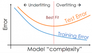
Last updated: 24th August, 2024 The performance of the machine learning models on unseen datasets depends upon two key concepts called underfitting and overfitting. In this post, you will learn about these concepts and more. In addition, you will also get a chance to test your understanding by attempting the quiz. The quiz will help you prepare well for data scientist interviews. Introduction to Overfitting & Underfitting Assuming an independent and identically distributed (I.I.d) dataset, when the prediction error on both the training and validation dataset is high, and the difference between them is very minimal, the model is said to have underfitted. In this scenario, it becomes cumbersome to …
Self-Supervised Learning: Concepts, Examples
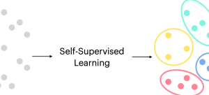
Last updated: 20th August, 2024 Self-supervised learning is an approach to training machine learning models primarily for large corpus of unlabeled dataset. It has gained significant traction due to its effectiveness in various applications related to text and image. Self-supervised learning differs from supervised learning, where models are trained using labeled data, and unsupervised learning, where models are trained using unlabeled data without any pre-defined objectives. Instead, self-supervised learning defines pretext tasks as training models to extract useful features from the data that can be later fine-tuned for specific downstream tasks. The potential of self-supervised learning has already been demonstrated in many real-world applications, such as image classification, natural language …
MSE vs RMSE vs MAE vs MAPE vs R-Squared: When to Use?

Last updated: 18th August, 2024 As data scientists, we navigate a sea of metrics to evaluate the performance of our regression models. Understanding these metrics – Mean Squared Error (MSE), Root Mean Squared Error (RMSE), Mean Absolute Error (MAE), Mean Absolute Percentage Error (MAPE), and R-Squared – is crucial for robust model evaluation and selection. In this blog, we delve into the intricacies of these different metrics while learning them based on clear definitions, formulas, and guidance on when to use which of these metrics. Different Types of Regression Models Evaluation Metrics The following are different types of regression model evaluation metrics including MSE, RMSE, MAE, MAPE, R-squared, and Adjusted …
K-Fold Cross Validation in Machine Learning – Python Example
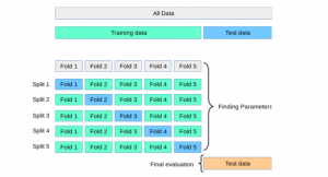
Last updated: 16th Aug, 2024 In this post, you will learn about K-fold Cross-Validation concepts used while training machine learning models with the help of Python code examples. K-fold cross-validation is a data splitting technique that is primarily used for assessing the model accuracy given smaller datasets. This technique can be implemented with k > 1 folds where k is equal number of data splits. K-Fold Cross Validation is also known as k-cross, k-fold cross-validation, k-fold CV, and k-folds. The k-fold cross-validation technique can be implemented easily using Python with scikit learn (Sklearn) package which provides an easy way to implement training of k-fold cross-validation models. It is important to learn the …
Gradient Boosting Machines (GBM): Concepts, Examples
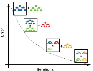
Last updated: 16th August, 2024 Gradient Boosting Machines (GBM) Algorithm is considered as one of the most powerful ensemble machine learning algorithms used for both regression and classification problems. This algorithm has been proven to increase the accuracy of predictions and is found to be extremely popular among data scientists. Let’s take a closer look at GBM and explore how it works with an example. What is a Gradient Boosting Machines Algorithm? Gradient boosting algorithm is an ensemble machine learning technique in which an ensemble of weak learners are created. In simpler words, the algorithm combines several smaller, simpler models in order to obtain a more accurate prediction than what …
Random Forest Classifier – Sklearn Python Example
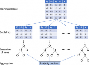
Last updated: 14th Aug, 2024 A random forest classifier is an ensemble machine learning model which is used for classification problems, and operates by constructing a multitude of decision trees during training, and, predicting the class label (of the data). In general, Random Forest is popular due to its high accuracy, robustness to overfitting, ability to handle large datasets with numerous features, and its effectiveness for both classification and regression tasks. Random Forest and Decision Tree classification algorithms are different, although Random Forest is built upon the concept of Decision Trees. In this post, you will learn about the concepts of random forest classifiers and how to train a Random …
Decision Tree Regression vs Linear Regression: Differences
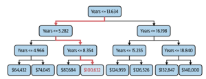
When it comes to building a regression model, one comes across the question such as whether to train the regression model using DecisionTree Regressor algorithm or linear regression algorithm? The following is the key differences you need to know in order to decide which algorithm is the most suitable one, and, why and when one can use one over the other? Linear vs Non-Linear Dataset: Which Algorithm to Use? Linear regression algorithm can be used when there exists linear relationship between the response and predictor variables in the given data set. For two or three dimensional datasets, it is as easy as draw scatter plot and find about the said …
Parametric vs Non-Parametric Models: Differences, Examples
Last updated: 11 Aug, 2024 When working with machine learning models, data scientists often come across a fundamental question: What sets parametric and non-parametric models apart? What are the key differences between these two different classes of models? What needs to be done when working on these models? This is also one of the most frequent questions asked in the interviews. Machine learning models can be parametric or non-parametric. Parametric models are those that require the specification of some parameters before they can be used to make predictions, while non-parametric models do not rely on any specific parameter settings and therefore often produce more accurate results. These two distinct approaches …
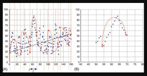
How to know if Linear Regression Model is Appropriate?
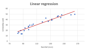
If you want to build a model for predicting a numerical value and wondering whether the linear regression model is most appropriate or valid, then creating the regression scatter plot is the most efficient way. And, this works best if the data set is two or three-dimensional. If a dataset is two-dimensional, it’s simple enough to plot the data to determine its shape. You can plot three-dimensional data too. The objective is to find whether the data set is relatively linear. When the plot is created, the data points fall roughly along a straight line as shown below. Whether Linear Regression Appropriate for High-dimension Datasets? The challenge comes when we …
Lasso Regression in Machine Learning: Python Example
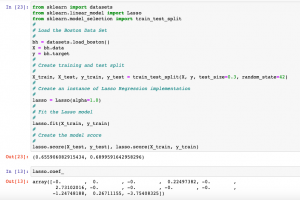
Last updated: 10th Aug, 2024 Lasso regression, sometimes referred to as L1 regularization, is a technique in linear regression that incorporates regularization to curb overfitting and enhance the performance of machine learning models. It works by adding a penalty term to the cost function that encourages the model to select only the most important features and set the coefficients of less important features to zero. This makes Lasso regression a popular method for feature selection and high-dimensional data analysis. In this post, you will learn concepts, formulas, advantages, and limitations of Lasso regression along with Python Sklearn examples. The other two similar forms of regularized linear regression are Ridge regression and …
Completion Model vs Chat Model: Python Examples

In this blog, we will learn about the concepts of completion and chat large language models (LLMs) with the help of Python examples. What’s the Completion Model in LLM? A completion model is a type of LLM that takes a text input and generates a text output, which is called a completion. In other words, a completion model is a type of LLM that generates text that continues from a given prompt or partial input. When provided with an initial piece of text, the model uses its trained knowledge to predict and generate the most likely subsequent text. A completion model can generate summaries, translations, stories, code, lyrics, etc depending on …
I found it very helpful. However the differences are not too understandable for me