
Plotting the decision boundary is a valuable tool for understanding, debugging, and improving machine learning classification models, especially for Logistic Regression. Plotting the decision boundary provides a visual assessment of model complexity, fit, and class separation capability. It enables identifying overfitting and underfitting based on gaps between boundary and data. Comparing decision boundary plots of different models allows direct visual evaluation of their relative performance in separating classes when working with classification problems. For linear models like logistic regression, it specifically helps tune regularization and model complexity to prevent overfitting the training data. Simple linear models like logistic regression will have linear decision boundaries. More complex models like SVM may show nonlinear patterns.
In this blog, you will learn about how to create decision plots using Python Sklearn library, for binary and multiclass classification models with models trained using Logistic regression algorithm. You will also learn about key aspects to be kept in mind when creating the decision plots for logistic regression models.
Decision Boundary for Logistic Regression Binary Classifier
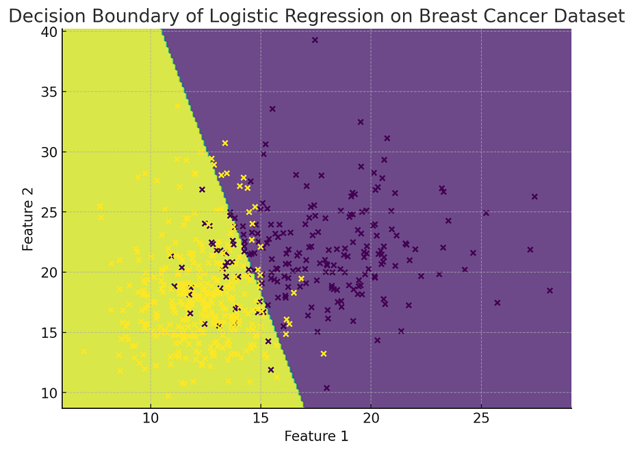
The following is the Python implementation for plotting decision boundary for the logistic regression binary classifier while using the Breast Cancer Wisconsin (Diagnostic) Dataset . The plot visualizes the decision boundary, showing how the model classifies the data into two categories: malignant and benign. In this example, only the first two features of the dataset are used for visualization purposes. The data points are color-coded based on their actual classification (malignant or benign), providing a clear view of the decision boundary’s effectiveness in separating the two classes.
from sklearn.datasets import load_breast_cancer
from sklearn.linear_model import LogisticRegression
import matplotlib.pyplot as plt
import numpy as np

# Load the Breast Cancer Wisconsin (Diagnostic) Dataset
X, y = load_breast_cancer(return_X_y=True)

# Select only the first two features for visualization
X = X[:, :2]

# Fit the logistic regression model
model = LogisticRegression()
model.fit(X, y)

# Create a mesh to plot in
x_min, x_max = X[:, 0].min() - 1, X[:, 0].max() + 1
y_min, y_max = X[:, 1].min() - 1, X[:, 1].max() + 1
xx, yy = np.meshgrid(np.arange(x_min, x_max, 0.1),
                     np.arange(y_min, y_max, 0.1))

# Predict the function value for the whole grid
Z = model.predict(np.c_[xx.ravel(), yy.ravel()])
Z = Z.reshape(xx.shape)

# Plot the contour and training examples
plt.figure(figsize=(8, 6))
plt.contourf(xx, yy, Z, alpha=0.8)
plt.scatter(X[:, 0], X[:, 1], c=y, edgecolors='k', s=20)
plt.xlabel('Feature 1')
plt.ylabel('Feature 2')
plt.title('Decision Boundary of Logistic Regression on Breast Cancer Dataset')
plt.show()
Here is how the plot representing decision boundary for logistic regression binary classification model would look like:
Decision Boundary for Logistic Regression Multiclass Classifier
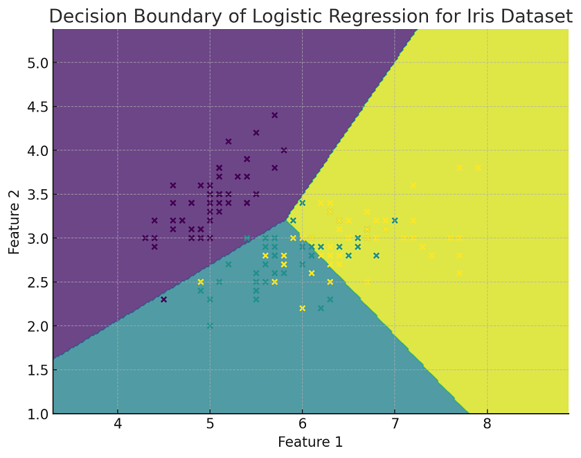
The following Python implementation for plotting decision boundary has been adapted for multiclass classification using the IRIS dataset and a logistic regression model. The model is trained to classify the data into the three different species of IRIS flowers. In this visualization, only the first two features of the dataset are used. The plot shows the decision boundaries between the different classes, with each region colored differently according to the predicted class. The actual data points from the dataset are also plotted, color-coded based on their true class labels, providing a clear view of how well the model separates the different classes.
from sklearn.datasets import load_iris
from sklearn.linear_model import LogisticRegression
import matplotlib.pyplot as plt
import numpy as np

# Load the Iris dataset
X, y = load_iris(return_X_y=True)

# Select only the first two features for visualization
X = X[:, :2]

# Fit the logistic regression model for multi-class classification
model = LogisticRegression(multi_class='ovr')  # 'ovr' stands for One-vs-Rest
model.fit(X, y)

# Create a mesh to plot in
x_min, x_max = X[:, 0].min() - 1, X[:, 0].max() + 1
y_min, y_max = X[:, 1].min() - 1, X[:, 1].max() + 1
xx, yy = np.meshgrid(np.arange(x_min, x_max, 0.02),
                     np.arange(y_min, y_max, 0.02))

# Predict the function value for the whole grid
Z = model.predict(np.c_[xx.ravel(), yy.ravel()])
Z = Z.reshape(xx.shape)

# Plot the contour and training examples
plt.figure(figsize=(8, 6))
plt.contourf(xx, yy, Z, alpha=0.8)
plt.scatter(X[:, 0], X[:, 1], c=y, edgecolors='k', s=20)
plt.xlabel('Feature 1')
plt.ylabel('Feature 2')
plt.title('Decision Boundary of Logistic Regression for Iris Dataset')
plt.show()
Here is how the plot representing decision boundary for logistic regression multiclass classification model would look like
Lessons to Learn from Plotting Decision Boundary with Logistic Regression Classifier
In both Python implementation examples, where we plotted the decision boundaries for logistic regression classifiers (first for binary classification with the Breast Cancer Wisconsin dataset and then for multiclass classification with the Iris dataset), there are several key learning points:
- Understanding Logistic Regression: Logistic regression is a linear model for classification rather than regression. In these examples, you can see how logistic regression can be applied to both binary and multiclass classification problems.
- Feature Selection for Visualization: The examples demonstrate the use of only the first two features of the datasets. This is crucial for visualization purposes as it allows plotting the decision boundaries in a two-dimensional space. It’s a common technique to simplify datasets for educational visualization, although in real-world scenarios, logistic regression can handle multiple features.
- Decision Boundary Representation: The decision boundary is a crucial concept in classification problems. It’s the line (or hyperplane in higher dimensions) that separates different classes. The plots visually demonstrate how logistic regression determines this boundary.
- Multi-class Classification with Logistic Regression: In the case of the Iris dataset, the code illustrates the use of logistic regression for multiclass classification using the ‘one-vs-rest’ (OvR) scheme. This is an important extension of logistic regression from binary to multiclass classification.
- Practical Implementation with Scikit-learn (sklearn): The examples show how to use Scikit-learn (Sklearn), a popular machine learning library in Python, for implementing logistic regression models. This includes data loading, model training, prediction, and visualization.
- Meshgrid for Plotting Decision Surfaces: The use of numpy.meshgrid in combination with the model’s predict function to create decision surfaces is a valuable technique for visualizing how different areas of the feature space are classified into different categories.
- Visualization Techniques: The examples highlight the use of Matplotlib for plotting, showcasing how to create scatter plots, contour plots, and overlay these with decision boundaries.
Best Practices for Plotting Decision Boundary with Logistic Regression Classifier
When plotting decision boundaries using logistic regression, the following are some of the best practices to keep in mind:
- Feature Space Limitation: Decision boundary plots are most effective in two or three dimensions. If your dataset has more than two or three features, consider using feature selection or dimensionality reduction techniques (like PCA) to reduce the feature space for visualization purposes.
- Linear Decision Boundaries: Logistic regression creates linear decision boundaries. Be aware that complex, non-linear boundaries cannot be accurately represented by a logistic regression model. For non-linear boundaries, consider other models like decision trees, random forests, or kernel SVMs.
- Scaling Features: Scale your features before fitting the logistic regression model, especially if they have different scales or units. This ensures that the model gives equal importance to all features.
- Class Imbalance Consideration: If your dataset is imbalanced (i.e., one class is much more frequent than others), the decision boundary might be biased towards the majority class. Consider using techniques like resampling, class weights, or different performance metrics more appropriate for imbalanced datasets.
- Data Overfitting and Regularization: Be cautious of overfitting, especially in datasets with many features. Logistic regression can be regularized (using L1 or L2 regularization) to avoid overfitting. Regularization parameters should be chosen carefully, as they can affect the decision boundary.
- Choosing a Solver: Different solvers can be used in logistic regression (like ‘liblinear’, ‘sag’, ‘saga’, etc.). The choice of solver can affect the performance of the model, especially for large datasets or datasets with a high number of features.
- Probabilistic Interpretation: Remember that logistic regression provides probabilities of class membership. The decision boundary represents where the model estimates a 50% chance of belonging to each class. Understanding this probabilistic output is important for interpreting the decision boundary.
- Multiclass Classification: For multiclass classification problems, logistic regression will create multiple decision boundaries. It often uses strategies like One-vs-Rest (OvR) or One-vs-One (OvO). Be aware of how your choice of strategy might affect the decision boundaries.
- Visual Clarity: When visualizing, ensure your plots are clear and interpretable. Label axes, use different colors or markers for different classes, and add legends to make your plots reader-friendly.
- Interpreting with Caution: Finally, use decision boundary plots as exploratory tools. They provide a simplified view of how the model is making decisions, but they do not capture every nuance, especially in complex datasets with high-dimensional feature spaces.

Check out my latest book titled as First Principles Thinking: Building winning products using first principles thinking.
- Questions to Ask When Thinking Like a Product Leader - July 3, 2025
- Three Approaches to Creating AI Agents: Code Examples - June 27, 2025
- What is Embodied AI? Explained with Examples - May 11, 2025
I found it very helpful. However the differences are not too understandable for me