Category Archives: Data Visualization
Online Scatter Plot Maker – Works with Your Excel Data
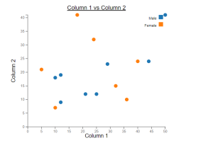
This online free tool, scatter plot creator, is designed to make data scatter plot visualization simpler, more efficient, and more integrated into your reporting. Scatter plots are invaluable for examining the relationship between two variables, identifying trends, outliers, and patterns. Whether you’re a data scientist, researcher, or data enthusiast, this tool will enable you to visualize your data effectively using scatter plots. The following are key features of this online scatter plot maker tool: Create Scatter Plots
Dashboard Design Best Practices: Examples
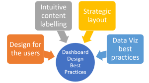
Are you looking to create effective, user-centric, and highly actionable data dashboards? Do you want your dashboard to not just present data, but tell a story that compels your team to make informed decisions? In an age of data-driven decision making, dashboards have become an indispensable tool for product managers, data analysts, and data visualization experts alike. A well-designed dashboard provides a real-time visual snapshot of performance, highlights crucial metrics, and assists in spotting trends or anomalies. However, designing a good dashboard is both an art and a science. It demands a deep understanding of users’ needs, a strategic approach to information organization, and an adept use of data visualization …
BI Analyst Career Path / Roadmap
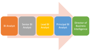
Are you interested in a career that combines data analysis, technology, and business strategy? Look no further than the role of a Business Intelligence (BI) Analyst. In this blog post, we will explore the career path/career roadmap of a BI Analyst, highlighting the various job titles, and discussing the skills and responsibilities associated with this in-demand profession. What is Business Intelligence? Business Intelligence (BI) refers to the process of collecting, analyzing, and interpreting data to gain valuable insights that drive informed business decisions. It is an umbrella term that encompasses the tools, methodologies, and processes used to transform raw data into meaningful information and actionable insights. It involves the collection, …
Seaborn: Multiple Line Plots with Markers, Legend
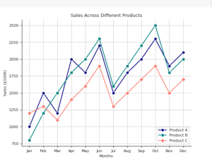
Do you want to learn how to create visually stunning and informative line plots that will captivate your audience by providing most apt information? Do you have the requirement of creating multiple line plots in the same figure representing sales of different products across different months in a year? Are you looking for a takeaway Python code with Seaborn library for creating line plots? If yes, you are in the right place. In this blog post, we’ll explore how to create multiple line plots with Seaborn, a powerful data visualization library built on top of Matplotlib. I will also show how to add markers to the line plots to make …
I found it very helpful. However the differences are not too understandable for me