Do you want to learn how to create visually stunning and informative line plots that will captivate your audience by providing most apt information? Do you have the requirement of creating multiple line plots in the same figure representing sales of different products across different months in a year? Are you looking for a takeaway Python code with Seaborn library for creating line plots? If yes, you are in the right place.
In this blog post, we’ll explore how to create multiple line plots with Seaborn, a powerful data visualization library built on top of Matplotlib. I will also show how to add markers to the line plots to make the data points more visible, and how to add a legend to the plot to help readers understand the meaning of each line.
Python / Seaborn Code for Plotting Multiple Line Plots
The Python code provided in this section creates multiple line plots using the Seaborn and Matplotlib libraries to visualize sales data for three different products across all 12 months of the year. Here are some key points to note:
- The code first defines a sample data dictionary and creates a Pandas DataFrame from it. You can also load the data from CSV file for which code is given later.
- The style and font size for the labels is set using code such as sns.set_style(‘ticks’) and plt.rcParams.update({‘font.size’: 8})
- The code creates multiple line plots with different markers for each product by adding multiple
sns.lineplot()functions. Each lineplot() function has marker and color for different markers & colors. Also, there is an attribute called label which is assigned different labels. This would show up in legend. Each line plot as x and y assigned different labels in the dataframe. - The plot is customized with a title, x label and y label using Matplotlib functions such as plt.title(), plt.xlabel(), and plt.ylabel()
- The plot is set with grid lines using the code, plt.grid(True)
- The plot is set with legend at bottom right using code such as plt.legent(loc=’lower right’). You could change the position to ‘top left’, ‘top right’, ‘lower left’
- The top and right spines of the plot are also removed using the
sns.despine()function. If you want the spines, comment the code.
Finally, the plot is displayed using the plt.show() function.
import seaborn as sns
import matplotlib.pyplot as plt
import pandas as pd

# Sample data
data = {
    'Months': ['Jan', 'Feb', 'Mar', 'Apr', 'May', 'Jun', 'Jul', 'Aug', 'Sep', 'Oct', 'Nov', 'Dec'],
    'Product A': [1000, 1500, 1200, 2000, 1800, 2200, 1500, 1800, 2000, 2300, 1900, 2100],
    'Product B': [800, 1200, 1500, 1800, 2000, 2300, 1600, 1900, 2200, 2500, 1800, 2000],
    'Product C': [1200, 1300, 1100, 1400, 1600, 1900, 1300, 1500, 1700, 1900, 1500, 1700]
}
df = pd.DataFrame(data)

# Set the style and font sizes
sns.set_style('ticks')
plt.rcParams.update({'font.size': 8})

# Create a Seaborn line plot with different markers for each product
sns.lineplot(x='Months', y='Product A', data=df, marker='o', color='navy', label='Product A')
sns.lineplot(x='Months', y='Product B', data=df, marker='s', color='teal', label='Product B')
sns.lineplot(x='Months', y='Product C', data=df, marker='D', color='salmon', label='Product C')

# Set plot title and axes labels
plt.title('Sales Across Different Products')
plt.xlabel('Months')
plt.ylabel('Sales ($100K)')

# Add a legend
plt.legend(loc='lower right')

# Add a grid
plt.grid(True)

# Remove the top and right spines
sns.despine()

# Show the plot
plt.show()
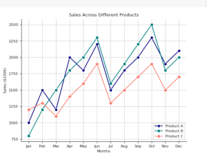
Here is how the plot would look like for the above code:

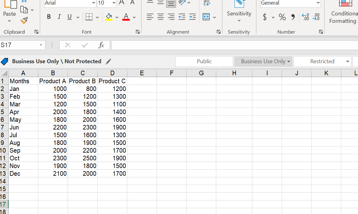
In order to read data from CSV, all you need to do is use the following code instead of using “data” to create dataframe as shown in the previous code.
# Read data from CSV file
df = pd.read_csv('path/to/file.csv')
The following data was read from CSV file.
Conclusion
In this blog post, we explored how to create multiple line plots in the same figure with markers and legend using Seaborn library in Python. We added visual appeal to the plot by customizing the line colors, adding markers, and grid lines. The code snippets provided in this blog post can be used as a template to create similar single line or multiple line plots for other datasets. Seaborn’s ease of use and customizability make it an excellent tool for creating beautiful and informative visualizations. Whether you are a beginner or an experienced data analyst, Seaborn is a valuable library to have in your toolkit.

Check out my latest book titled as First Principles Thinking: Building winning products using first principles thinking.
- Completion Model vs Chat Model: Python Examples - June 30, 2024
- LLM Hosting Strategy, Options & Cost: Examples - June 30, 2024
- Application Architecture for LLM Applications: Examples - June 25, 2024
Leave a Reply