
Are you looking to create effective, user-centric, and highly actionable data dashboards? Do you want your dashboard to not just present data, but tell a story that compels your team to make informed decisions?
In an age of data-driven decision making, dashboards have become an indispensable tool for product managers, data analysts, and data visualization experts alike. A well-designed dashboard provides a real-time visual snapshot of performance, highlights crucial metrics, and assists in spotting trends or anomalies. However, designing a good dashboard is both an art and a science. It demands a deep understanding of users’ needs, a strategic approach to information organization, and an adept use of data visualization techniques. This blog post will delve into the best practices for dashboard design, supplemented with practical examples to help you design dashboards that truly make an impact.
Dashboard Design Best Practices
How can you transform a simple data dashboard into an influential tool that drives business decisions? The key lies in adopting and applying proven best practices in dashboard design. These are strategies honed through industry experiences and refined over time to ensure that your dashboard isn’t merely a data repository but a powerful instrument that provides clear insights, guides decision-making, and enhances overall business performance. The following represents best practices related to dashboard design.
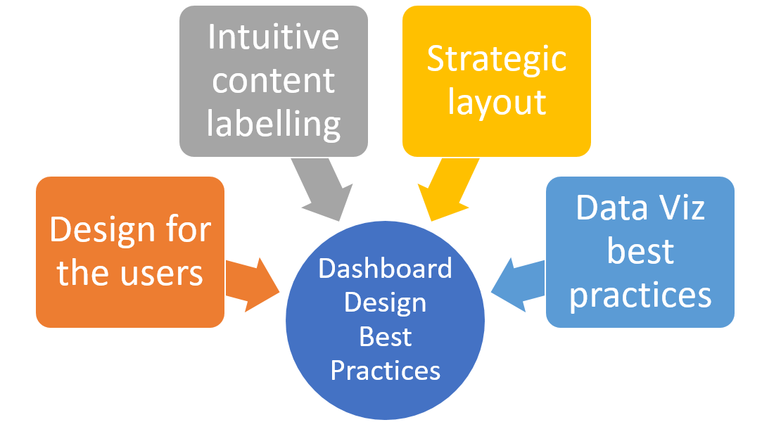
Design for the User
- Audience Awareness: One of the most critical steps in designing your dashboard is understanding and catering to the unique needs and requirements of your target users. For instance, a dashboard designed for a Chief Financial Officer (CFO) would significantly differ from one meant for a marketing manager. The CFO’s dashboard might be dominated by financial KPIs, such as revenue, profit margins, operational costs, and cash flow projections. Conversely, a marketing manager would need a dashboard focusing on metrics like customer acquisition cost, return on advertising spend, customer lifetime value, and campaign conversion rates.
- User-Friendly Navigation: Simplifying the navigation process is a key aspect of user-friendly dashboard design. The objective is to reduce the cognitive load on the user, enabling them to find the information they need quickly and easily. For example, consider a dashboard for a retail business, with multiple sub-pages detailing various aspects such as sales, inventory, customer demographics, and employee performance. Instead of labeling these pages simply as ‘Page 1’, ‘Page 2’, and so on, they should be intuitively named, such as ‘Sales Overview’, ‘Inventory Status’, ‘Customer Insights’, and ‘Employee Metrics’. This way, users can anticipate the kind of data they’ll encounter on each page, making their navigation journey smooth and intuitive.
Intuitive Content Labeling
- Effective Collection Naming: As a best practice, collections within a dashboard should be named based on the specific business questions they answer. For instance, in a dashboard for a logistics company, you might have collections titled “Fleet Efficiency”, “Route Optimization”, and “Delivery Timelines”. Each of these collections directly addresses a different facet of the business’s operations. “Fleet Efficiency” could analyze fuel consumption, maintenance schedules, and overall cost-effectiveness, while “Route Optimization” could focus on travel times, traffic patterns, and most efficient routes. “Delivery Timelines” could review delivery speed, delays, and customer satisfaction rates. By using such specific, query-oriented names, you make it instantly clear what each collection is about, thus aiding in data interpretation and decision-making.
- Transparent Card Naming: Each card within a collection should also be named clearly to indicate the specific business question it aims to answer. For example, within the “Fleet Efficiency” collection, you could have cards named “Average Fuel Consumption”, “Maintenance Costs Trend”, and “Cost per Mile”. Each of these card names clearly corresponds to a specific business query related to fleet efficiency. This level of transparency allows users to understand the card’s content at a glance without needing to delve into the details unless required.
- Clarifying Descriptions: Including explanatory descriptions below collection titles can help users understand the scope of the collection and how they can act on the data. For instance, for the “Route Optimization” collection, a description might read: “This collection analyzes different route options for our delivery fleet. It considers factors such as distance, traffic patterns, and road conditions to suggest the most efficient routes. Use this data to plan delivery schedules and assign resources more effectively.” By providing such a description, you not only explain the purpose of the collection but also give users actionable advice on how to use the data.
Strategic Layout Management
- Strategic Card Placement: The placement of cards on your dashboard can significantly affect how users interact with it. For example, in a digital marketing dashboard, the most important metrics like website traffic, conversion rate, and return on advertising spend should be placed at the top-left corner, as this is where users will naturally start reading. Other metrics like social media engagement, click-through rates, and customer retention can follow, moving towards the bottom-right corner. This approach leverages the ‘F-pattern’ reading behavior common among Western cultures, ensuring that the most vital data points get noticed first.
- Manage Collection & Card Volume: Avoiding information overload is crucial for maintaining an effective and user-friendly dashboard. For instance, in a healthcare dashboard aimed at hospital administrators, it’s best to limit the collections per page to a manageable number, such as five. These collections could be “Patient Admissions”, “Staff Scheduling”, “Inventory of Medicines”, “Maintenance Tasks”, and “Patient Satisfaction”. Within each collection, there should be a balanced number of cards, around 4 to 6. For example, under “Patient Admissions”, cards could include “Daily Admissions”, “Admission Trends”, “Average Length of Stay”, “Bed Occupancy Rate”, and “Admissions by Department”. This approach ensures that users are presented with a comprehensive yet digestible amount of information, facilitating better data comprehension and decision-making.
Data Visualization Best Practices
- Size for Importance: The size of the cards in your dashboard can be used to draw attention to the most important pieces of information. Consider an e-commerce dashboard where the primary metric is “Total Sales”. You could enlarge the “Total Sales” card to make it stand out, ensuring that it catches the viewer’s attention first. Meanwhile, less critical but still important cards, such as “Customer Demographics” or “Average Time on Site”, could be kept smaller to avoid distracting from the primary metric but still be present for a more detailed analysis.
- Highlight Key Statistics: Summary statistics can be a great way to provide a snapshot of the data story each card is trying to tell. For instance, in a human resources dashboard, you might have a card for “Employee Turnover Rate”. Here, you could highlight the average turnover rate for the current year, and additionally, show how it compares to the previous year. This quick summary helps the user immediately grasp the central message without getting bogged down in the underlying data.
- Appropriate Chart Selection: Different chart types tell different data stories, and selecting the right one is critical for effective data communication. Let’s say you’re designing a dashboard for a sales team and one card needs to depict monthly sales performance over the last two years. A line chart would be appropriate here as it effectively represents trends over time. Conversely, if another card is displaying sales by product category, a bar chart or a pie chart could be more suitable, as these chart types are good for comparing categories. Each chart’s choice should be determined by the kind of data story you want to convey to your users.
Conclusion
Designing effective data dashboards is a strategic endeavor that demands careful consideration of the end-user’s needs and the data story you aim to communicate. This involves a range of best practices including creating audience-aware, user-friendly interfaces, adopting clear and descriptive naming conventions, strategically arranging visual elements, and carefully managing the amount of information displayed.
By incorporating these principles, one can design dashboards that are not only visually appealing but also functionally effective, presenting complex data in an easily understandable format. With the right balance of simplicity and detail, these dashboards can become powerful tools that facilitate data-driven decision making, ultimately driving the success of the organization. As the saying goes, “A picture is worth a thousand words.” In the world of data visualization, an effective dashboard can be worth a thousand spreadsheets. Thus, embracing these best practices can help turn data into impactful, actionable insights.

Check out my latest book titled as First Principles Thinking: Building winning products using first principles thinking.
- Three Approaches to Creating AI Agents: Code Examples - June 27, 2025
- What is Embodied AI? Explained with Examples - May 11, 2025
- Retrieval Augmented Generation (RAG) & LLM: Examples - February 15, 2025
I found it very helpful. However the differences are not too understandable for me