
This article represents instructions and concepts related to How to create a Progressive Web Angular App (PWA) with Angular Material. Angular Material represents material design components for Angular apps.
Create Progressive Web App (PWA) with Angular
The following page represents instructions and related concepts on creating PWAs using different Angular versions such as Angular 4 and Angular 5:
Why Angular Material Design?
Angular PWA can be created with both, Bootstrap as well as Angular Material. From some of the following pages, it looks like Angular Material is preferred choice if you are looking for a WOW UI/UX experience.
Great news is Angular Material and Angular CDK has finally seen GA release (5.0.0).
- Angular Material offers 30 UI components for Angular apps
- Angular CDK helps in creating custom components.
Angular Material can now be considered stable set of libraries for enterprise-wide adoption. It would have a regular release cycle as like Angular. So, it can be considered safe enough to adopt Angular Material in your next Angular app project.
Setup Angular Material and Angular CDK
Follow the instructions on this page, Angular Material – Getting Started to install the Angular Material and Angular CDK.
Go to the angular app project folder and execute the commands listed in above mentioned page.
A Sample Angular PWA with Angular Material UI
The following represents the sample screenshot, we will try and achieve:
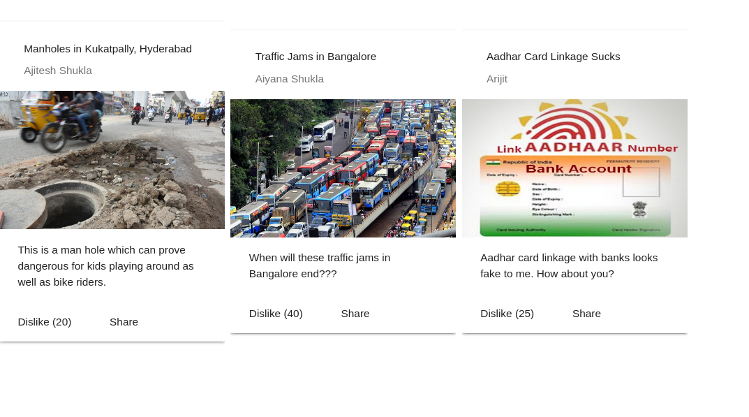
Figure 1. Angular Material Sample Cards
The following files need to be changed in order to achieve above:
- app.component.ts (Component)
- app.component.html (Component view)
- A custom angular material module (Angular Material Module)
- app.module.ts (Module)
Angular App Component Changes
To achieve above, the file app.component.ts would be changed appropriately as shown in the following code. A simplistic component with an array consisting of details which will be displayed in each of the card.
import { Component } from '@angular/core';
import {MatCardModule} from '@angular/material/card';

@Component({
  selector: 'app-root',
  templateUrl: './app.component.html',
  styleUrls: ['./app.component.css']
})
export class AppComponent {
  title = 'app';

  tiles = [
    {title: 'Manholes in Kukatpally, Hyderabad', image: 'http://www.thehansindia.com/assets/1378_Manhole.jpg',
      descr: 'This is a man hole which can prove dangerous for kids playing around as well as bike riders.',
      user: 'Ajitesh Shukla', css: 'example-header-image', dislikes: 20},
    {title: 'Traffic Jams in Bangalore', image: 'http://www.fakingnews.firstpost.com/wp-content/uploads/2016/06/Bangalore-traffic.jpg',
      descr: 'When will these traffic jams in Bangalore end???', user: 'Aiyana Shukla', css: 'example-header-image-2',
     dislikes: 40},
    {title: 'Aadhar Card Linkage Sucks',
      image: 'http://www.aadhaarcardnumber.in/wp-content/uploads/2015/09/Link-aadhar-card-to-bank-account-online.jpg',
      descr: 'Aadhar card linkage with banks looks fake to me. How about you?', user: 'Arijit', css: 'example-header-image-3',
     dislikes: 25}

  ];
}
Angular App Component View Changes
The corresponding app.component.html file would need to include selectors appropriate for displaying the cards. Make a note of some of the following in the code given below:
- Selector mat-grid-list is used to create a two-dimensional list view that arranges cells into grid-based layout. Read the details on GridList overview page
- Selector mat-grid-tile representing the rows and columns
- Selector mat-card represents a content container for text, photos, and actions in the context of a single subject. Read the details on Card overview page
This is how the html file looked like:
<mat-grid-list cols="4" rowHeight="500px" gutterSize="8px">
  <mat-grid-tile *ngFor="let tile of tiles">
  <mat-card class="example-card">
  <mat-card-header>


<div mat-card-avatar class="{{tile.css}}"></div>


   <mat-card-title>{{tile.title}}</mat-card-title>
   <mat-card-subtitle>{{tile.user}}</mat-card-subtitle>
 </mat-card-header>
 <img mat-card-image src="{{tile.image}}" height="180">
 <mat-card-content>


 {{tile.descr}}


 </mat-card-content>
 <mat-card-actions>
 <button mat-button>Dislike ({{tile.dislikes}})</button>
 <button mat-button>Share</button>
 </mat-card-actions>
 </mat-card>
 </mat-grid-tile>
</mat-grid-list>
Custom Angular Material Module
Angular material supports multiple components representing different UI elements. The following can be two different techniques to work with Angular Material components:
- Use components as required and import each one of them in the feature-level module representing NgModule. This would, however, lead to changes with the feature-level module, now and then.
- Create another module and import/export the angular material module used. Import this module in feature-level module. This is recommended way of working with Angular Material components. This is what is demonstrated below.
Note some of the following:
- Inclusion (import) of modules such as MatCardModule, MatButtonModule, MatGridListModule
- Export above modules for usage in the component views
import { NgModule } from '@angular/core';
import {MatCardModule} from '@angular/material/card';
import {MatButtonModule, MatGridListModule} from '@angular/material';

@NgModule({
  imports: [MatCardModule, MatButtonModule, MatGridListModule],
  exports: [MatCardModule, MatButtonModule, MatGridListModule],
})
export class AppCustomMaterialModule { }
Angular App Module Changes
Note the changes such as following:
- The Angular material module AppCustomMaterialModule is imported.
- ServiceWorkerModule which is key to PWA
import { BrowserModule } from '@angular/platform-browser';
import { NgModule } from '@angular/core';


import { ServiceWorkerModule } from '@angular/service-worker';
import { AppComponent } from './app.component';

import { environment } from '../environments/environment';
import {BrowserAnimationsModule} from '@angular/platform-browser/animations';
import {AppCustomMaterialModule} from './app-custom-material.module';

@NgModule({
  declarations: [
    AppComponent
  ],
  imports: [
    BrowserModule,
    ServiceWorkerModule.register('/ngsw-worker.js', { enabled: environment.production }),
    BrowserAnimationsModule,
    AppCustomMaterialModule
  ],
  providers: [],
  bootstrap: [AppComponent]
})
export class AppModule { }
You could create an Angular PWA with either Bootstrap or Angular Material. However, I am inclined to use Angular Material for my next app as this has gone full GA.

Check out my latest book titled as First Principles Thinking: Building winning products using first principles thinking.
- Mathematics Topics for Machine Learning Beginners - July 6, 2025
- Questions to Ask When Thinking Like a Product Leader - July 3, 2025
- Three Approaches to Creating AI Agents: Code Examples - June 27, 2025
I found it very helpful. However the differences are not too understandable for me