
In this plot, you will learn about how to add trend line to the line chart / line graph using Python Matplotlib.As a data scientist, it proves to be helpful to learn the concepts and related Python code which can be used to draw or add the trend line to the line charts as it helps understand the trend and make decisions.
In this post, we will consider an example of IPL average batting scores of Virat Kohli, Chris Gayle, MS Dhoni and Rohit Sharma of last 10 years, and, assess the trend related to their overall performance using trend lines. Let’s say that main reason why we want to understand the trend line? The primary goal is to assess on whom could the larger money be put in order to acquire him for the team? The batsman who has the largest upward trend line with highest slope is the one I would like to put my money on. Having said that, the batting scores mean and variance / standard deviation also comes into picture in taking the final decision on who to put larger money on.
Here is their batting average scores in IPL seasons in last 10 years from 2010 – 2019
| Years | Chris Gayle | Rohit Sharma | MS Dhoni | Virat Kohli |
| 2010 | 32.44 | 28.85 | 31.88 | 27.90 |
| 2011 | 67.55 | 28.85 | 43.55 | 46.41 |
| 2012 | 61.08 | 30.92 | 29.83 | 28.00 |
| 2013 | 59.00 | 38.42 | 41.90 | 45.28 |
| 2014 | 21.77 | 30.00 | 74.20 | 27.61 |
| 2015 | 40.91 | 34.42 | 31.00 | 45.90 |
| 2016 | 22.70 | 44.45 | 40.57 | 81.08 |
| 2017 | 22.22 | 23.78 | 26.36 | 30.80 |
| 2018 | 40.88 | 23.83 | 75.83 | 48.18 |
| 2019 | 40.83 | 28.92 | 83.20 | 33.14 |
Before getting ahead and understanding the code related to line chart and related trendlines, lets understand why trend line is needed.
Why/When use Trend Line with Line Chart?
There are scenarios when a numerical entity changes with time which is represented using line chart or line plot or line graph. However, it becomes difficult to find the trend given the complexity of the line chart. This is where the trend line comes into picture. Lets plot the line charts of batting average scores for individual batsman listed in this post.
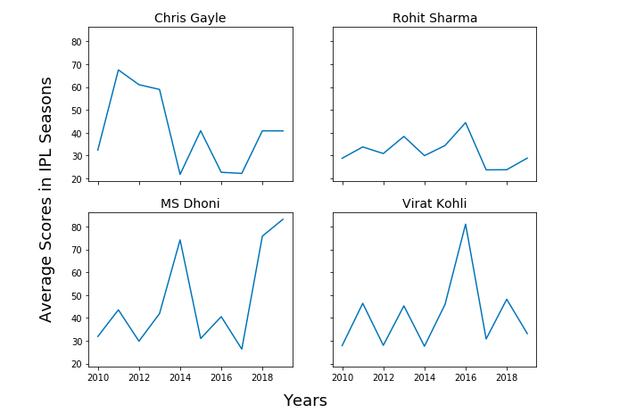
You may note that it becomes difficult to find out about the performance of batsman across different seasons. Thus, if one would like to make a decision on who to put larger money on to acquire for the next season, IPL 2020 (currently going on), it would just get difficult.
This is where adding trend line to all of the line charts will make difference.
How to draw trend line for line chart / graph using Python?
First and foremost, lets represent the IPL batting average scores data across different seasons from 2010-2019 shown in table 1 in form of numpy array.
import numpy as np
#
# Chris Gayle
#
chris_gayle = np.array([32.44, 67.55, 61.08, 59.00, 21.77, 40.91, 22.70, 22.22, 40.88, 40.83])
#
# Rohit Sharma
#
rohit_sharma = np.array([28.85, 33.81, 30.92, 38.42, 30.00, 34.42, 44.45, 23.78, 23.83, 28.92])
#
# MS Dhoni
#
ms_dhoni = np.array([31.88, 43.55, 29.83, 41.90, 74.20, 31.00, 40.57, 26.36, 75.83, 83.20])
#
# Virat Kohli
#
virat_kohli = np.array([27.90, 46.41, 28.00, 45.28, 27.61, 45.90, 81.08, 30.80, 48.18, 33.14])
Here is the Python code which is used to draw the trend lines for line charts / line graphs in order to assess the overall performance of these batsman in last 10 years in terms of increasing or decreasing scoring trends.
import matplotlib.pyplot as plt
import numpy as np
#
# Number of years represented as Numpy Array
#
X = np.array([2010, 2011, 2012, 2013, 2014, 2015, 2016, 2017, 2018, 2019])
fig, ax = plt.subplots(2, 2, figsize=(9, 7), sharex=True, sharey=True)
#
# Chris Gayle
#
z = np.polyfit(X, chris_gayle, 1)
p = np.poly1d(z)
ax[1, 0].plot(X,p(X),"r--")
ax[1, 0].plot(X, chris_gayle)
ax[1, 0].set_title('Chris Gayle', fontsize=14)
#
# Rohit Sharma
#
z = np.polyfit(X, rohit_sharma, 1)
p = np.poly1d(z)
ax[0, 0].plot(X,p(X),"r--")
ax[0, 0].plot(X, rohit_sharma )
ax[0, 0].set_title('Rohit Sharma', fontsize=14)
#
# MS Dhoni
#
z = np.polyfit(X, ms_dhoni, 1)
p = np.poly1d(z)
ax[1, 1].plot(X,p(X),"r--")
ax[1, 1].plot(X, ms_dhoni)
ax[1, 1].set_title('MS Dhoni', fontsize=14)
#
# Virat Kohli
#
z = np.polyfit(X, virat_kohli, 1)
p = np.poly1d(z)
ax[0, 1].plot(X,p(X),"r--")
ax[0, 1].plot(X, virat_kohli)
ax[0, 1].set_title('Virat Kohli', fontsize=14)
#
# Draw the plot
#
fig.text(0.5, 0.04, 'Years', ha='center', fontsize=18)
fig.text(0.04, 0.5, 'Average Scores in IPL Seasons', va='center', rotation='vertical', fontsize=18)
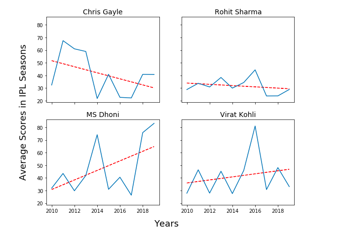
Here is how the trend line plot would look like for all the players listed in this post.
The Python code which does the magic of drawing / adding the trend line to the line chart / line graph is the following. Pay attention to some of the following in the code given below:
- Two plots have been created – One is Line chart / line plot / line graph, and, other is trend line.
- Plotting code which represents line chart is ax[0, 1].plot(X, virat_kohli)
- Plotting code which represents trend line is the following. Numpy ployfit method is used to fit the trend line which then returns the coefficients.
z = np.polyfit(X, virat_kohli, 1) // Polynomial fit
p = np.poly1d(z)
ax[0, 1].plot(X,p(X),"r--")
Here is the full Python code for adding trend line to the line chart.
virat_kohli = np.array([27.90, 46.41, 28.00, 45.28, 27.61, 45.90, 81.08, 30.80, 48.18, 33.14])

z = np.polyfit(X, virat_kohli, 1) // Polynomial fit
p = np.poly1d(z)

ax[0, 1].plot(X,p(X),"r--")
ax[0, 1].plot(X, virat_kohli)

ax[0, 1].set_title('Virat Kohli', fontsize=14)
Line Chart & Trend line Analysis
Given the trend line in figure 2, it can be concluded that MS Dhoni batting averages have been increasing as it has upward trend line. That said, Virat Kohli batting average also has upward trend line but the slope is lesser than that of MS Dhoni. Thus, if it comes to take decision on who to put larger money on, I would bet my money on MS Dhoni.
Conclusions
Here is the summary of what you learned about adding trend line to line graph or line chart using Python:
- Matplotlib can be used to draw line chart and trend line
- Matplotlib plot function is used to draw the line chart and trend line
- Numpy ployfit method is used to fit the polynomial which returns coefficients which are later used to draw the trend line.

Check out my latest book titled as First Principles Thinking: Building winning products using first principles thinking.
- Questions to Ask When Thinking Like a Product Leader - July 3, 2025
- Three Approaches to Creating AI Agents: Code Examples - June 27, 2025
- What is Embodied AI? Explained with Examples - May 11, 2025
Thanks for sharing, exactly what I needed.
Thank you