
Have you ever told a story to someone, but they just didn’t seem to understand it? They might have been confused about the plot or why the characters acted in certain ways. If this has happened to you before, then you are not alone. Many people struggle with storytelling or rather data storytelling because they do not know how to communicate their data effectively to tell an engaging story. Data storytelling is a powerful tool that can be used to educate, inform or persuade an audience by using different kinds of narration. By using charts, graphs, images and other visuals, data can be made more interesting and engaging. Data storytelling involves taking data and presenting it in a way that is easy to understand and makes an impact.
In this blog post, you will learn about some of the key concepts in relation to data storytelling and why data scientists / data analyst should acquire this skill. Data storytelling is one of the key skills which data analysts & data scientists would need to acquire in order to do a great job in representing the data with story. Most of the time, it has been seen that data analysts / data scientists merely present multiple plots with the sole aim of showing the logic and reasoning. However, it is equally important to represent the data as story as it results in an emotional connect with stakeholders and help them make the decisions. Thus, data scientists must acquire the data storytelling skills to do a great job.
What is Storytelling?
Storytelling is the art of conveying a message or information to an audience through a narrative. At its core, storytelling involves creating a narrative that engages the audience, draws them in, and takes them on a journey. It is not just about conveying information, but also about creating an emotional connection with the audience. Storytelling can be used in a variety of settings, from business presentations to personal conversations. It is an effective way to capture people’s attention, communicate important messages, and inspire action. When done well, storytelling can be a powerful and memorable experience for both the storyteller and the audience.
Aristotle put forward a simple yet significant concept in the art of storytelling, which is that a story should have a distinct start, middle, and end. To achieve this, he suggested a three-act structure for plays, consisting of the establishment of the plot, the introduction of a conflict, and its resolution. This concept has been developed and improved over time and is now widely known as the setup, conflict, and resolution model.
Storytelling is an important process in many different industries. In the advertising world, for example, a good story can be the difference between a commercial that people remember and one that they forget. In the entertainment industry, a well-told story can make a movie or TV show into a blockbuster hit. And in the business world, a good story can help make a company’s products or services more appealing to customers.
Storytelling is all about creating a narrative that engages and entertains the audience. There are many different techniques that you can use to create a successful story, but some of the most important ones include establishing a clear plot, developing interesting characters, and using strong dialogue.
- Different narrative voices: One common storytelling technique is to use different narrative voices. This can be done by alternating between different characters’ perspectives, or by telling a story from different time periods. This technique can help to add depth and complexity to a story, and can make it more interesting to read.
- Flashback: Another technique that can be used in storytelling is flashback. This can be used to provide backstory or to show events that happened before the main story began. Flashback can help to fill in the gaps for readers and can add nuance to the story.
- Foreshadowing: Yet another technique that can be used in storytelling is foreshadowing. This involves hinting at events that will happen later in the story. Foreshadowing can add suspense and intrigue to a story, and can keep readers guessing about what will happen next.
Stories can be either true or fictional, and they can be used for a variety of purposes such as entertaining, educating, or persuading. There are four different aspects of storytelling such as the following:
- Characters: The people, animals, or objects that are part of the story.
- Setting: Setup or context in which the story takes place. This can be either physical or mental space.
- Conflict: The problem or obstacle that the main character(s) face. The conflict throws the world of main characters out of balance. The main characters move from the world of balance to imbalance due to conflict.
- Resolution: The way in which the conflict is resolved. The resolution can result in outcomes such as the goal being met or lessons learned.
What is Data Storytelling?
The advent of dashboards / manual reporting along with great charts very clearly help the end users understand what has happened. However, they are not very good in telling why something has happened. In other words, they lack the overall narrative that can more effectively and efficiently communicate both information and key insights. This is where data storytelling comes to the rescue.
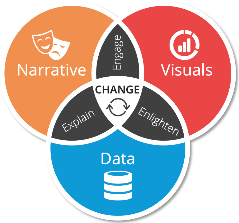
Data storytelling can be defined as the process of using data to tell a story. It can include elements like data visualization, data analysis, and storytelling techniques such as narratives or scenarios as discussed in the previous section. The goal is to make data more understandable for non-technical users by presenting it in an appealing manner with relevant context attached (i.e., why they should care about this particular point). The picture below represents three key components of data storytelling such as data, narrative and visuals. The picture has been taken from the book, Colorwise by Kate Strachnyi.
Data storytelling is the process of taking data and presenting it in a way that is easy to understand and makes an impact. It can be used to educate, inform or persuade an audience. It is is a way to convey data-driven stories, as it enhances engagement and stimulates curiosity among viewers. There are various different data visualization tools that allow data storytellers to animate seemingly static data into eye-catching infographics, which can enhance understanding and spark more discussion across multiple channels of social media. By using charts, graphs, images and other visuals, data can be made more interesting and engaging. Data storytelling is a powerful tool because it can help us make sense of complex information and see relationships that might be hidden in raw data. It can also help us understand the implications of data and how it affects our lives. This is particularly helpful for organizations with more complex datasets that require careful exploration and more time than what’s traditionally allocated in a presentation or meeting.
There are a number of ways data storytelling can be used to improve data analysis:
- To help explain data trends and patterns to non-technical users
- To highlight the significance of data findings
- As a way to communicate complex data in an easily understandable manner
- To improve data literacy by teaching people how to read and understand data visualizations
- To create data-driven narratives that help tell a story
Data storytelling represents the methods of extracting useful information/knowledge/insights from the data and presenting it as a compelling story to a specific audience. From the business standpoint, the primary goal behind data storytelling is to extract actionable insights/information from the data in order to identify hidden business opportunities. The following are key aspects of data storytelling as shown in the above picture:
- Data preparation
- Data visualization
- Storytelling / narrative
Let’s understand the above aspects with a few examples.
Data Preparation – Great Story requires right data set!
First and foremost, it is most important to gather the right kind of data from various different sources and prepare the data appropriately for further analysis. Here is a great related quote I could gather from the internet in relation to stories and data.
“Maybe Stories are just Data with a Soul!” – Brene Brown
It is very important to understand what is the right kind of data that can create actionable insights. Post that, it is equally important to identify reliable data sources. Once data is gathered, cleaned, and prepared, the next step is to understand different aspects of data (perform data analysis) vis-a-vis related business domains. A diligent data analysis will be an important step in order to transition to the next step – visualization.
In this post, the example taken is the need to make an informed decision on whether to continue investing money in MS Dhoni for the upcoming IPL Season 2020. What is needed is actionable insight supported by the story which can help in the decision making. Thus, as a first step, it is important to identify what kind of data will help in making this decision and where to take this data. In this post, I took the IPL batting average scores of MS Dhoni for the last 10 years (2010-2019) and the data source used is IPL website.

Data Visualization – Important Part of Data Storytelling
One of the most important aspects of data storytelling is using the right kind of visualization plots. The primary goal is to come up with actionable insights supported by the story with which decision-makers can connect. In order to come up with actionable insights with a great story, it is very important to use the right kind of plot. If the right plots are not used, it will be difficult to extract information out of any given data. The following are some of the most common uses of data visualizations in data story telling:
- Help understand the changes happening with time (time-series plots). In the example below, time-series plot helped understand the overall event while creating the right narrative
- Help determine the frequency of events
- Help determine the relationship based on correlations
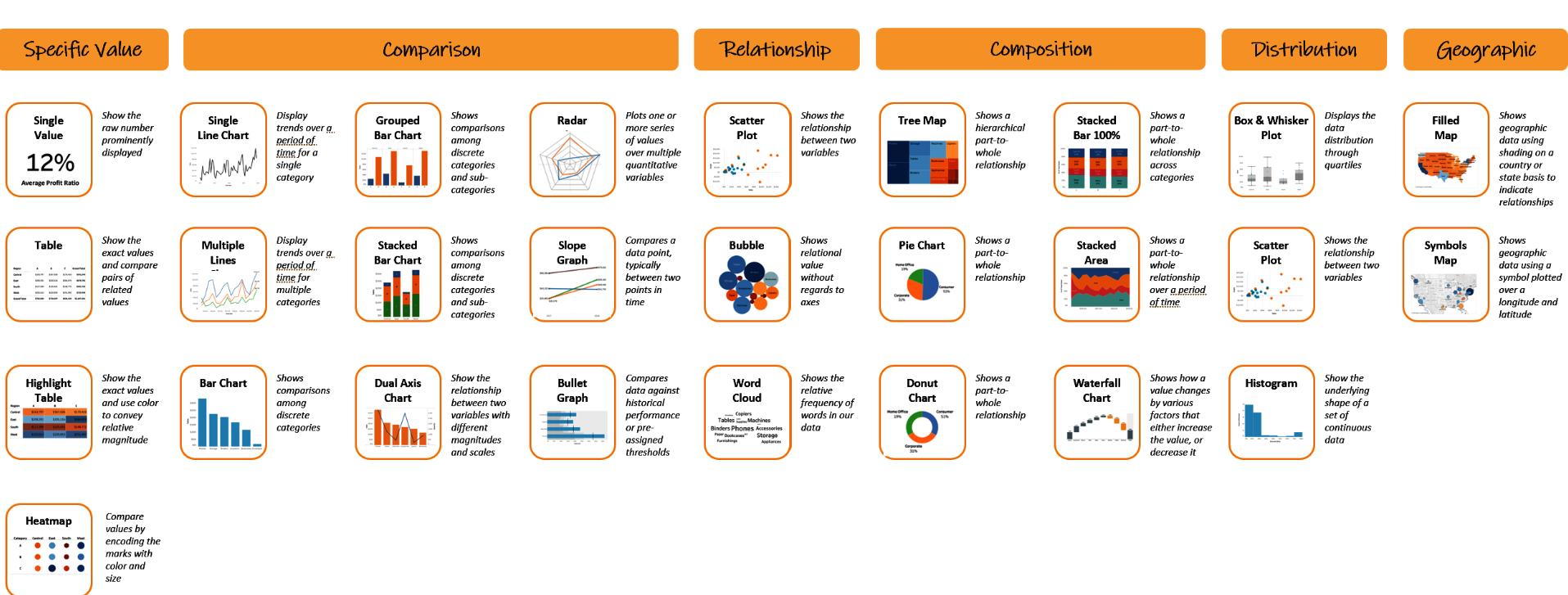
The following picture can be used as a cheat sheet for different types of data visualizations vs different types of charts that could be used. The picture has been taken from the book Colorwise by Kate Strachnyi.
Let’s understand this with an example of how time-series data visualization of IPL batting average scores of MS Dhoni for the last 10 years (2010-2019) and what narrative can be built using that.
Here are the IPL batting average scores of the last 10 seasons (2010-2019) of Mahendra Singh Dhoni, one of the greatest Indian team cricket captains of all time.
#
# MS Dhoni IPL Batting Average Scores Across Seasons (2010-2019)
#
X = np.array([2010, 2011, 2012, 2013, 2014, 2015, 2016, 2017, 2018, 2019])
ms_dhoni = np.array([31.88, 43.55, 29.83, 41.90, 74.20, 31.00, 40.57, 26.36, 75.83, 83.20])
Could you make anything out of this data? In other words, were you able to extract any information out of the above data?
Alright! Let’s try a little hard and draw line plots / scatter plots and see if we can extract some information out of data that can be represented as a story or used for storytelling. Here is the Python code for drawing scatter / line plots of the above data.
import matplotlib.pyplot as plt
import numpy as np
#
# MS Dhoni IPL Batting Average Scores Across Seasons (2010-2019)
#
X = np.array([2010, 2011, 2012, 2013, 2014, 2015, 2016, 2017, 2018, 2019])
ms_dhoni = np.array([31.88, 43.55, 29.83, 41.90, 74.20, 31.00, 40.57, 26.36, 75.83, 83.20])

fig, ax = plt.subplots(1, 2, figsize=(13, 6))

ax[0].scatter(X, ms_dhoni)
ax[1].plot(X, ms_dhoni)

fig.text(0.5, 0.04, 'Years', ha='center', fontsize=18)
fig.text(0.04, 0.5, 'Average Scores in IPL Seasons', va='center', rotation='vertical', fontsize=18)
The above Python code would result in the following scatter and line plots. Can you extract some story out of these plots? Can you extract some information from these plots?
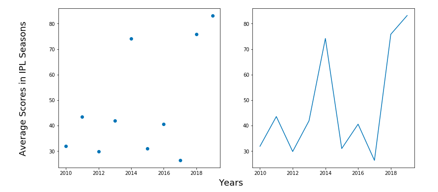
I don’t think we can extract any useful information out of these plots. Now, let’s add a trend line to a line chart. Here is the Python code to draw line charts and trend lines.
import matplotlib.pyplot as plt
#
# MS Dhoni IPL Batting Average Scores Across Seasons (2010-2019)
#
X = np.array([2010, 2011, 2012, 2013, 2014, 2015, 2016, 2017, 2018, 2019])
ms_dhoni = np.array([31.88, 43.55, 29.83, 41.90, 74.20, 31.00, 40.57, 26.36, 75.83, 83.20])

fig, ax = plt.subplots(1, 1, figsize=(10, 8))

z = np.polyfit(X, ms_dhoni, 1)
p = np.poly1d(z)
plt.plot(X,p(X),"r--")
plt.plot(X, ms_dhoni)
plt.title('MS Dhoni IPL Batting Average Scores', fontsize=16)
plt.xlabel('Years', fontsize=16)
plt.ylabel('Average Scores in IPL Seasons', fontsize=16)
Executing the above code would print the following plot. Can we extract some story or information out of this plot?
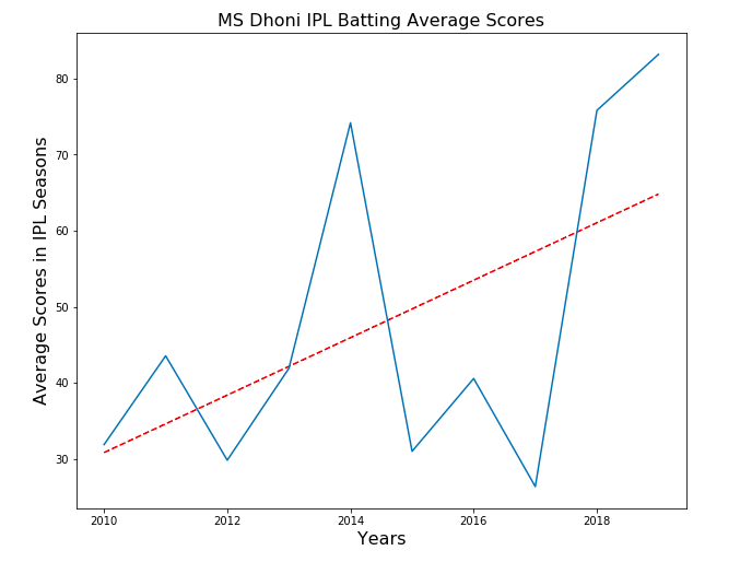
Yes, we can extract information from the above plot. The plot is shown to have an upward trend representing the fact that Dhoni looks to be playing well.
Thus, it is important that you choose the right kind of visualization plot to represent the story related to data. In other words, choose the visualization plot using which maximum information can be represented in the data.
Storytelling – Communicating Story
Now that we have the appropriate visualization plot ready, it is very important part to communicate the story in a manner that actionable insights could be derived. The ultimate goal is to help decision-makers take the decision.
So, what story can be communicated using the visualization plot shown in the previous section?
The story is this – Dhoni looks to be playing well! His batting average is seen to have an upward trend which means that he can be trusted to play well in the upcoming season. Thus, an informed decision can be taken to invest in him.
What data storytelling is not?
Data visualization or data presentation. While data storytelling may include visualizations, it goes beyond just showing charts and graphs to tell a story. The goal of data storytelling is to make data more understandable, while the purpose of data visualization is typically to highlight trends or patterns in large amounts of information (e.g., big data).
Data storytelling is not data analysis either because data storytelling only uses data to tell a story, while data analysis involves more rigorous statistical methods such as descriptive statistics and hypothesis testing. Data storytelling may include some form of data analysis that helps inform the narrative being told by using charts/graphs or other visualizations as evidence for claims made in the story.
References
- Data storytelling: The essential data science skills everyone needs
- How Sheryl Sandberg’s Last Minute Addition To Her TED Talk Sparked A Movement
- Brené Brown’s Presentation Caught Oprah’s Attention. The Same Skills Can Work For You
Conclusions
Here is the summary of what you learned in this post regarding data storytelling:
- Data storytelling is one of the most important skills data scientists must acquire to do a great job in the process of building machine learning models.
- Key aspects of data storytelling is data preparation, data visualization and data storytelling with the help of data visualization.
- One of the primary goal of data storytelling is to extract useful information / actionable insights from the data and present the information as compelling story.

Check out my latest book titled as First Principles Thinking: Building winning products using first principles thinking.
- Mathematics Topics for Machine Learning Beginners - July 6, 2025
- Questions to Ask When Thinking Like a Product Leader - July 3, 2025
- Three Approaches to Creating AI Agents: Code Examples - June 27, 2025
I found it very helpful. However the differences are not too understandable for me