In this blog post, we’ll be discussing correlation concepts, matrix & heatmap using Seaborn. For those of you who aren’t familiar with Seaborn, it’s a library for data visualization in Python. So if you’re looking to up your data visualization game, stay tuned! We’ll start with the basics of correlation and move on to discuss how to create matrices and heatmaps with Seaborn. Let’s get started!
Introduction to Correlation
Correlation is a statistical measure that expresses the strength of the relationship between two variables. The two main types of correlation are positive and negative. Positive correlation occurs when two variables move in the same direction; as one increases, so do the other. For example, there is a positive correlation between hours of study and grades on a test. A negative correlation occurs when two variables move in opposite directions; as one increases, the other decreases. For example, there is a negative correlation between smoking and life expectancy. Correlation can be used to test hypotheses about cause and effect relationships between variables. Correlation is often used in the real world to predict trends. For example, if there is a strong positive correlation between the number of hours spent studying and grades on a test, we can predict that if someone spends more hours studying, they will get a higher grade on the test.
Correlation is often used to determine whether there is a cause-and-effect relationship between two variables. For example, if researchers want to know whether watching television causes obesity, they would examine the correlation between television viewing and obesity rates. If they found that there was a strong positive correlation, it would suggest that there may be a causal relationship. However, correlation does not necessarily imply causation; other factors may be at play. However, it is important to remember that correlation does not imply causation. For example, there may be a strong correlation between ice cream sales and swimming accidents, but that doesn’t mean that eating ice cream causes people to have accidents.
If there are multiple variables and the goal is to find the correlation between all of these variables and store them using the appropriate data structure, the matrix data structure is used. Such a matrix is called a correlation matrix. A correlation matrix is a table that shows the correlation coefficients between a set of variables. Correlation matrices are used to determine which pairs of variables are most closely related. They can also be used to identify relationships between variables that may not be readily apparent. Correlation matrices are a valuable tool for researchers and analysts who want to understand the relationships between multiple variables.
Dependence between two variables, also termed correlation, can be measured using the following:
- Correlation coefficient / Pearson correlation coefficient is a statistical measure of the linear relationship between two variables. The Pearson correlation is also known simply as the correlation coefficient. The Pearson correlation coefficient can range from -1 to 1. The formula given below (Fig 1) represents the Pearson correlation coefficient. The Pearson correlation coefficient is used in many different fields, including psychology, sociology, and biology. In psychology, the Pearson correlation coefficient is often used to measure the strength of the relationship between two constructs, such as intelligence and academic performance. In sociological research, the Pearson correlation coefficient may be used to examine the relationship between income and education level.
- Spearman correlation coefficient: Spearman Correlation coefficient is a statistic used to measure the strength and direction of the relationship between two variables. The Spearman Correlation coefficient is also known as Spearman’s Rank Correlation coefficient or Spearman’s RHO. The Spearman Correlation coefficient can range from -1.0 to +1.0. The Spearman correlation coefficient is often used when one or both of the variables are not normally distributed. For example, Spearman correlation coefficient could be used to examine the relationship between IQ scores and test scores. In this case, Spearman correlation coefficient would be a more appropriate measure than Pearson correlation coefficient because IQ scores are not normally distributed. Spearman correlation coefficient can be used to determine whether there is a linear or nonlinear relationship between two variables.
Pearson correlation coefficient between two variables X and Y can be calculated using the following formula. X bar is the mean value of X and Y bar is the mean value of Y. [latex]X_i[/latex] and [latex]Y_i[/latex] represents different values of X and Y.
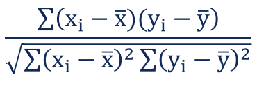
Fig 1. Pearson correlation coefficient formula
The value of the correlation coefficient can take any values from -1 to 1.
- If the value is 1, it is said to be a positive correlation between two variables. This means that when one variable increases, the other variable also increases.
- If the value is -1, it is said to be a negative correlation between the two variables. This means that when one variable increases, the other variable decreases.
- If the value is 0, there is no correlation between the two variables. This means that the variables changes in a random manner with respect to each other.
Correlation between two variables can also be determined using a scatter plot between these two variables. Here is the diagram representing correlation as a scatterplot. The correlation of the diagram in the top-left will have correlation near to 1. The correlation of the diagram in the middle row will have a correlation near to 0. The correlation of the diagram in the bottom-right will have a correlation near -1.
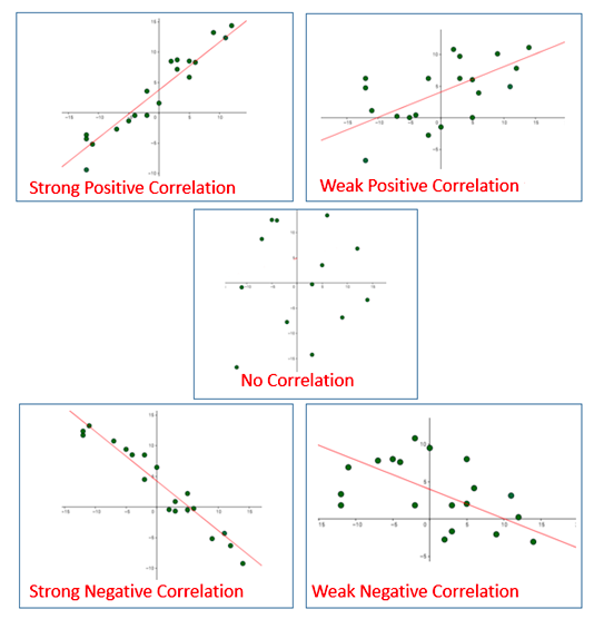
Fig 2. Correlation represented using the Scatterplot
Correlation between two random variables or bivariate data does not necessary imply causal relationship.
Why must one understand correlation concepts?
As a data scientist or machine learning enthusiast, it is very important to understand the concept of correlation as it helps achieve some of the following objectives:
- Correlation is used in linear regression models to determine the strength of the relationship between the dependent and independent variables. The linear regression model is a machine learning algorithm that is used to predict a continuous value, such as a price or quantity. The linear regression model uses the correlation between the dependent and independent variables to determine how much of the dependent variable is explained by the independent variable. In case there is a strongly positive or negative correlation, the predictor variables can be considered as features for training the models.
- Correlation is often used in machine learning to identify multicollinearity, which is when two or more predictor variables are highly correlated with each other. Multicollinearity can impact the accuracy of predictive models, so it’s important to identify and remove predictors that are associated with high multicollinearity. There are different methods for identifying multicollinearity, but one common method is to calculate the variance inflation factor (VIF), which measures the degree of correlation between predictor variables. Variance inflation factor (VIF) is a measure of how much the variance of a parameter is increased by collinearity. VIFs are typically used in statistical modeling to assess multicollinearity and to help select model variables. In machine learning, VIF can be used to reduce the dimensionality of data by removing features that are highly correlated with each other. By reducing multicollinearity, VIF can improve the accuracy of predictions and prevent overfitting. Multicollinearity can be addressed either removing one of the correlated variables or by using regularization techniques. Regularization techniques penalize model complexity, which helps to prevent overfitting. In addition, feature engineering techniques can be used to create new features that are not strongly correlated with each other.
What is Correlation Heatmap?
Correlation heatmaps are a type of plot that visualize the strength of relationships between numerical variables. Correlation plots are used to understand which variables are related to each other and the strength of this relationship. A correlation plot typically contains a number of numerical variables, with each variable represented by a column. The rows represent the relationship between each pair of variables. The values in the cells indicate the strength of the relationship, with positive values indicating a positive relationship and negative values indicating a negative relationship. Correlation heatmaps can be used to find potential relationships between variables and to understand the strength of these relationships. In addition, correlation plots can be used to identify outliers and to detect linear and nonlinear relationships. The color-coding of the cells makes it easy to identify relationships between variables at a glance. Correlation heatmaps can be used to find both linear and nonlinear relationships between variables.
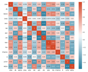
Here is a sample correlation heatmap created to understand the linear relationship between different variables in the housing data set. The code is discussed in the later section.

Correlation Heatmap Pandas / Seaborn Code Example
Here is the Python code which can be used to draw a correlation heatmap for the housing data set representing the correlation between different variables including predictor and response variables. Pay attention to some of the following:
- Pandas package is used to read the tabular data using read_table method.
- Method corr() is invoked on the Pandas DataFrame to determine the correlation between different variables including predictor and response variables.
- The Seaborn heatmap() method is used to create the heat map representing the correlation matrix
import pandas as pd
import numpy as np
import matplotlib.pyplot as plt
import seaborn as sns
#
#
#
df = pd.read_table('/Users/apple/Downloads/housing.data', header=None, sep='\s+')
df.columns = ['CRIM', 'ZN', 'INDUS', 'CHAS', 'NOX', 'RM',
             'AGE', 'DIS', 'RAD', 'TAX', 'PTRATIO', 'B',
             'LSTAT', 'MEDV']
#
# Correlation between different variables
#
corr = df.corr()
#
# Set up the matplotlib plot configuration
#
f, ax = plt.subplots(figsize=(12, 10))
#
# Generate a mask for upper traingle
#
mask = np.triu(np.ones_like(corr, dtype=bool))
#
# Configure a custom diverging colormap
#
cmap = sns.diverging_palette(230, 20, as_cmap=True)
#
# Draw the heatmap
#
sns.heatmap(corr, annot=True, mask = mask, cmap=cmap)
Here is how the correlation heatmap will look like:
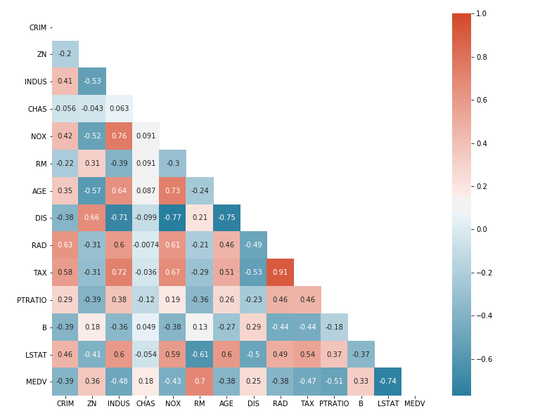
From the above correlation heatmap, one could get some of the following information:
- Variables such as NOX & INDUS, AGE & NOX, TAX & RAD and MEDV & RM are having strong positive correlation. Generally speaking, a Pearson correlation coefficient value greater than 0.7 indicates the presence of multi-collinearity.
- Variables such as MEDV & LSTAT, DIS & INDUS, DIS & NOX, and DIS & AGE are having strong negative correlations.
- There are several variables that have no correlation and whose correlation value is near 0.
Conclusions
Here is the summary of what you learned about the correlation heatmap in this post:
- A correlation heatmap is a graphical representation of a correlation matrix representing the correlation between different variables.
- The value of correlation can take any value from -1 to 1.
- Correlation between two random variables or bivariate data does not necessarily imply a causal relationship.
- Correlation between two variables can also be determined using a scatter plot between these two variables.

Check out my latest book titled as First Principles Thinking: Building winning products using first principles thinking.
- Three Approaches to Creating AI Agents: Code Examples - June 27, 2025
- What is Embodied AI? Explained with Examples - May 11, 2025
- Retrieval Augmented Generation (RAG) & LLM: Examples - February 15, 2025
Hi Ajitesh, your explanation is fantastic. I am beginner in heat map and stuff.
i didnt understand 1 point here.
Fig 3. Correlation Heatmap for Housing Dataset in this you said NOX & INDUS are having strong correlation. when you specify 2 variables., should we take as X (nox) and Y (indus)? cause same variables are on Y and X asis. Just clear this point for me. OR how to determine the STRONG PART? just by the values of 0.7 or more?
Thanks
Hello
Great work summarizing this concept and the code used to obtain it. However, I still have a question and think it may serve as an improvement to the article: which of the two correlations (Pearson and Spearman) is represented by Seaborn?
Thanks
Thank you for your comment. Let me provide details asked by you.
Either way, you take (X axis or Y axis) its value remains the same. It’s up to your research problem to go with 0.7 or 0.8, there is no hard and fast rule. As mentioned in the article, >0.7 shows multi collinearity…Here we just want to know which features are related and, to what extend.
Might I recommend using a dataset that users can also download/access. I wanted to see what your underlying data looks like, but alas, not possible since the set appears to be local.