This blog post will walk you through the steps needed to install Altair graphical libraries in Jupyter Notebook. For data scientists, Altair visualization library can prove to very useful. In this blog, we’ll look at how to download and install Altair, as well as some examples of using Altair capabilities for data visualization.
What is Altair?
Altair is a free statistical visualization library that can be used with python (2 or 3). It provides high-quality interactive graphics via an integrated plotting function ́plot() that produces publication-quality figures in a variety of hardcopy formats and interactive environments across platforms. Altair is also easy to learn, with intuitive commands like ‘plot’, ‘hist’ etc., which are simple enough for undergraduate students to use yet powerful enough for research and development use. Check out some great examples of Altair visualization on this page – Altair visualizatione examples
You can create different kinds of plots such as the following:
How to install Altair for Python in Jupyter Notebook?
Here are the steps to install Altair for python in Jupyter notebook:
- Install altair and vega datasets using the following command.
pip install altair vega_datasets - Execute jupyter notebook, by typing in the terminal or cmd prompt.
- Type import altair or import altair as alt to check if Altiar was successfully installed. You should see no error messages displayed on the console screen upon executing this code
Hello World with Altair
Here is a sample hello world code you could use to get started:
import altair as alt
# load a simple dataset as a pandas DataFrame
#
from vega_datasets import data
#
# Get cars data
#
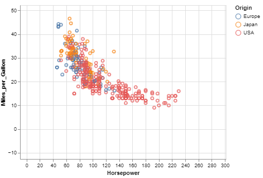
cars = data.cars()
#
# Create a scatter plot
# Plot Miles per gallon against the horsepower across different region
#
alt.Chart(cars).mark_point().encode(
x='Horsepower',
y='Miles_per_Gallon',
color='Origin',
).interactive()
The main point is that you’re connecting data columns with visual encodings, such as the x-axis, y-axis, color, and so on. The rest of the plot is handled automatically. Here is how the plot will look like:
Here are some basic details in relation to the Altair visualization library
- Data in Altair is built around the pandas DataFrame
- The fundamental object in the Altair is chart which takes a dataframe as a single argument:
import altair as alt
chart = alt.Chart(data)

Check out my latest book titled as First Principles Thinking: Building winning products using first principles thinking.
- Mathematics Topics for Machine Learning Beginners - July 6, 2025
- Questions to Ask When Thinking Like a Product Leader - July 3, 2025
- Three Approaches to Creating AI Agents: Code Examples - June 27, 2025
I found it very helpful. However the differences are not too understandable for me