Tag Archives: data visualization
Dashboard Design Best Practices: Examples
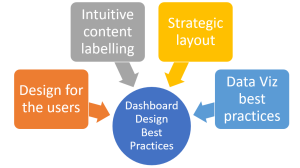
Are you looking to create effective, user-centric, and highly actionable data dashboards? Do you want your dashboard to not just present data, but tell a story that compels your team to make informed decisions? In an age of data-driven decision making, dashboards have become an indispensable tool for product managers, data analysts, and data visualization experts alike. A well-designed dashboard provides a real-time visual snapshot of performance, highlights crucial metrics, and assists in spotting trends or anomalies. However, designing a good dashboard is both an art and a science. It demands a deep understanding of users’ needs, a strategic approach to information organization, and an adept use of data visualization …

I found it very helpful. However the differences are not too understandable for me