If you’re a data scientist, data analyst or a Python programmer, data visualization is key part of your job. And what better way to visualize all that juicy data than with a scatter plot? Matplotlib is your trusty Python library for creating charts and graphs, and in this blog we’ll show you how to use it to create beautiful scatter plots using examples and with the help of Matplotlib library. So dig into your data set, get coding, and see what insights you can uncover!
What is a Scatter Plot?
A scatter plot is a type of data visualization that is used to show the relationship between two variables. Scatter plots are used in data science and statistics to show the distribution of data points, and they can be used to identify trends and patterns. Scatter plots are a type of graph that shows the scatter plot for data points. These plots are created by using a set of X and Y-axis values. The X-axis can be used to represent one of the independent variables, while the Y-axis can be used to represent the other independent variables or dependent variable. Scatter plots can be used for the following:
- Visualize the distribution of data: Scatter plots can be used to visualize any type of data, but they are particularly useful for data that is not evenly distributed. For example, scatter plots can be used to show the distribution of ages in a population, the distribution of heights in a population, or the distribution of grades in a classroom.
- Detect outliers: Scatter plots are often used to detect outliers, or data points that lie outside the general trend. To create a scatter plot, the data points are plotted on a coordinate grid, and then a line is drawn to connect the points. The scatter plot can then be analyzed to look for patterns and trends. Outliers are typically easy to spot on a scatter plot, as they will lie outside the general trend of the data. Outlier detection can be used to find errors in data, or to identify unusual data points that may require further investigation.
- Visualize the relationship between two variables; For example, a scatter plot could be used to visualize the relationship between someone’s weight and their height. The scatter plot would show how the weight and height of different people are related. scatter plots can also be used to visualize relationships between non-numerical data sets. For example, a scatter plot could be used to visualize the relationship between different types of food and how they make people feel. The scatter plot would show how different types of food make people feel different levels of fullness, satisfaction, and energy.
- Visualize regression models
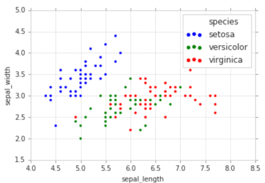
The following represents a sample scatter plot representing three different classes / species for IRIS flower data set. X-axis represents an attribute namely sepal length and Y-axis represents the attribute namely sepal width.
Scatter Plot with Python Code
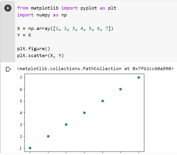
The following is a simple scatter plot created using Matplotlib library.
from matplotlib import pyplot as plt
import numpy as np

X = np.array([1, 2, 3, 4, 5, 6, 7])
Y = X

plt.figure()
plt.scatter(X, Y)
Here is the plot which gets created as a result of implementing above code:
Here is another example representing how scatter plot can be used to classify the data set across different classes.
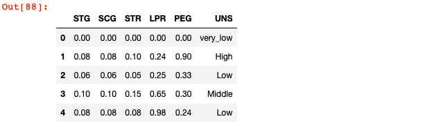
import panda as pd

df2 = pd.read_csv('/Users/apple/Downloads/user knowledge level - Sheet1.csv')
df2.head()
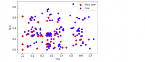
The code below can be used to scatter plot the classes such as very_low and Low while using the feature STG and SCG as X and Y axis. Make a note of how scatter function is invoked multiple times for plotting different data points that satisfies the given conditions. Thus, you could invoke scatter plot multiple times to plot different types of data points. This will turn out to be useful when you are dealing with classification machine learning problem having data points related to different labels / classes.
plt.scatter(df2['STG'][(df2.UNS == 'very_low') | (df2.UNS == 'Very Low')],
            df2['SCG'][(df2.UNS == 'very_low') | (df2.UNS == 'Very Low')],
           marker='D',
           color='red',
           label='Very Low')
plt.scatter(df2['STG'][df2.UNS == 'Low'],
            df2['SCG'][df2.UNS == 'Low'],
           marker='o',
           color='blue',
           label='Low')
plt.xlabel('STG')
plt.ylabel('SCG')
plt.legend()
plt.show()

The above scatter plot could be achieved in one line by using category_scatter function from mlxtend python package authored by Dr. Sebastian Raschka. Here is the command:
from mlxtend.plotting import category_scatter
df['UNS'] = np.where(df['UNS'] == 'Very Low', 'very_low', df['UNS'])
fig = category_scatter(x='STG', y='SCG', label_col='UNS',
                       data=df, legend_loc='upper right')
That’s all for now on scatter plots. If you have any questions, please don’t hesitate to let us know in the comments section below. We love hearing from our readers and we try to answer every question as best we can. And if you want to learn more about data visualization with Python programming, be sure to check out our other tutorials. Thanks for reading! Happy plotting!

Check out my latest book titled as First Principles Thinking: Building winning products using first principles thinking.
- Mathematics Topics for Machine Learning Beginners - July 6, 2025
- Questions to Ask When Thinking Like a Product Leader - July 3, 2025
- Three Approaches to Creating AI Agents: Code Examples - June 27, 2025
I found it very helpful. However the differences are not too understandable for me