Classification models are a fundamental part of machine learning and are used extensively in various industries. Evaluating the performance of these models is critical in determining their effectiveness and identifying areas for improvement. One of the most common tools used for evaluating classification models is the confusion matrix. It provides a visual representation of the model’s performance by displaying the number of true positives, false positives, true negatives, and false negatives.
In this post, we will explore how to create and visualize confusion matrices in Python using Matplotlib. We will walk through the process step-by-step and provide examples that demonstrate the use of Matplotlib in creating clear and concise confusion matrices. Whether you’re a beginner or an experienced data scientist, this blog will equip you with the knowledge to evaluate and improve your classification models using confusion matrices in Python.
Confusion Matrix using Matplotlib
The confusion matrix is a key tool in evaluating the performance of classification models. It provides a visual representation of how well the model is predicting true positives, false positives, true negatives, and false negatives.
In order to demonstrate the confusion matrix using Matplotlib, let’s fit a pipeline estimator to the Sklearn breast cancer dataset using StandardScaler (for standardising the dataset) and Random Forest Classifier as the machine learning algorithm.
The dataset used for demonstrating confusion matrix in the code below is the breast cancer dataset available in the Scikit-learn machine learning library. This dataset contains information about breast cancer tumors and their characteristics, which can be used to predict whether a tumor is malignant (cancerous) or benign (non-cancerous). The dataset contains a total of 569 instances, each with 30 numeric features. The target variable of the dataset is the diagnosis of the tumor, which is either malignant (encoded as 1) or benign (encoded as 0). The dataset is commonly used for classification tasks, where the goal is to build a model that can accurately predict whether a tumor is malignant or benign based on its characteristics.
from sklearn import datasets
from sklearn.model_selection import train_test_split
from sklearn.preprocessing import StandardScaler
from sklearn.ensemble import RandomForestClassifier
from sklearn.pipeline import make_pipeline
#
# Load the breast cancer data set
#
bc = datasets.load_breast_cancer()
X = bc.data
y = bc.target
#
# Create training and test split
#
X_train, X_test, y_train, y_test = train_test_split(X, y, test_size=0.30, random_state=1, stratify=y)
#
# Create the pipeline
#
pipeline = make_pipeline(StandardScaler(),
RandomForestClassifier(n_estimators=10, max_features=5, max_depth=2, random_state=1))
#
# Fit the Pipeline estimator
#
pipeline.fit(X_train, y_train)
Once an estimator is fit to the training data set, next step is to print the confusion matrix. In order to do that, the following steps will need to be followed:
- Get the predictions. Predict method on the instance of estimator (pipeline) is invoked.
- Create the confusion matrix using actuals and predictions for the test dataset. The confusion_matrix method of sklearn.metrics is used to create the confusion matrix array.
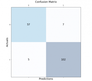
- Method matshow is used to print the confusion matrix box with different colors. In this example, the blue color is used. The method matshow is used to display an array as a matrix.
- In addition to the usage of matshow method, it is also required to loop through the array to print the prediction outcome in different boxes.
from sklearn.metrics import confusion_matrix
#
# Get the predictions
#
y_pred = pipeline.predict(X_test)
#
# Calculate the confusion matrix
#
conf_matrix = confusion_matrix(y_true=y_test, y_pred=y_pred)
#
# Print the confusion matrix using Matplotlib
#
fig, ax = plt.subplots(figsize=(7.5, 7.5))
ax.matshow(conf_matrix, cmap=plt.cm.Blues, alpha=0.3)
for i in range(conf_matrix.shape[0]):
    for j in range(conf_matrix.shape[1]):
        ax.text(x=j, y=i,s=conf_matrix[i, j], va='center', ha='center', size='xx-large')

plt.xlabel('Predictions', fontsize=18)
plt.ylabel('Actuals', fontsize=18)
plt.title('Confusion Matrix', fontsize=18)
plt.show()
This is how the confusion matrix will look like. Note that confusion matrix is created on 143 test labels vs predicted labels.
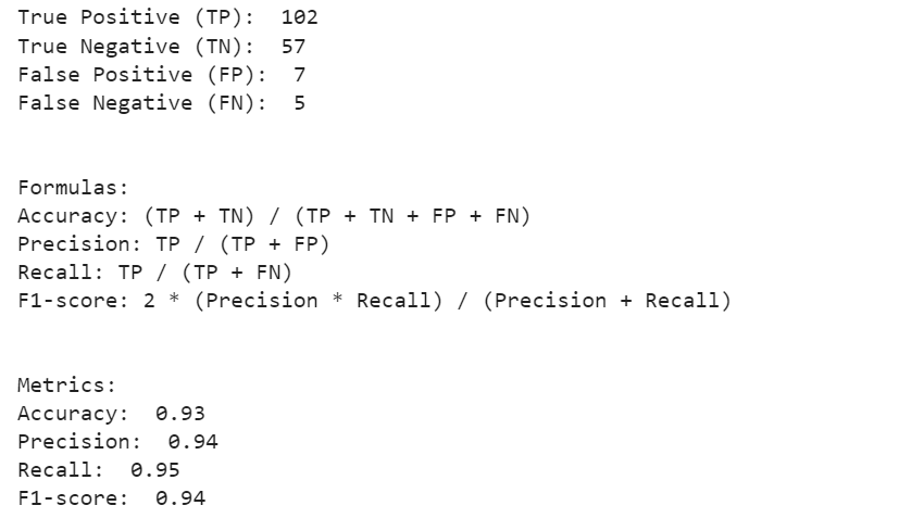
To interpret the confusion matrix, we need to understand the following terms:
- True Positive (TP): The model correctly predicted the positive class.
- False Positive (FP): The model predicted the positive class, but it was actually negative.
- True Negative (TN): The model correctly predicted the negative class.
- False Negative (FN): The model predicted the negative class, but it was actually positive.
Once we have identified these values from the confusion matrix, we can calculate several key metrics to evaluate the performance of our classification model:
- Accuracy: The percentage of correct predictions made by the model. It is calculated as (TP + TN) / (TP + TN + FP + FN).
- Precision: The percentage of positive predictions made by the model that were correct. It is calculated as TP / (TP + FP).
- Recall: The percentage of actual positive cases that were correctly predicted by the model. It is calculated as TP / (TP + FN).
- F1-score: The harmonic mean of precision and recall. It is a balanced measure that considers both precision and recall. It is calculated as 2 * (precision * recall) / (precision + recall).
Lets look at the code to calculate all of the above.
# Extract the true positive, true negative, false positive, and false negative values from the confusion matrix
tn, fp, fn, tp = conf_matrix.ravel()

# Print the true positive, true negative, false positive, and false negative values
print("True Positive (TP): ", tp)
print("True Negative (TN): ", tn)
print("False Positive (FP): ", fp)
print("False Negative (FN): ", fn)

# Calculate accuracy
accuracy = (tp + tn) / (tp + tn + fp + fn)

# Calculate precision
precision = tp / (tp + fp)

# Calculate recall
recall = tp / (tp + fn)

# Calculate F1-score
f1_score = 2 * (precision * recall) / (precision + recall)

# Print the formulas for accuracy, precision, recall, and F1-score
print("\n\nFormulas:")
print("Accuracy: (TP + TN) / (TP + TN + FP + FN)")
print("Precision: TP / (TP + FP)")
print("Recall: TP / (TP + FN)")
print("F1-score: 2 * (Precision * Recall) / (Precision + Recall)")

# Print the accuracy, precision, recall, and F1-score
print("\n\nMetrics:")
print("Accuracy: ", round(accuracy, 2))
print("Precision: ", round(precision, 2))
print("Recall: ", round(recall, 2))
print("F1-score: ", round(f1_score, 2))
The following is what would get printed by executing the code.
Confusion Matrix using Mlxtend Package
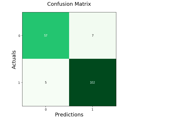
Here is another package, mlxtend.plotting (by Dr. Sebastian Rashcka) which can be used to draw or show confusion matrix. It is much simpler and easy to use than drawing the confusion matrix in the earlier section. All you need to do is import the method, plot_confusion_matrix and pass the confusion matrix array to the parameter, conf_mat. The green color is used to create the show the confusion matrix.
from mlxtend.plotting import plot_confusion_matrix

fig, ax = plot_confusion_matrix(conf_mat=conf_matrix, figsize=(6, 6), cmap=plt.cm.Greens)
plt.xlabel('Predictions', fontsize=18)
plt.ylabel('Actuals', fontsize=18)
plt.title('Confusion Matrix', fontsize=18)
plt.show()
Here is how the confusion matrix will look like:
Conclusion
The confusion matrix is an essential tool in machine learning for evaluating the performance of classification models. It provides a clear representation of how well the model is performing in terms of true positives, false positives, true negatives, and false negatives. Python’s Matplotlib library makes it easy to create confusion matrices and visualize them in a clear and concise manner. With the code and examples provided in this tutorial, you can now use Matplotlib to create and interpret confusion matrices for your own classification models. Remember that understanding the performance of your model is crucial for improving it, and the confusion matrix is an indispensable tool for achieving this goal.

Check out my latest book titled as First Principles Thinking: Building winning products using first principles thinking.
- Questions to Ask When Thinking Like a Product Leader - July 3, 2025
- Three Approaches to Creating AI Agents: Code Examples - June 27, 2025
- What is Embodied AI? Explained with Examples - May 11, 2025
I found it very helpful. However the differences are not too understandable for me