Last updated: 26th Nov, 2023
In this post, you will learn about how to use learning curves to assess the improvement in learning performance (accuracy, error rate, etc.) of a machine learning model while implementing using Python (Sklearn) packages. Knowing how to use learning curves will help you assess/diagnose whether the model is suffering from high bias (underfitting) or high variance (overfitting) and whether increasing training data samples could help solve the bias or variance problem. You may want to check some of the following posts in order to get a better understanding of bias-variance and underfitting-overfitting.
- Bias-variance concepts and interview questions
- Overfitting/Underfitting concepts and interview questions
What are learning curves?
Learning curve in machine learning is a graphical representation that shows the relationship between a model’s performance on a training and validation set over a period of time, or as a function of experience (the amount of training data). This is achieved by monitoring the training and validation scores (model accuracy) with an increasing number of training samples. The following represents key aspect of any learning curve:
-
Training curve: This curve shows the model’s performance on the training dataset as it learns. Initially, as the model is exposed to more data, its performance on the training set usually improves.
-
Validation curve: This curve shows the model’s performance on a separate validation dataset that it has not seen during training. This helps in understanding how well the model generalizes to new, unseen data.
The plot given below represents models with different training, validation accuracies. In the plot, the training accuracy of the model is denoted by orange dashed line (training curve), the validation accuracy of the model is denoted by the blue line (validation curve), and the desired model accuracy is denoted by the black dashed line.
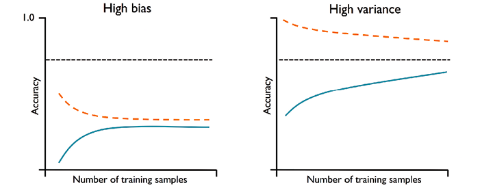
Pay attention to some of the following in the above diagram:
- High Bias Models (Underfitting): The plot on the left side represents the model having both low training and validation accuracy. This indicates that that the model under fits the training data and thus, is the case of high bias. You may notice that as the training samples size increases, the training accuracy decreases and validation accuracy increases. However, the validation accuracy is far from the desired accuracy.
- One way to tackle the high bias of machine learning models is to add more features to the training data. This will allow the model to learn more complex relationships and hopefully reduce the bias. Adding more features to the model can help reduce the model bias. This is because more features give the model more data to learn from, which can help it to become more accurate. Another way to tackle high bias is to use a different machine learning algorithm that is better suited for the data. Finally, it is also possible to combine multiple models to create a more accurate prediction.
- One way to tackle the high bias of machine learning models is to add more features to the training data. This will allow the model to learn more complex relationships and hopefully reduce the bias. Adding more features to the model can help reduce the model bias. This is because more features give the model more data to learn from, which can help it to become more accurate. Another way to tackle high bias is to use a different machine learning algorithm that is better suited for the data. Finally, it is also possible to combine multiple models to create a more accurate prediction.
- High Variance Models (Overfitting): The plot on the right side represents a model that has large gap between training and validation accuracy. The training accuracy is larger than the validation accuracy. These models suffer from high variance (overfitting). You may notice that as the training samples size increases, the training accuracy decreases and validation accuracy increases. However, the training accuracy is much greater than validation accuracy and also desired accuracy. Some of the ways to address this problem of overfitting are following:
- Add more data: Collect more training data; This may not always help, though as adding more data may result in noise.
- Remove less important features: Reduce the complexity of the model by removing noisy features; For unregularized models, you can use feature selection or feature extraction techniques to decrease the number of features
- Use cross-validation: Cross-validation is a technique that involves splitting your data into multiple sets, and then training your model on one set of data and testing it on another set of data. This helps to ensure that your model is not overfit to the data that it was trained on.
- Use regularization: This technique adds a penalty to the cost function of the model in order to discourage overfitting. This penalty can be added in different ways, such as by adding a constant to the cost function or by adding a term to the cost function that is proportional to the number of parameters in the model.
The following represents models having good bias variance tradeoff.
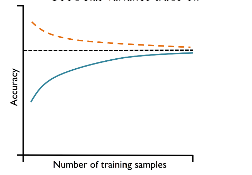
In the above picture, you may note that the difference between training and validation accuracy is much less than the model that overfitted. Here is the summary of what we learned about learning curve in terms of training and validation curve:
- Convergence: Ideally, both training and validation curve (representing model performance) should converge to a certain level. If they do, it indicates that the model is learning effectively.
- Overfitting: If the training curve shows good performance but the validation curve does not improve or even gets worse, the model might be overfitting (right plot in the above plots). This means it’s learning the training data too well, including its noise and outliers, but failing to generalize to new data.
- Underfitting: If both curves converge but to a performance level that is not satisfactory, the model might be underfitting. This suggests that the model is too simple to capture the underlying pattern in the data.
- Data Sufficiency: The shape of the curves can indicate whether more data is needed. If performance keeps improving as more data is added, it suggests that the model could benefit from more data.
Why must learning curves be used?
As data scientists, the following are the three most important reasons why every data scientist must use learning curves:
- Model Performance Insights – Is model underfitting or overfitting?: These curves provide critical insights into model performance, revealing issues like overfitting, where the model excels on training data but fails on new data, and underfitting, where it performs poorly across the board. This understanding is key in adjusting model complexity and algorithm selection.
- Data Efficiency Assessment – Do we need more data?: These curves indicate if additional data will enhance model performance. A plateauing curve suggests that more data won’t significantly improve outcomes, guiding efficient data usage and resource allocation.
- Optimal Model and Hyperparameter Selection – Would hyperparameter tuning help?: Learning curves assist in selecting the most effective model and fine-tuning its hyperparameters. They demonstrate how different models or settings impact learning, allowing for optimized performance and better problem-solving efficiency.
Python Sklearn Example for Learning Curve
In this section, you will see how to assess the model learning with Python Sklearn breast cancer datasets. Pay attention to some of the following in the code given below:
- An instance of pipeline created using sklearn.pipeline make_pipeline method is used as an estimator. You could as well use any machine learning algorithm supporting fit and predict method as an estimator
- Learning_curve method takes cross-validation as an input parameter. In the example is 10-Fold StratifiedKFold cross-validation algorithm. Instead, you can use any other cross-validation algorithm.
- Training sizes of 10 intervals got created using np.linspace(0.1, 1, 10) method.
- Due to usage of cross-validation method, average (mean) accuracies for training and validation data for calculated.
from sklearn.model_selection import train_test_split
from sklearn.preprocessing import StandardScaler
from sklearn.pipeline import make_pipeline
from sklearn.linear_model import LogisticRegression
from sklearn.model_selection import learning_curve
from sklearn import datasets
import matplotlib.pyplot as plt
#
# Load Breast Cancer Dataset
#
bc = datasets.load_breast_cancer()
X = bc.data
y = bc.target
#
# Create training and test split
#
X_train, X_test, y_train, y_test = train_test_split(X, y, test_size=0.3, stratify=y, random_state=1)
#
# Create a pipeline; This will be passed as an estimator to learning curve method
#
pipeline = make_pipeline(StandardScaler(),
                        LogisticRegression(penalty='l2', solver='lbfgs', random_state=1, max_iter=10000))
#
# Use learning curve to get training and test scores along with train sizes
#
train_sizes, train_scores, test_scores = learning_curve(estimator=pipeline, X=X_train, y=y_train,
                                                       cv=10, train_sizes=np.linspace(0.1, 1.0, 10),
                                                     n_jobs=1)
#
# Calculate training and test mean and std
#
train_mean = np.mean(train_scores, axis=1)
train_std = np.std(train_scores, axis=1)
test_mean = np.mean(test_scores, axis=1)
test_std = np.std(test_scores, axis=1)
#
# Plot the learning curve
#
plt.plot(train_sizes, train_mean, color='blue', marker='o', markersize=5, label='Training Accuracy')
plt.fill_between(train_sizes, train_mean + train_std, train_mean - train_std, alpha=0.15, color='blue')
plt.plot(train_sizes, test_mean, color='green', marker='+', markersize=5, linestyle='--', label='Validation Accuracy')
plt.fill_between(train_sizes, test_mean + test_std, test_mean - test_std, alpha=0.15, color='green')
plt.title('Learning Curve')
plt.xlabel('Training Data Size')
plt.ylabel('Model accuracy')
plt.grid()
plt.legend(loc='lower right')
plt.show()
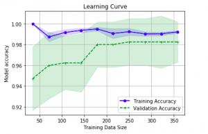
Here is how the plot would look like:

Note some of the following in above learning curve plot:
- For training sample size less than 200, the difference between training and validation accuracy is much larger. This is the case of overfitting
- For training size greater than 200, the model is better. It is a sign of good bias-variance trade-off.
Conclusions
Here is the summary of what you learned in this post:
- Use learning curve as a mechanism to diagnose machine learning model bias-variance problem.
- For model having underfitting / high-bias, both the training and validation scores are vary low and also lesser than the desired accuracy.
- In order to reduce underfitting, consider adding more features. Or, consider reducing degree of regularization for models (build using SVM, logistic regression etc) which support regularization.
- For model having overfitting / high-variance, there is a large gap between training and validation accuracy. Also, training accuracy may come to be more than desired accuracy.
- In order to reduce overfitting, consider adding more features and data (although adding data may not always work). For regularized models, consider increasing the value of regularization. But take caution or else model will underfit.

Check out my latest book titled as First Principles Thinking: Building winning products using first principles thinking.
- Mathematics Topics for Machine Learning Beginners - July 6, 2025
- Questions to Ask When Thinking Like a Product Leader - July 3, 2025
- Three Approaches to Creating AI Agents: Code Examples - June 27, 2025
I found it very helpful. However the differences are not too understandable for me