This article represents code examples for overlaying or creating density curve on Histogram using ggplot2 package in R programming. Please feel free to comment/suggest if I missed to mention one or more important points. Also, sorry for the typos.
Code Samples to Overlay Density Curve on Histogram
In the code examples below, diamonds data set belonging to ggplot2 package is used. One must load the ggplot2 package (require(“ggplot2”)) before executing the code samples given below.
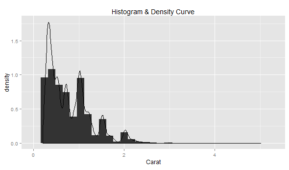
# Most simplistic density curve
ggplot(diamonds, aes(x=carat)) + geom_histogram(aes(y=..density..)) +
  geom_density() +
  labs(title="Histogram & Density Curve", x="Carat")
Following diagram would get displayed by executing the above code.
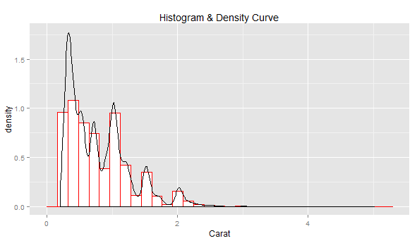
# Density curve with histogram painted using body color as white and
# border color as red
ggplot(diamonds, aes(x=carat)) + geom_histogram(col="red", fill="white", aes(y=..density..)) +
  geom_density() +
  labs(title="Histogram & Density Curve", x="Carat")
Following diagram would get displayed by executing the above code.
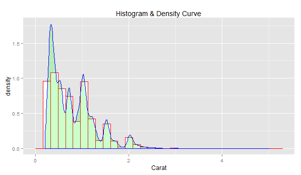
# Density curve with border color as blue, body color as green and
# transparency index as 0.2;
ggplot(diamonds, aes(x=carat)) + geom_histogram(col="red", fill="white", aes(y=..density..)) +
  geom_density(col="blue", fill="green", alpha=0.2) +
  labs(title="Histogram & Density Curve", x="Carat")
Following diagram would get displayed by executing the above code.

I have been recently working in the area of Data analytics including Data Science and Machine Learning / Deep Learning. I am also passionate about different technologies including programming languages such as Java/JEE, Javascript, Python, R, Julia, etc, and technologies such as Blockchain, mobile computing, cloud-native technologies, application security, cloud computing platforms, big data, etc. I would love to connect with you on Linkedin.
Check out my latest book titled as First Principles Thinking: Building winning products using first principles thinking.
Check out my latest book titled as First Principles Thinking: Building winning products using first principles thinking.
Latest posts by Ajitesh Kumar (see all)
- Mathematics Topics for Machine Learning Beginners - July 6, 2025
- Questions to Ask When Thinking Like a Product Leader - July 3, 2025
- Three Approaches to Creating AI Agents: Code Examples - June 27, 2025
I found it very helpful. However the differences are not too understandable for me