Machine learning is a powerful machine intelligence technique that can be used to develop predictive models for different types of data. It has become the backbone of many intelligent applications and evaluating machine learning model performance at a regular intervals is key to success of such applications. A machine learning model’s performance depends on several factors including the type of algorithm used, how well it was trained and more. In this blog post, we will discuss essential techniques for evaluating machine-learning model performance in order to provide you with some best practices when working with machine-learning models.
The following are different techniques that can be used for evaluating machine learning model performance:
- Root mean squared error (RMSE)
- AUC-ROC curve
- Logarithmic loss
- Kappa score
- Confusion matrix
- Kolmogorov-Smirnov Test
- Cross-validation techniques
- Gini coefficient
- Gain and lift chart
- Chi-square test
- Brier score
What is Root Mean Square Error (RMSE) metrics?
RMSE, or Root mean square error, is one of the most commonly used metrics for evaluating the performance of regression models. RMSE is a measure of how well a model fits a dataset by examining the average difference between actual and predicted values. Once the model has been fitted to the data, RMSE can then be used as an indicator of how accurately it can be expected to predict future results. RMSE works by taking the difference between each point in the dataset and squaring it, thereby creating a positive value that cannot be skewed by outliers or errors. The RMSE metric calculates this error as an average across all points in the sample set, giving an indication of how accurate a given model is likely to be. RMSE thus provides a valuable tool for assessing and comparing various models when determining which regression technique is suitable for your particular data analysis requirements. RMSE can be compared to other regression model evaluation metrics such as mean absolute error (MAE). Compared to MAE, RMSE amplifies and more severely punishes larger errors.
RMSE is calculated as follows:
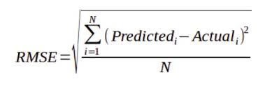
The smaller the value of the RMSE, the better is the predictive accuracy of the model. The RMSE comes in the original scale of the predicted values. For example, if the model predicts a house price in USD and the RMSE comes out to be 355.1, this translates to “the model predictions are wrong by 355.1 dollars on an average”.
What is AUC-ROC?
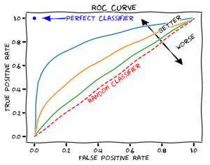
AUC (Area Under The Curve) ROC (Receiver Operating Characteristics) Curve is a machine learning model performance evaluation technique that uses the area under the ROC curve to evaluate classification model performance. AUC stands for area under the curve. Here, the curve is the receiver operating characteristic curve, or ROC curve for short. AUC can also be understood as the Area Under the ROC Curve. The ROC curve is created by plotting the true positive rate against the false-positive rate. The ROC curve shows the sensitivity of the classifier by plotting the rate of true positives to the rate of false positives. The model performance is measured by this curve, and it helps understand how a model performs across different threshold values for classifying data points as positives or negatives. AUC-ROC curve is defined as the area under the curve of a Receiver Operating Characteristic (ROC) plot. It is used when performing classification analysis. This curve can be used to describe the performance of a classifier when faced with ROC space, which is a two-dimensional plane created by plotting True Positive Rate (TPR) and False Positive Rate (FPR).
AUC-ROC curve can be used in classification problems with two or more classes. In this case, the AUC-ROC curve will be used to evaluate a classifier for each possible outcome of classification (e.g., given an email containing spam/not spam). This is done by finding out the TPR and FPR values associated with these outcomes. The area under ROC curve (AUC) will then be the average AUC of all classifiers. True positive rate is the percentage of data points that are correctly classified as positives, and the false-positive rate is the percentage of negative data points which are incorrectly being marked as positive. True positive rate is also called sensitivity, and false-positive rate is also called fall-out.
Here is a sample plot for AUC-ROC curve:

AUC-ROC graphs provide a visual representation of how well the model can discriminate between two classes and how reliable the model output is. Higher the value of area under the curve, the machine learning model is performing well. A perfect AUC-ROC score means that your model predicts outcomes 100% accurately, meaning that it distinguishes between classes with no errors. A score close to 0, on the other hand, indicates that there is no correlation between predicted outputs and actual outcomes – meaning that your model performs poorly. A good AUC-ROC score will be anywhere from 0.7 to 1, depending on what type of classifier you are using and its general performance level.
The ROC curve is not just a single number; it is a whole curve. The AUC is one way to summarize the ROC curve into a single number, so that it can be compared easily and automatically. A good ROC curve has a lot of space under it (because the true positive rate shoots up to 100% very quickly). A bad ROC curve covers very little area. So high AUC is good, and low AUC is not so good.
AUC-ROC is used to measure machine learning model performance for binary classification problems. In such cases, the models have a higher chance of overfitting and producing poor results on unseen test data. AUC-ROC Curve is also useful when evaluating machine learning model performance for multi-class problems, where the number of classes is more than two.
The formula for measuring true positive rate is :
True positive rate = TP / (TP+FN)
The formula for measuring false-positive rate is:
False Positive Rate=FP/ (TN+FP)
Logarithmic loss or Log Loss or Cross-entropy loss
Logarithmic loss, also known as Log loss or Cross-Entropy Loss, is a powerful metric for assessing and evaluating the performance of a classification model. Log loss is calculated by taking the natural logarithm of probabilities predicted by a machine learning algorithm, and multiplying them by the actual class label. This metric can capture the accuracy of how well an algorithm predicts each class label in a binary classification problem. Log loss helps us to observe how different models perform against the same dataset, alongside other evaluation metrics like precision and recall.
Log-loss, or logarithmic loss, gets into the finer details of a classifier. In particular, if the raw output of the classifier is a numeric probability instead of a class label of 0 or 1, then log-loss can be used. The probability can be understood as a gauge of confidence. If the true label is 0 but the classifier thinks it belongs to class 1 with probability 0.51, then even though the classifier would be making a mistake, it’s a near miss because the probability is very close to the decision boundary of 0.5. Log-loss is a “soft” measurement of accuracy that incorporates this idea of probabilistic confidence. The formula below represents log loss of a binary classifier:
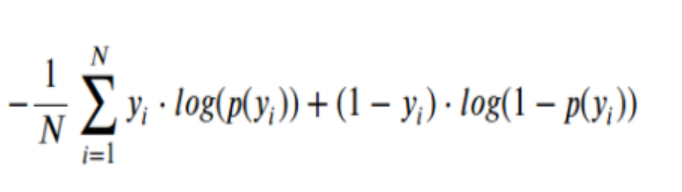
Here is the detail of the above formula. pi is the probability that the ith data point belongs to class 1, as judged by the classifier. yi is the true label and is either 0 or 1. Since yi is either 0 or 1, the formula essentially “selects” either the left or the right summand. The minimum is 0, which happens when the prediction and the true label match up.
If we have a higher Log Loss, then we know that our model has performed poorly on our dataset while a lower Log Loss implies that our classification model was accurate. Logarithmic loss can be extremely helpful in understanding how well our classification model performs and whether further adjustments are necessary to increase accuracy. Log loss is used to evaluate the performance of classification machine learning models that are built using classification algorithms such as logistic regression, support vector machine (SVM), random forest, and gradient boosting.
Log-loss is the cross entropy between the distribution of the true labels and the predictions, and it is very closely related to what’s known as the relative entropy, or Kullback–Leibler divergence. Entropy measures the unpredictability of something. Cross entropy incorporates the entropy of the true distribution, plus the extra unpredictability when one assumes a different distribution than the true distribution. So log-loss is an information-theoretic measure to gauge the “extra noise” that comes from using a predictor as opposed to the true labels. By minimizing the cross entropy, we maximize the accuracy of the classifier
What is Kappa’s score?
Kappa score is an important metric used in the evaluation of classification model performance. Kappa score measures the agreement between an observed accuracy and what would be expected by a random assignment, accounting for the prevalence of classes in the data set. Kappa score can be a useful tool when comparing multiple models on their respective ability to classify individuals into a predetermined set of categories. Kappa score ranges from -1 to 1, with higher values representing excellent agreement between observed accuracy and what is expected at random, while lower values indicate worse than random levels of agreement. A Kappa score greater than 0 indicates better than chance performance by the model, while scores lower than 0 imply that the model performed worse than chance. Kappa score provides an objective measure to evaluate a classification model’s performance and assess how well it has been trained on the underlying data set.
The following is the formula for Kappa’s score:
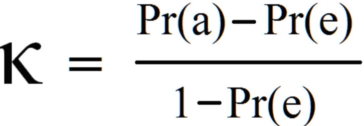
In the equation, Pr(a) is the relative observed agreement between annotators or classifier, and Pr(e) is the expected agreement between annotators / classifiers, if each annotator/classifier was to randomly pick a category for each annotation.
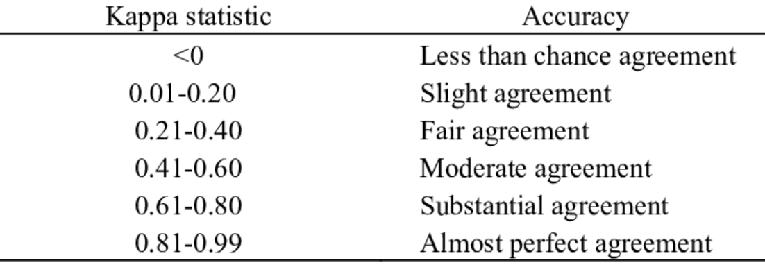
The following table can be used to assess agreement between annotators / classifiers against the Kappa score:
What’s Confusion Matrix?
The confusion matrix is defined as a contingency table that is used to evaluate the performance of machine learning classifiers. It measures how well instances from each category are predicted by the machine learning model. The confusion matrix can be used to measure the performance of machine learning models in three ways:
- The accuracy is the proportion of correct predictions.
- Precision is defined as the true positive rate and tells how many actual positives were identified among all the positives predicted by the machine learning model.
- Recall or sensitivity (true positive rate) is also known as true discovery
- rate. This is the machine learning model’s ability to find all positive instances in a data set.
- Confusion matrices can be generated for machine learning evaluation using different machine learning libraries. In the case of Python, scikit-learn provides a number of functions that can be used to generate confusion matrices from machine learning model scores.
What is Kolmogorov-Smirnov Test?
Kolmogorov-Smirnov (KS) test is a non-parametric test used for decision-making in machine learning. It is a statistical measure used to evaluate the difference between two probability distributions. For example, it can be used to compare how well an algorithm performs with new data over time or across different machine learning models trained on the same dataset but using different training parameters (hyper-parameters).
The Kolmogorov-Smirnov test is also used for evaluating the equality of two empirical distribution functions (EDF) or to check if they come from a common parent distribution.
The KS test can be calculated as follows:
$$D=\sup_{x}\left|F_A(x) – F_B(x)\right|$$
Where A and B are machine learning models.
If the KS test score is high, it means that there is a big difference between machine learning model performances or they come from different distributions which indicate that machine learning model performance (or their machine learning pipelines) should be improved.
The KS Test has been widely used in machine learning as it can evlauate how well an algorithm performs with new data over time and across different machine learning models trained on the same dataset but using different training parameters (hyper-parameters). It is also used to evaluate machine learning model performance with new data over time and across machine learning models trained on same datasets but using different hyper-parameters.
Cross-validation techniques
The cross-validation technique is used to evaluate machine learning model performance. This technique helps in determining how well the machine learning model is generalizing to unseen data from the future.
There are generally two types of cross-validation techniques:
- Holdout method/Split sample approach: It divides a given dataset into training and testing datasets (80%–20%, 70%-30%, 60%-40%).
- Repeated hold out: It divides a given dataset into training and testing datasets multiple times. This technique is known as k-fold cross-validation or leaves one out method (k = number of folds, for example, if the value of ‘K’s in five-fold cross-validation is four then it means that data has been divided into five sets and machine learning model is tested on the data in four folds and machine learning model performance is evaluated based on test results of fourth fold).
What is the Gini coefficient?
Gini coefficient is a statistical measure of distribution inequality and it ranges from 0 to 100%. A model with an extremely low value for the Gini coefficient indicates that the machine learning algorithm succeeded in reducing the variation between class values in favor of increasing the difference between classes. On the other hand, a high value for Gini Index shows machine learning can create a distinction between class values. Thus, a machine learning model with a high Gini Index is better for classification problems than the one that has a low value of the Gini coefficient.
What is the gain and lift chart?
Gain and lift chart is a good way to evaluate how the machine learning model performs on independent test data. The gain and lift chart is a mixture of precision, recall, and f-score curves. The gain and lift chart plots precision, recall, and f-score curves on the same graph for a single classifier value. Gain and lift charts are used in case of multiclass problems where there is more than two classes involved.
A gain chart is used to find the change in model performance when a machine learning algorithm is applied to independent test data. A gain chart plots precision, recall, and f-score curves for each classifier value.
A lift chart evaluate how a machine learning model performs across different classes. The x-axis of a lift graph represents all possible values that can be predicted by a machine learning model. On the other hand, the y-axis of a lift graph represents the number of observations that belong to each possible value. The machine learning model is then evaluated for each classifier value in order to find out its true positive rate (recall) and false positive rate (precision).
A combination of gain and lift charts can be used to understand machine learning model performance on independent test data.
What is Chi-square test?
Chi-square test is used to assess the performance of machine learning classification models. It is a hypothesis testing technique that tests if the observed frequencies of events are significantly different from their expected frequency. The null hypothesis for chi-square test is “there exists no difference in model performance” and it’s alternative hypothesis states ‘the model performs differently than what was expected’
In order to use chi-square test, the machine learning model has to be trained with categorical variables only.
What is Brier’s score?
Brier score is defined as the mean squared error of a machine learning model. It is used to evaluate the accuracy of a set of probabilistic predictions. It is used to quantify how good or bad our machine learning model is in terms of prediction accuracy. Brier score ranges between 0 and 1, where zero stands for perfect predictions while one represents random guesses on average. Lower the Brier score, better the machine learning model accuracy.

Check out my latest book titled as First Principles Thinking: Building winning products using first principles thinking.
- Mathematics Topics for Machine Learning Beginners - July 6, 2025
- Questions to Ask When Thinking Like a Product Leader - July 3, 2025
- Three Approaches to Creating AI Agents: Code Examples - June 27, 2025
I found it very helpful. However the differences are not too understandable for me