Everyone knows that data visualization is one of the most important tools for any data scientist or statistician. It helps us to better understand the relationships between variables and identify patterns in our data. There are specific types of visualization used to represent categorical data. This type of data visualization can be incredibly helpful when it comes to analyzing our data and making predictions about future trends. In this blog, we will dive into what categorical data visualization is, why it’s useful, and some examples of how it can be used.
Types of Data Visualizations for Categorical Dataset
When it comes to visualizing categorical data sets, there are primarily four different types of visualizations one can use. They are as following:
- Frequency table
- Bar chart
- Pie chart
- Pareto chart
Frequency table
One of the most popular methods is known as a frequency table which simply tabulates the number of occurrences of each category within the dataset. Frequency table organizes data in the form of columns and rows. Generally, a frequency table contains two columns which represent the categories of the data set and their respective frequencies. The frequency column displays how often each category appears in the dataset.
Frequency tables are commonly used to quickly summarize qualitative or categorical variables by counting how frequently each possible value occurs in a given set of observations. For example, if there is a need to know the sales of toy cars in different months of the year, they could construct a frequency table that counts how many toy cars are sold in each month. The following is an example of frequency table for nominal categorical data set of toy cars sales in different months.
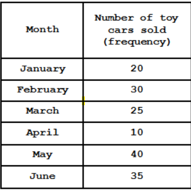
Another use case for Frequency tables is understanding how categorical data is distributed across a population or sample set. For example, in the above table, researchers might be interested in understanding what percentage of toy cars got sold in different months.
It must be noted that frequency tables are also suitable to measure the frequency of occurrence in relation to numerical or quantitative data (discrete and/or continuous).
Bar Chart
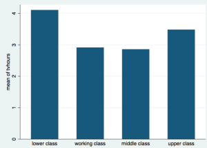
Another popular option for visualizing categorical data sets is the bar chart. Bar charts use bars, or rectangles, to represent the different categories. The length of each bar corresponds to the size of the data set it represents. These bars can be arranged horizontally or vertically depending on the type of graph being created. Bar charts are one of the most popular types of graphs due to their ability to help quickly compare categories and easily illustrate trends over time. The following is an example of using bar chart for visualizing the tv viewing pattern of different classes of people.

Bar charts are perfect for visualizing and comparing distinct groups within a data set. When using a bar chart, each category should have its own line with its label included next to it. This helps viewers quickly evaluate changes in the dataset by looking at how much each category has increased or decreased relative to previous times/values. By adding labels to each bar, viewers can identify what category they are referencing and get an idea as to what kind of information is being conveyed about that specific group in comparison with other groups within the dataset.
Bar charts can also be used to display data distributions over time by displaying multiple bars representing periods or different samples in the same graph. This allows for easy comparison between different samples and helps identify any major changes between them.
Pie Chart
A pie chart is another useful visualization for categorical data sets which displays proportions as slices that add up to 100 percent. For example, pie charts can be used to compare sales figures between different product lines, or to understand customer demographics in terms of age or income. A pie chart is composed of several slices, each of which represent portions of the whole. Each portion can be labeled with its own name, or with a number or percentage that represents its portion of the whole. The larger the slice, the larger its associated portion or value. Pie charts can easily compare different categories within a set of data and display how they relate to each other in terms of size and proportions. Here is an example of pie chart used for understanding marketing expenditure in different categories of marketing.
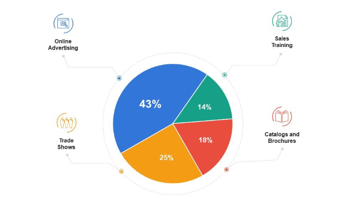
When creating a pie chart, it is important to consider the relative sizes of the slices in relation to one another and make sure that they accurately reflect the underlying data set. This is where relative frequency calculation in the frequency table comes handy. Note that the frequency table can be used to calculate absolute frequency, relative frequency, cumulative frequency and relative cumulative frequency. When creating multiple pie charts with overlapping categories, it is important to choose colors that are easily distinguishable from one another so as not to cause confusion or misinterpretations among viewers. Additionally, it is also helpful to include an accompanying legend so viewers know what each color/slice/portion represents within the set as well as any other relevant labeling information such as percentages or labels for individual slices.
Pie charts can also be useful for understanding market shares by industry. Marketers often utilize pie charts when analyzing their target markets in order to identify the key players and their respective share of the market. For instance, marketers may use pie charts to represent the total number of customers in a given region broken down by age group or gender. This allows them to determine which demographic has the largest influence on their products and services, as well as how this changes over time with different campaigns and strategies.
Pareto Chart
A Pareto chart is a type of graph used for visualizing categorical data sets, in which the categories are grouped and sorted by frequency or magnitude. It is named after Vilfredo Pareto, an Italian economist who developed the concept of the 80/20 rule – that 80% of wealth was owned by 20% of the population. The chart typically consists of two parts: bars that represent the frequencies of each category in descending order from left to right, and a line graph showing the cumulative total. Here is an example of pareto chart.
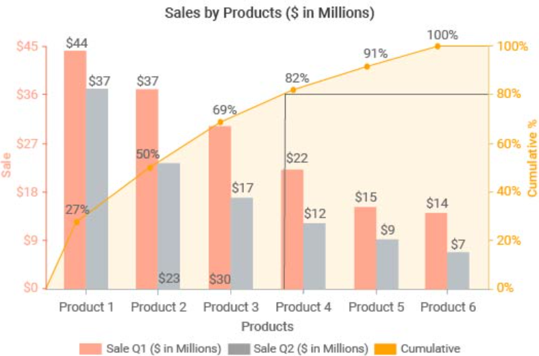
The purpose of using a Pareto chart is to highlight those categories with the greatest importance. This allows us to quickly identify which categories contribute most to overall performance or outcomes, making it easier to focus on those areas when looking for improvement opportunities. For example, in inventory management, a Pareto chart may be used to identify which items are most frequently sold; this could help determine which products should be kept in stock and how much space should be allotted for them in warehouses or stores.
Conclusion
In conclusion, categorical data visualizations are powerful tools that can help anyone better understand their categorical datasets by providing an easy-to-interpret visual representation of their information. Whether you are working with demographic information or customer feedback surveys, these visualizations can provide valuable insight into your business and help you make informed decisions based on your analysis.

Check out my latest book titled as First Principles Thinking: Building winning products using first principles thinking.
- Three Approaches to Creating AI Agents: Code Examples - June 27, 2025
- What is Embodied AI? Explained with Examples - May 11, 2025
- Retrieval Augmented Generation (RAG) & LLM: Examples - February 15, 2025
I found it very helpful. However the differences are not too understandable for me