Frequency distributions are an important tool for data scientists, statisticians, and other professionals who work with data. Frequency distributions help to organize and summarize data, making it easier to identify the behavior of the data including patterns and trends. Evaluating frequency distribution is one of the important technique of univariate descriptive statistics. In this article, we’ll take a look at the concepts of the frequency distribution, its different types and provide some examples of each.
What is Frequency Distribution?
Frequency distribution is a statistical tool used to represent the frequency with which different categories of a qualitative or quantitative variable occur. It provides an overview of the data and allows us to analyze patterns within it. Frequency distribution of the values of a given variable is captured in the table which is called as frequency distribution table.
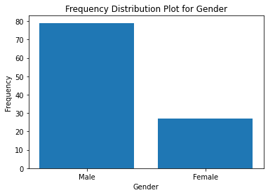
In the case of qualitative variables, each category is represented in the frequency distribution and its absolute frequency (number of occurrences) and relative frequency (number of occurrences divided by total number of cases) is calculated. This method can be used to compare different categories in terms of how often they appear in the dataset. For example, when analyzing gender data, we can obtain a frequency distribution table that shows us how many participants belong to each gender category. Here is the related frequency distribution table:
| Gender | Frequency |
| Male | 79 |
| Female | 27 |
Here is the python code for creating frequency distribution plot for the above data captured in the above table:
Here is the plot:
When dealing with discrete quantitative variables, each value has its own place in the table and its frequency can be computed. This type of distribution provides an understanding of how values are distributed across the range of the variable under consideration. For example, if we want to know how many people have a certain height, we can use a discrete frequency distribution chart; this will allow us to see the frequencies for different heights present in our dataset. Here is the frequency table:
| Height | Frequency |
| 152 | 2 |
| 155 | 4 |
| 160 | 6 |
| 165 | 3 |
| 172 | 2 |
The same code such as the above can be used to plot the frequency distribution table of discrete quantitative variable. Here is how the plot would look like:

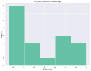
When dealing with continuous quantitative variables, firstly we need to group our data into classes before calculating frequencies for those classes. In this scenario, what is calculated is not only the absolute frequencies for each class but also other measures such as class boundaries and midpoints (for determining central tendency), class widths (for determining variability), etc . For example, if we are analyzing age data from a survey, we would group them into classes. Then we would calculate absolute frequencies for those classes; this would give us valuable information about our sample’s age structure.
The following is the python code for creating frequency distribution plot for continuous quantitative variable such as age.
Here is the plot representing the above code:

Different types of Frequency Distribution & Examples
Frequency distribution is a method of organizing data into categories and determining the number of observations that fall into each category. It is used to help identify trends within data sets, determine how often certain factors occur, and make predictions about future outcomes. There are four main types of frequency distribution which can be captured in frequency distribution table:
- Absolute frequency
- Relative frequency
- Cumulative frequency
- Relative cumulative frequency.
Absolute frequency is the most basic type of frequency distribution. It shows the actual number of occurrences for each category in a data set. For example, if you have a list of student grades on an exam, absolute frequency would tell you how many students received A’s, B’s, C’s, etc. Absolute frequencies are helpful in understanding what raw data values exist and their distribution across the data set. Absolute frequency can be used to capture frequency distribution for qualitative, discrete quantitative and continuous quantitative variables.
Relative frequency is similar to absolute frequencies but it expresses the results as a percentage or proportion instead of an exact count. This type of frequency helps to compare different categories or groups and understand their proportions in relation to one another. For example, if an exam had 300 students who took it and 50 received A’s then the relative frequency would be 16.7%, meaning that 16.7% of all test takers received an A grade on the exam.
Cumulative frequency differs from absolute and relative frequencies because it looks at all preceding categories when calculating totals rather than just individual categories like absolute and relative frequencies do. In other words, cumulative frequencies take all previous values into account while counting up totals (or “cumulative totals”). For example if there were 10 people who scored between 50-59 on an exam then their cumulative total would be 10 since they include all scores that preceded them as well (i.e., scores 0-49). Cumulative frequencies help to see patterns or trends over time or with multiple groups or categories at once rather than looking at one group or category by itself like with absolute and relative frequencies.
Relative cumulative frequencies combine elements from both relative and cumulative frequencies by expressing percentages or proportions alongside cumulative totals for each category or group in a data set. This type of frequency helps to quickly identify trends between variables such as how different groups are performing over time or how much difference there is between two different sets of data points without having to look at each individual point separately like with absolute and relative frequencies alone can do.
The following frequency distribution table represents all of the above types of frequency distribution:
| Blood type | Absolute frequency | Relative frequency | Cumulative frequency | Relative cumulative frequency |
| A+ | 15 | 25 | 15 | 25 |
| A- | 2 | 3.33 | 17 | 28.33 |
| B+ | 6 | 10 | 23 | 38.33 |
| B- | 1 | 1.67 | 24 | 40 |
| AB+ | 1 | 1.67 | 25 | 41.67 |
| AB- | 1 | 1.67 | 26 | 43.33 |
| O+ | 32 | 53.33 | 58 | 96.67 |
| O- | 2 | 3.33 | 60 | 100 |
| Sum | 60 | 100 |
Conclusion
Frequency distributions are an invaluable tool for gaining insight into data sets and understanding patterns within them. Whether you’re a beginner looking to explore the basics or an experienced analyst aiming to compare different types of frequency distributions, understanding this concept can be a powerful asset. Frequency distribution is one of the key tool for univariate descriptive statistics. One can calculate frequency distribution for qualitative (categorical), discrete quantitative and continuous quantitative variables. Frequency distribution is captured using table called as frequency distribution table. Frequency distribution table can be used to capture absolute frequency,, relative frequency, cumulative frequency and relative cumulative frequency. If you would want to learn more, please feel free to drop a message.

Check out my latest book titled as First Principles Thinking: Building winning products using first principles thinking.
- Mathematics Topics for Machine Learning Beginners - July 6, 2025
- Questions to Ask When Thinking Like a Product Leader - July 3, 2025
- Three Approaches to Creating AI Agents: Code Examples - June 27, 2025
I found it very helpful. However the differences are not too understandable for me