Are you looking to learn how to create bar charts / bar plots / bar graph using the combination of Matplotlib and Pandas in Python? Bar charts are one of the most commonly used visualizations in data analysis, enabling us to present categorical data in a visually appealing and intuitive manner. Whether you’re a beginner data scientist or an intermediate-level practitioner seeking to enhance your visualization skills, this blog will provide you with practical examples and hands-on guidance to create compelling bar charts / bar plots using Matplotlib libraries in Python. You will also learn how to leverage the data manipulation capabilities of Pandas to prepare the data for visualization, ensuring that the bar charts accurately represent the underlying information.
Bar Chart using Matplotlib, Pandas Libraries in Python
A bar chart, also known as a bar plot or bar graph, is a graphical representation of categorical data using rectangular bars. Each bar represents a category or group, and the length or height of the bar corresponds to the quantity or value associated with that category. Bar charts are commonly used to display and compare discrete data, such as frequency counts, categorical variables, or aggregated values across different categories. They provide an intuitive and visual way to analyze and interpret data, making it easier to identify patterns, trends, and comparisons between categories. Bar charts are widely used in various fields, including data analysis, statistics, business, and research, to effectively communicate and present categorical data in a clear and concise manner.
Matplotlib is a popular plotting library in Python that provides a wide range of functions and customization options for creating various types of plots, including bar charts. To create a bar chart using Matplotlib, you can use the plt.bar() function, which takes in the x-values and y-values as arguments.
Pandas is a powerful data manipulation library in Python that provides data structures and functions to work with structured data, such as tabular data. To create a bar chart using Pandas, we typically start by creating a DataFrame, which represents your data in a tabular format. Pandas offers functions like pd.read_csv() to read data from various sources, such as CSV files or URLs, and create a DataFrame.
The following is an example Python code that demonstrates how to create a bar chart using Matplotlib and Pandas:
import pandas as pd
import matplotlib.pyplot as plt

# Sample data
data = {
    'Year': [2017, 2018, 2019, 2020, 2021],
    'Revenue': [50000, 72000, 90000, 105000, 120000]
}

# Create a DataFrame from the data
df = pd.DataFrame(data)

# Create a bar chart using Matplotlib
plt.bar(df['Year'], df['Revenue'], width=0.5, color="orange")

# Set the chart title and labels
plt.title('Revenue by Year')
plt.xlabel('Year')
plt.ylabel('Revenue')

# Add data labels to the bars
for i, value in enumerate(df['Revenue']):
    plt.text(df['Year'][i], value, str(value), ha='center', va='bottom')

plt.grid(True)

# Display the chart
plt.show()
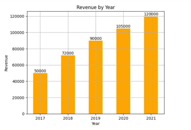
Here is the plot that gets created:
The following is the summary of the steps involved:
- Import the necessary libraries: pandas for data manipulation and matplotlib.pyplot for creating the bar chart / bar plot.
- Define the sample data as a dictionary, where the keys represent the categories or groups (e.g., ‘Year’) and the corresponding values are lists of data points (e.g., ‘Revenue’).
- Create a Pandas DataFrame df from the data dictionary, which provides a tabular structure to work with the data. Pandas provides several methods to read data from different sources, including local drives and URLs. Here are examples of how to read data from a CSV file on a local drive and from a CSV file hosted at a URL into a Pandas DataFrame:
import pandas as pd

# Path to the local CSV file
file_path = 'path/to/your/local/file.csv'

# URL of the CSV file
url = 'https://raw.githubusercontent.com/path/to/your/csv/file.csv'

# Read the CSV file into a DataFrame
df_file = pd.read_csv(file_path)

# Read the CSV file from the URL into a DataFrame
df_url = pd.read_csv(url)
- Use Matplotlib’s plt.bar() function to create the bar chart. Pass the ‘Year’ column as the x-values and the ‘Revenue’ column as the y-values.
- Set the chart title, x-label, and y-label using the plt.title(), plt.xlabel(), and plt.ylabel() functions, respectively.
- Display the chart using plt.show(), which renders the bar chart in a separate window or notebook cell.
Here are some of the things that you could do:
- You can specify the color of the bars using the color parameter in plt.bar(). For example, plt.bar(x, y, color=’red’).
- By default, the width of the bars is determined automatically. However, you can adjust it using the width parameter in plt.bar(). For example, plt.bar(x, y, width=0.5).
- If the x-axis labels are long or overlapping, you can rotate them for better readability using plt.xticks(rotation=90).
- You can add gridlines to the chart for better visualization using plt.grid(True).
- You can add data labels to the bars using the plt.text() function to display the values on top of the bars. Here is the sample code:
# Add data labels to the bars
for i, value in enumerate(df['Revenue']):
    plt.text(df['Year'][i], value, str(value), ha='center', va='bottom')
Conclusion
In this blog, we explored how to create bar charts / bar plots / bar grapgs using Matplotlib and Pandas in Python. Bar charts are a powerful visualization tool for representing categorical data in a visually appealing and intuitive manner. By leveraging Matplotlib’s plotting capabilities and Pandas’ data manipulation features, the dataframes were created and the chart appearance was customized. We also added labels and titles, and incorporated data labels on the bars. I hope this blog has provided you with valuable insights into creating bar charts using Matplotlib and Pandas. Start exploring your own datasets, experiment with different customization options, and create impactful bar charts that communicate your data effectively.
- The Watermelon Effect: When Green Metrics Lie - January 25, 2026
- Coefficient of Variation in Regression Modelling: Example - November 9, 2025
- Chunking Strategies for RAG with Examples - November 2, 2025


I found it very helpful. However the differences are not too understandable for me