This article represents some facts on when to use what kind of plots with code example and plots, when working with R programming language. Please feel free to comment/suggest if I missed to mention one or more important points. Also, sorry for the typos.
Following are the key plots described later in this article:
- Histogram
- Scatterplot
- Boxplot
Following is the description for above mentioned plots along with code examples based on base R package. Note that each of the these plots could be done using different commands when using ggplot2 package.
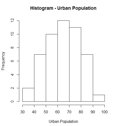
- Histogram:Histograms is one of the best form of visualizations when working with single continuous variable. It plots the relative frequencies of the variables as like the bar chart. The R command used to plot histogram is hist(Variable). For example, in a data sample consisting of features such as height or weight, height or weight can act as the continuous variable. Histogram, hist(), command can, then be used to find the relative frequency of occurence of height or weight in the data sample. Lets take an example of USArrests data available in the base package. Following command creates a Histogram shown in the diagram below
hist(USArrests$UrbanPop, main="Histogram - Urban Population", xlab="Urban Population")
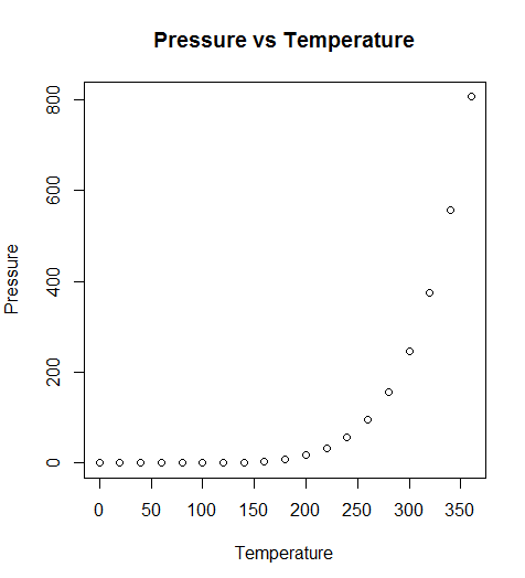
- ScatterPlot: Scatterplot is used to study the relationship between the two variables which vary one along the x-axis and the other along the y-axis. It is most widely used form of plot and is used to study the regression models. Following are commands, in the simplest form, that could be used to do scatterplot using base R package:
plot( variableAlongXAxis, variableAlongYAxis, data="DataSet", main="Plot Title", xlab="Label for X-Axis", ylab="Label for Y Axis" )

# Following command can as well be used

plot( responseParameter ~ predictorParameter, data="DataSet", main="Plot Title", xlab="Label for X-Axis", ylab="Label for Y Axis" )
Lets take an example from default data available in R package. Following R command prints the Scatterplot shown below:
plot( pressure ~ temperature, data=pressure, main="Pressure vs Temperature", xlab="Temperature", ylab="Pressure")
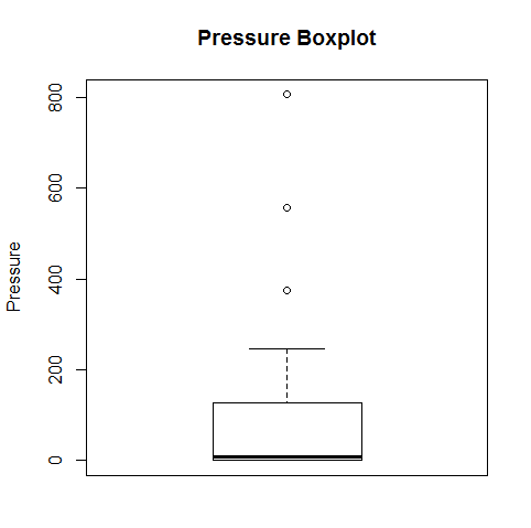
- BoxPlot: Boxplot is a plot which is used to get a sense of data spread of one variable. The plot displays a box and that is where the name is derived from. The top line of box represents third quartile, bottom line represents first quartile and middle line represents median. The top line above the box represents 1.5 times the inter-quartile range(difference between third and first quartile). The dots above and below the lines are outliers. In base R package, the command used to draw boxplot is boxplot(Variable). The following command is used to get a sense of pressure data represented in the boxplot diagram below.
boxplot(pressure$pressure, main="Pressure Boxplot", ylab="Pressure")
Latest posts by Ajitesh Kumar (see all)
- The Watermelon Effect: When Green Metrics Lie - January 25, 2026
- Coefficient of Variation in Regression Modelling: Example - November 9, 2025
- Chunking Strategies for RAG with Examples - November 2, 2025


I found it very helpful. However the differences are not too understandable for me