- Quick introduction to GGPlot
- Installation and loading of GGPlot
- GGPlot – Key Concepts
Quick Introduction to GGPlot
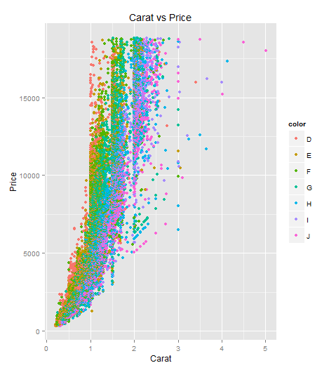
ggplot is one of statistical package that facilitates the easy creation of different plots. One of the key concept related to ggplot is that ggplot is built up layer by layer. This means that one could start by initializing the ggplot using ggplot(data) command and then, keep adding on plot functions as another layer in order to finally draw the plot/chart. The layers are separated by “+” sign. Following is a sample ggplot command created using diamonds data that gets loaded by default when loading ggplot.
ggplot(data=diamonds, aes(x=carat, y=price)) + geom_point(aes(color=color)) + xlab("Carat") + ylab("Price") + ggtitle("Carat vs Price")
Following is the plot for above command:
Installation and Loading of ggplot
Before going further, lets quickly see what would it take to install and load ggplot2 package.
- Install the ggplot2 package. When using R console, you could do that by clicking on Packages > Install packages…. When using RStudio, one could do that by clicking on Tools > Install packages…
- Load the package using either “library” command or “require” command.
GGPlot – Key Concepts
Following are some key concepts to know when starting with ggplot:
- ggplot function: ggplot function is the core of ggplot2 package. The basic syntax is ggplot(data=dataFrameName). The data argument (or dataset passed) to ggplot command must be of type, data frame. ggplot could also take additional number of arguments. However, the main argument is the one specified in the example below. When loading ggplot, diamonds data comes by default. Thus, to work with diamonds data, following is how ggplot commands would look like:
ggplot(data=diamonds)
- Different layer functions: Once initialized using ggplot command, one would require to draw the plot. For this, one would need to use one of the many layer functions such as some of the following which takes different arguments, the primary one being another function called as aes (short for aesthetic).
- geom_point
- geom_histogram
- geom_line
- aes function: In above mentioned layer functions, one of the key parameter is aes function which takes some of the following as arguments:
- Labels representing points to be plotted on the graph/plot. Following is the syntax:
aes(x,y)
- Color of the plot using command such as aes(color=someColor)
- Shape of the plot using command such as aes(shape=clarity)
One must note that aes function could either go in ggplot function such as following or in one of the geom functions.
# aes function within ggplot function ggplot(data=diamonds, aes(x=carat, y=price)) + geom_point() + xlab("Carat") + ylab("Price") + ggtitle("Carat vs Price") # aes function within geom function ggplot(data=diamonds) + geom_point(aes(x=carat, y=price)) + xlab("Carat") + ylab("Price") + ggtitle("Carat vs Price") - Labels representing points to be plotted on the graph/plot. Following is the syntax:

- Book: First principles thinking for building winning products - April 19, 2022
- Free AI / Machine Learning Courses at Alison.com - November 16, 2021
- 12 Weeks Free course on AI: Knowledge Representation & Reasoning (IIT Madras) - November 14, 2021
I found it very helpful. However the differences are not too understandable for me