If you’re building machine learning models for solving different prediction problems, you’ve probably heard of clustering. Clustering is a popular unsupervised learning technique used to group data points with similar features into distinct clusters. One of the most widely used clustering algorithms is KMeans, which is popular due to its simplicity and efficiency. However, one major challenge in clustering is determining the optimal number of clusters that should be used to group the data points. This is where the Silhouette Score comes into play, as it helps us measure the quality of clustering and determine the optimal number of clusters. Silhouette score helps us get further clarity for the following questions:
- How can we determine the most appropriate value of K in K-means clustering?
- Are the clusters of high quality?
- How can we measure the dissimilarities between clusters and within clusters?
- Which objects are well-classified, which ones are misclassified, and which ones lie in between clusters?
- What is the overall structure of the data like?
- How can we identify the number of natural clusters present in the data?
In this post, you will learn about concepts of KMeans Silhouette Score in relation to assessing the quality of K-Means clusters fit on the data. As a data scientist, it is of utmost important to understand the concepts of Silhouette score as it would help in evaluating the quality of clustering done using K-Means algorithm. You may as well want to check some of the following posts in relation to clustering:
- K-Means clustering explained with Python examples
- K-Means clustering elbow method and SSE Plot
- K-Means interview questions and answers
Introduction to Silhouette Score Concepts
The following is an abstract from the paper “Silhouettes: a graphical aid to the interpretation and validation of cluster analysis” that defines the concept of Silhouette.
A new graphical display is proposed for partitioning techniques. Each cluster is represented by a so-called silhouette, which is based on the comparison of its tightness and separation. This silhouette shows which objects lie well within their cluster, and which ones are merely somewhere in between clusters. The entire clustering is displayed by combining the silhouettes into a single plot, allowing an appreciation of the relative quality of the clusters and an overview of the data configuration. The average silhouette width provides an evaluation of clustering validity, and might be used to select an ‘appropriate’ number of clusters.
Peter J. Rousseeuw (1987)
Silhouette score is used to evaluate the quality of clusters created using clustering algorithms such as K-Means in terms of how well samples are clustered with other samples that are similar to each other. The Silhouette score is calculated for each sample of different clusters. In order to calculate the Silhouette score for each observation / data point, the following distances need to be found out for each observations belonging to all the clusters:
- Mean distance between the observation and all other data points in the same cluster. This distance can also be called as mean intra-cluster distance. The mean distance is denoted by a
- Mean distance between the observation and all other data points of the next nearest cluster. This distance can also be called as mean nearest-cluster distance. The mean distance is denoted by b
Silhouette score, S, for each sample is calculated using the following formula:
[latex]S = \frac{(b – a)}{max(a, b)}[/latex]
The value of Silhouette score varies from -1 to 1. If the score is 1, the cluster is dense and well-separated than other clusters. A value near 0 represents overlapping clusters with samples very close to the decision boundary of the neighbouring clusters. A negative score [-1, 0] indicate that the samples might have got assigned to the wrong clusters.
Silhouette Score explained using Python example
The Python Sklearn package supports the following different methods for evaluating Silhouette scores.
- silhouette_score (sklearn.metrics) for the data set is used for measuring the mean of the Silhouette Coefficient for each sample belonging to different clusters.
- silhouette_samples (sklearn.metrics) provides the Silhouette scores for each sample of different clusters.
We will learn about the following in relation to Silhouette score:
- Calculate Silhouette score for K-Means clusters with n_clusters = N
- Perform comparative analysis to determine best value of K using Silhouette plot
Calculate Silhouette score for K-Means clusters with n_clusters = N
Here is the code calculating the silhouette score for K-means clustering model created with N = 3 (three) clusters using Sklearn IRIS dataset.
from sklearn import datasets
from sklearn.cluster import KMeans
#
# Load IRIS dataset
#
iris = datasets.load_iris()
X = iris.data
y = iris.target
#
# Instantiate the KMeans models
#
km = KMeans(n_clusters=3, init='k-means++', max_iter=300, n_init=10, random_state=0)
#
# Fit the KMeans model
#
km.fit_predict(X)
#
# Calculate Silhoutte Score
#
score = silhouette_score(X, km.labels_, metric='euclidean')
#
# Print the score
#
print('Silhouetter Score: %.3f' % score)
Executing the above code predicts the Silhouette score of 0.553. This indicates that the clustering is reasonably good, since the Silhouette Score is closer to 1 than to -1 or 0. A Silhouette Score of 0.553 suggests that the clusters are well separated and that the objects within each cluster are relatively homogeneous.
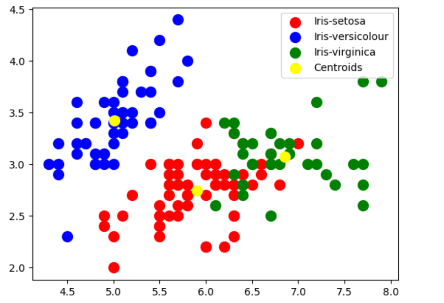
In case you want to visualize the cluster created using above code, here is the python code:
# Visualizing the clusters
#
plt.scatter(X[pred_y == 0, 0], X[pred_y == 0, 1], s = 100, c = 'red', label = 'Iris-setosa')
plt.scatter(X[pred_y == 1, 0], X[pred_y == 1, 1], s = 100, c = 'blue', label = 'Iris-versicolour')
plt.scatter(X[pred_y == 2, 0], X[pred_y == 2, 1], s = 100, c = 'green', label = 'Iris-virginica')
plt.scatter(km.cluster_centers_[:, 0], km.cluster_centers_[:,1], s = 100, c = 'yellow', label = 'Centroids')
plt.legend()
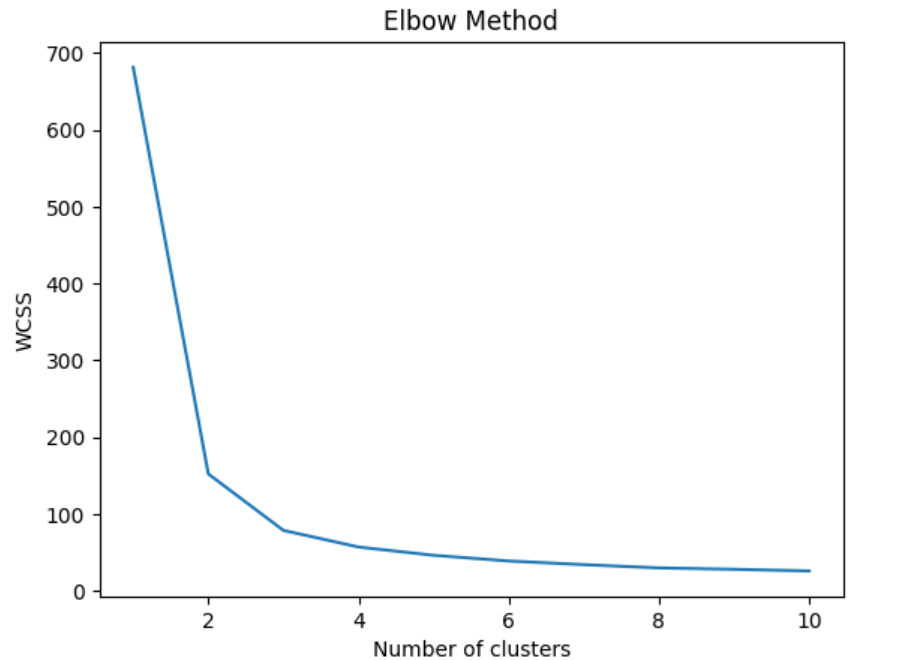
If you have been wondering on how did we arrive at N = 3, we can use the Elbow method to find the optimal number of clusters. Recall that elbow method involves plotting the within-cluster sum of squares (WCSS) against the number of clusters and looking for the “elbow” point in the curve, which represents the point of diminishing returns. In the code given below, firstly the number of clusters is looped from K = 1 to K=10 while fitting KMeans model to the dataset for each value of K. We then calculate the WCSS for each K and plot the results. The resulting plot shows a clear elbow point at K=3, indicating that the optimal number of clusters is 3.
# Finding the optimal number of clusters using Elbow Method
#
wcss = []
for i in range(1, 11):
    kmeans = KMeans(n_clusters=i, init='k-means++', max_iter=300, n_init=10, random_state=0)
    kmeans.fit(X)
    wcss.append(kmeans.inertia_)
plt.plot(range(1, 11), wcss)
plt.title('Elbow Method')
plt.xlabel('Number of clusters')
plt.ylabel('WCSS')
plt.show()
This is how Elbow plot would look like. The plot shows a clear elbow point at K=3, indicating that the optimal number of clusters is 3.
Comparative Analysis to Determine Best Value of K using Silhouette Plot
You can find detailed Python code to draw Silhouette plots for different number of clusters and perform Silhouette analysis appropriately to find the most appropriate cluster. In this section, we will use YellowBrick – a machine learning visualization library to draw the silhouette plots and perform comparative analysis.
Yellowbrick extends the Scikit-Learn API to make model selection and hyperparameter tuning easier. It provides some very useful wrappers to create the visualisation in no time. Here is the code to create Silhouette plot for K-Means clusters with n_cluster as 2, 3, 4, 5.
from yellowbrick.cluster import SilhouetteVisualizer

fig, ax = plt.subplots(2, 2, figsize=(15,8))
for i in [2, 3, 4, 5]:
    '''
    Create KMeans instance for different number of clusters
    '''
    km = KMeans(n_clusters=i, init='k-means++', n_init=10, max_iter=100, random_state=42)
    q, mod = divmod(i, 2)
    '''
    Create SilhouetteVisualizer instance with KMeans instance
    Fit the visualizer
    '''
    visualizer = SilhouetteVisualizer(km, colors='yellowbrick', ax=ax[q-1][mod])
    visualizer.fit(X)
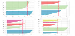
Executing the above code will result in the following Silhouette plots for 2, 3, 4 and 5 clusters:

Here is the Silhouette analysis done on the above plots with an aim to select an optimal value for n_clusters.
- The value of n_clusters as 4 and 5 looks to be suboptimal for the given data due to the following reasons:
- Presence of clusters with below average silhouette scores
- Wide fluctuations in the size of the silhouette plots.
- The value of 2 and 3 for n_clusters looks to be optimal one. The silhouette score for each cluster is above average silhouette scores. Also, the fluctuation in size is similar. The thickness of the silhouette plot representing each cluster also is a deciding point. For plot with n_cluster 3 (top right), the thickness is more uniform than the plot with n_cluster as 2 (top left) with one cluster thickness much more than the other. Thus, one can select the optimal number of clusters as 3.
Conclusions
Here is the summary of what you learned in this post in relation to silhouette score concepts:
- Silhouette score for a set of sample data points is used to measure how dense and well-separated the clusters are.
- Silhouette score takes into consideration the intra-cluster distance between the sample and other data points within same cluster (a) and inter-cluster distance between sample and next nearest cluster (b).
- The silhouette score falls within the range [-1, 1].
- The silhouette score of 1 means that the clusters are very dense and nicely separated. The score of 0 means that clusters are overlapping. The score less than 0 means that data belonging to clusters may be wrong / incorrect.
- The silhouette plots can be used to select the most optimal value of the K (no. of cluster) in K-means clustering.
- The aspects to look out for in Silhouette plots are cluster scores below the average silhouette score, wide fluctuations in the size of the clusters and also the thickness of the silhouette plot.

Check out my latest book titled as First Principles Thinking: Building winning products using first principles thinking.
- Completion Model vs Chat Model: Python Examples - June 30, 2024
- LLM Hosting Strategy, Options & Cost: Examples - June 30, 2024
- Application Architecture for LLM Applications: Examples - June 25, 2024
Leave a Reply