In today’s data-driven world, the ability to extract insights from vast amounts of information has become a critical skill for data scientists and analysts. Visualizing data through charts, graphs, and other types of visual representations can help them uncover patterns and relationships that might be difficult to spot otherwise. However, not all visualizations are created equal, and choosing the right type of visualization can make all the difference in communicating insights effectively. That’s why understanding the different types of visualization available is crucial for data visualization experts and data scientists. In this blog, we’ll explore some of the most common types of visualization, including comparison plots, relation plots, composition plots and more.
Comparison Plots
Comparison plots are graphical representations used to visually compare multiple variables or single variable over time. These plots help in identifying trends, similarities, differences, and patterns in the data. The following are different types of comparison plots:
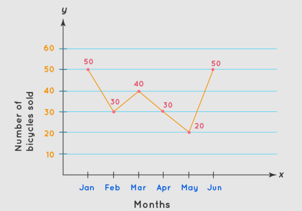
- Line chart: Line charts are used to compare variables over time and visualizing / analyzing the trends. They are used to represent changes in one or more variables over time. The X-axis represents the time, while the Y-axis represents the value of the variables being compared. Line charts are ideal for representing data with many data points, as they provide a clear view of the trend. Line charts work best if the time period is greater than 10. For smaller time periods, you can as well use bar charts.
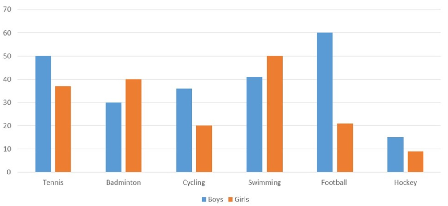
- Bar chart: Bar charts are used to compare numerical values across different categories. In other words, bar charts can be used to compare discrete data or categorical data. The X-axis represents the categories or groups, while the Y-axis represents the numerical values being compared. Var charts of two kinds: vertical bar charts and horizontal bar charts. Bar chart must not be confused with histograms. While bar charts are used to compare the categorical data based on numerical values, histograms are used to show the distribution of single variable. Bar charts can also be used to compare single variable over a short period of time. Below is bar chart representing number of boys & girls playing different types of sports.
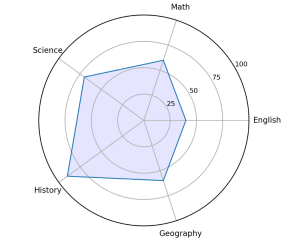
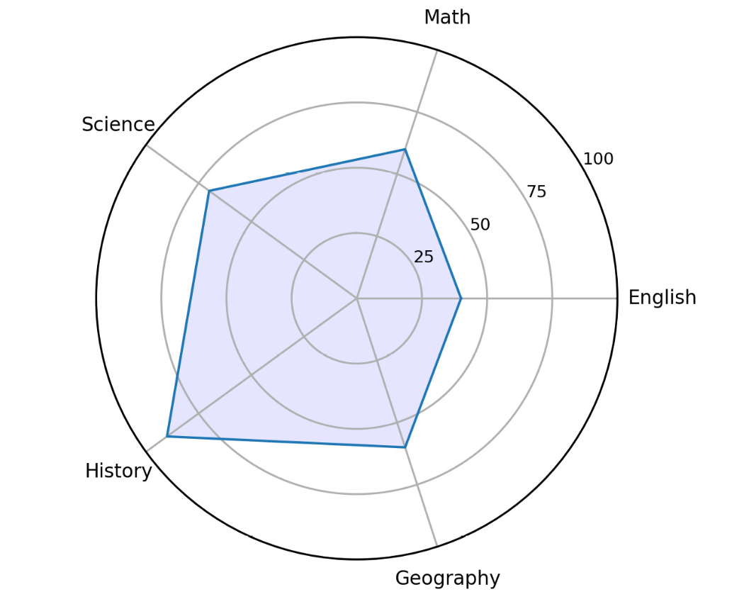
- Radar chart: Radar charts are used to compare multiple variables simultaneously with each variable plotted on its own axis which results into a polygon. Radar charts are also known as spider or web charts. All axes are arranged radially with equal distance between each other while starting from the center. All axes must have the same scale. The picture below represents radar chart representing marks of one student in different subjects.
Relation Plots
Relation plots are a type of visualization that are used to represent the relationship between two or more variables in a dataset. They are useful for identifying patterns and correlations within complex data sets, and can help to reveal insights that might not be immediately apparent from looking at raw data. The example of relation plots include scatter plot, bubble plot, heatmap, etc.
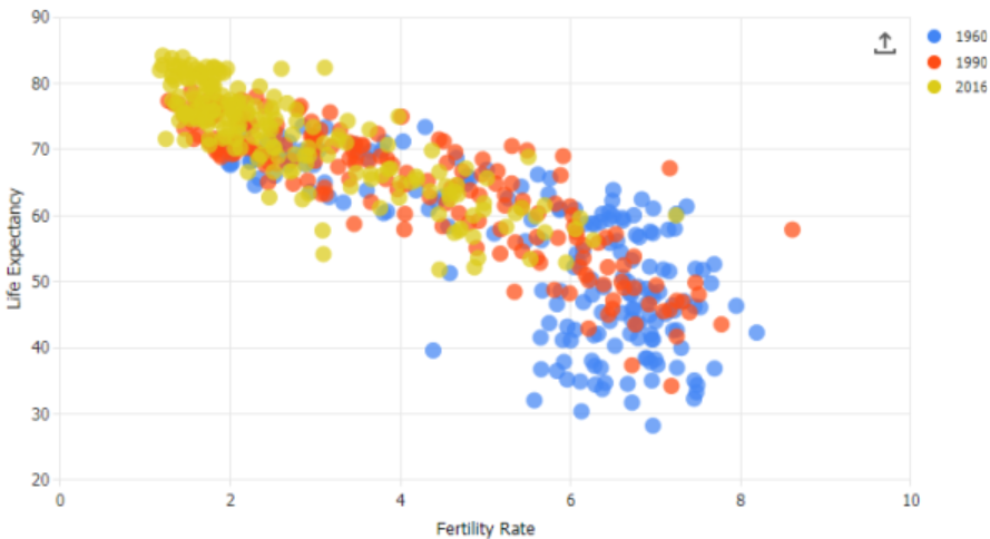
- Scatter plot: Scatter plot helps visualize the correlation between two variables for one or multiple groups. These plots display two variables as a set of points on a graph, with each point representing an observation in the dataset. Scatter plots can be used to detect whether a correlation exists between two variables. They can also be used to analyze relationship between multiple colors using different colors. Here is a sample scatter plot.
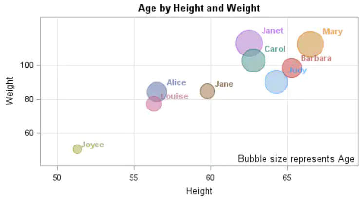
- Bubble plot: Bubble plots are used to show relationships between three variables. The third variable is represented by the size of the dot. The size of the bubble corresponds to the magnitude of the third variable. This type of relation plot is useful for exploring relationships between three variables, such as the relationship between age, income, and education level.
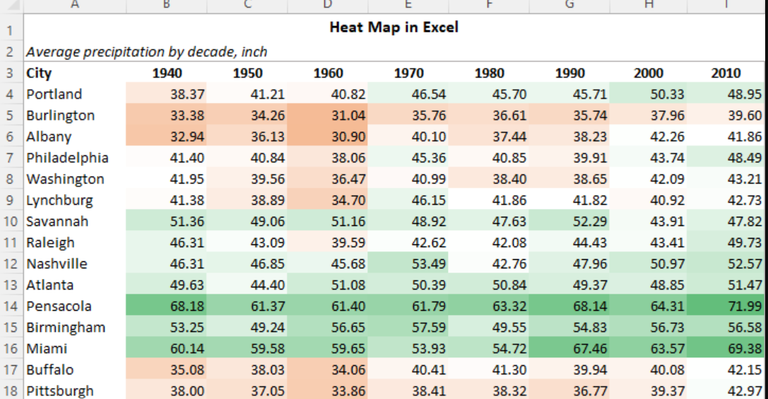
- Heatmap: Heatmaps are another type of relation plot commonly used in data analysis. A heatmap is a visualization where values contained in a matrix are represented as colors or color saturation. Heatmaps use color-coding to represent the strength of the relationship between two variables. The darker the color, the stronger the relationship. Heatmaps are great for visualizing multivariate data (data in which analysis is based on more than two variables per observation), where categorical variables are placed in the rows and columns and a numerical or categorical variable is represented as colors or color saturation.
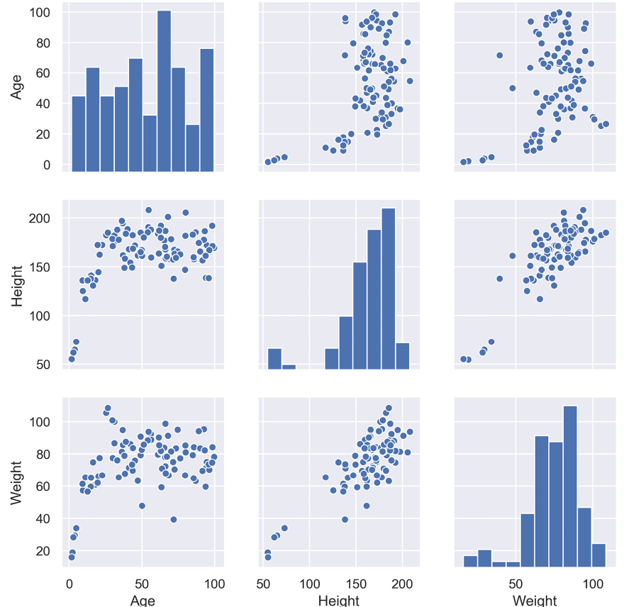
- Correlogram: A correlogram is a combination of scatter plots and histograms. The diagonals of the correlation matrix represent the distribution of each variable in the form of a histogram. You can also plot the relationship between multiple groups or categories using different colors. A correlogram is a great chart for for understanding the correlation between variable pairs. Here is a sample plot for correlogram
Composition Plots
Composition plots are used when the need is to represent the different parts of the whole. In other words, composition plots are a type of visualization that represent the parts of a whole in a dataset. Examples of composition plots include pie or donut charts, stacked bar charts, Venn diagrams etc.
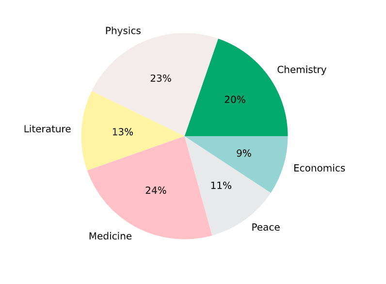
- Pie Chart: Pie charts display the proportion of each category in a dataset as a slice of a circle, with each arc or slice representing an individual category or group. In other words, they can be used to represent numerical proportions by dividing a circle into slices. The full circle equates to 100%. Pie charts can be useful when you want to compare the relative sizes of different categories or groups within a dataset. The pie chart below shows the distribution of marks in different subjects of a class.
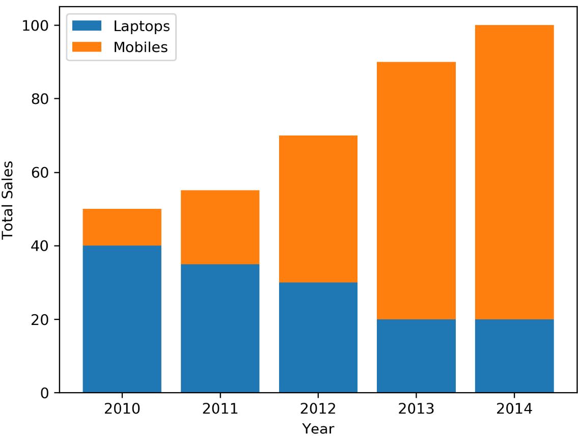
- Stacked bar chart: Stacked bar charts display the total size of each category or group as a single bar, with each segment representing the proportion contributed by individual subcategories. Stacked bar charts can be useful when you want to compare the relative sizes of different subcategories within larger categories or groups.
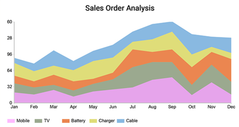
- Stacked area chart: Stacked area chart can be used to displays changes in proportions over time rather than across categories or groups. Stacked area charts can be useful for visualizing how different subcategories contribute to overall trends or patterns over time. The values of several groups are illustrated by stacking individual area charts on top of one another. It helps to analyze both individual and overall trend information.
- Venn diagram: Venn diagram shows relationships between multiple sets using overlapping circles. This diagram shows all possible logical relations between a finite collection of different sets. Each set is represented by a circle. The circle size illustrates the importance of a group. The size of overlap represents the intersection between multiple groups. This type of composition plot is particularly useful when trying to identify how much overlap exists between different groups or categories.
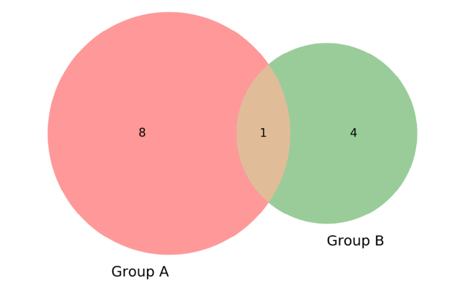
Chart Types Summary
Choosing the most appropriate types of chart must depend upon what questions you are asking about business metric. The following diagram (source: Domo – Best practices in choosing chart types) showcases different areas representing key business metrics and related chart types.
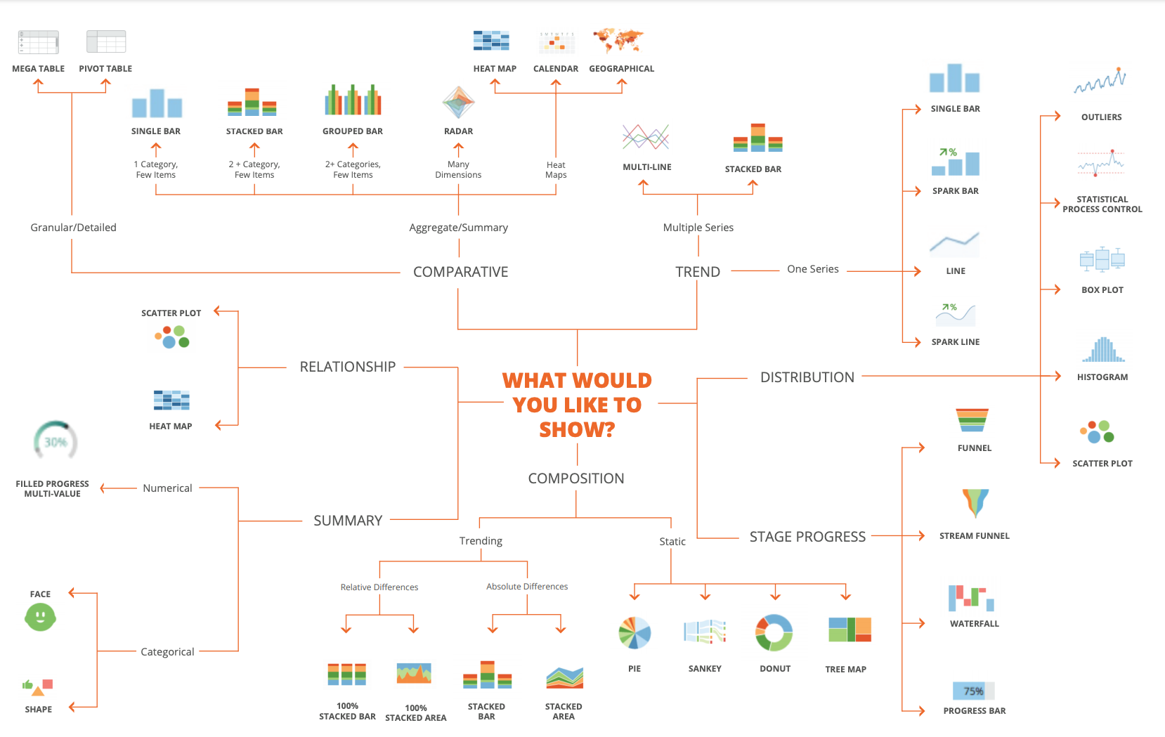
The following are some of the business requirements and related chart types based on which you could choose most appropriate types:
- Comparative analysis: Comparative analysis involves comparing the performance of different business units or products to identify patterns, trends, strengths, and weaknesses. It helps in understanding the relative performance and making informed decisions. Some commonly used charts for comparative analysis are bar chart, line chart, radar chart.
- Trend analysis: Trend analysis involves evaluating how sales and profit are trending over different time intervals. It helps in identifying patterns, seasonality, and long-term trends. Line charts are effective for visualizing trends over time, allowing identification of upward or downward trends. Area charts compare the contribution of different time periods to total sales or profit. Sparklines provide compact trend visualizations, commonly used within tables or reports to represent sales and profit trends for different products or business units.
- Distribution: Distribution charts help understand the distribution of data, such as customer demographics or people distribution across different categories. A histogram displays the distribution of continuous variables, showing the frequency of data points in each interval. Pie charts illustrate categorical data composition, dividing a whole into slices. Box plots summarize data distribution, including median, quartiles, and outliers, useful for analyzing datasets’ spread and skewness.
- Stage progress: Stage progress charts track the progress of project implementations or any process involving multiple stages. They help in visualizing the completion status of each stage and identifying potential bottlenecks. Charts such as progress bar chart, gantt chart, etc. can be used.
- Composition analysis: Composition charts reveal the composition or breakdown of a whole into its constituent parts. They help in understanding the contribution or distribution of different elements within a category. For example, composition charts can be used to know the composition of marketing funnel by lead source. Charts such as stacked bar chart, pie chart, Sankey chart, donut, tree map can be used.
- Relationship analysis: Relationship analysis charts help evaluate the relationship or correlation between different variables. They assist in understanding how changes in one variable affect another. Charts such as scatter plot, bubble charts, heat map can be used.
Conclusion
In conclusion, data visualization is an essential tool for presenting complex data in a way that is easy to understand and interpret. There are various types of visualizations, each with their unique strengths and weaknesses. Comparison plots help us compare multiple datasets, while relation plots show how different variables are related to each other. Composition plots allow us to break down a dataset into its constituent parts. By using these types of visualizations effectively, we can gain insights into our data and make more informed decisions. It is crucial to choose the appropriate visualization for the data we are working with and the insights we want to extract. When selecting a visualization, we must consider factors such as the type of data, the number of variables, and the message we want to convey. If you want to learn more, please drop a message.

Check out my latest book titled as First Principles Thinking: Building winning products using first principles thinking.
- Questions to Ask When Thinking Like a Product Leader - July 3, 2025
- Three Approaches to Creating AI Agents: Code Examples - June 27, 2025
- What is Embodied AI? Explained with Examples - May 11, 2025
I found it very helpful. However the differences are not too understandable for me