In this post, you will learn about Flutter Row concepts with code example.
Flutter Row is a flex widget that lets you create flexible layouts in the horizontal directions. The design of these objects is based on the web’s flexbox layout model. In other words, Row is a widget that displays its children in a horizontal array.
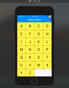
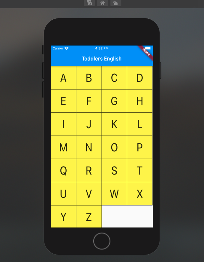
In this post, you will see how to build a UI such as below using Flutter Row widget.

In order to achieve above, a stateless widget namely AlphabetWidget is created whose build method is used to build the above UI widgets. Here is the code for AlphabetWidget.
class AlphabetWidget extends StatelessWidget {
  @override
  Widget build(BuildContext context) {
    double cellheight = 85;
    Color cellcolor = Color(0xFFFFEE58);
    double tsFactor = 3.0;
    Alignment cellalignment = Alignment.center;

    List alphabets = [['A', 'B', 'C', 'D'],
                      ['E', 'F', 'G', 'H'],
                      ['I', 'J', 'K', 'L'],
                      ['M', 'N', 'O', 'P'],
                      ['Q', 'R', 'S', 'T'],
                      ['U', 'V', 'W', 'X'],
                      ['Y', 'Z']];

    return ListView(
      children: <Widget>[
        Row(
          children: List.generate(alphabets[0].length, (index) {
            return Flexible(
              flex: 2,
              child: Container(
                height: cellheight,
                alignment: cellalignment,
                decoration: const BoxDecoration(
                  color:  Color(0xFFFFEE58),
                  border: Border(
                    right: BorderSide(width: 1.0, color: Color(0xFFFF000000)),
                    bottom: BorderSide(width: 1.0, color: Color(0xFFFF000000)),
                  )),
                child: Text(
                  alphabets[0][index],
                  textScaleFactor: tsFactor,
                )),
            );
          }),
        ),
        Row(
          children: List.generate(alphabets[1].length, (index) {
            return Flexible(
              flex: 2,
              child: Container(
                  height: cellheight,
                  alignment: cellalignment,
                  decoration: const BoxDecoration(
                      color:  Color(0xFFFFEE58),
                      border: Border(
                        right: BorderSide(width: 1.0, color: Color(0xFFFF000000)),
                        bottom: BorderSide(width: 1.0, color: Color(0xFFFF000000)),
                      )),
                  child: Text(
                    alphabets[1][index],
                    textScaleFactor: tsFactor,
                  )),
            );
          }),
        ),
        Row(
          children: List.generate(alphabets[2].length, (index) {
            return Flexible(
              flex: 2,
              child: Container(
                  height: cellheight,
                  alignment: cellalignment,
                  decoration: const BoxDecoration(
                      color:  Color(0xFFFFEE58),
                      border: Border(
                        right: BorderSide(width: 1.0, color: Color(0xFFFF000000)),
                        bottom: BorderSide(width: 1.0, color: Color(0xFFFF000000)),
                      )),
                  child: Text(
                    alphabets[2][index],
                    textScaleFactor: tsFactor,
                  )),
            );
          }),
        ),
        Row(
          children: List.generate(alphabets[3].length, (index) {
            return Flexible(
              flex: 2,
              child: Container(
                  height: cellheight,
                  alignment: cellalignment,
                  decoration: const BoxDecoration(
                      color:  Color(0xFFFFEE58),
                      border: Border(
                        right: BorderSide(width: 1.0, color: Color(0xFFFF000000)),
                        bottom: BorderSide(width: 1.0, color: Color(0xFFFF000000)),
                      )),
                  child: Text(
                    alphabets[3][index],
                    textScaleFactor: tsFactor,
                  )),
            );
          }),
        ),
        Row(
          children: List.generate(alphabets[4].length, (index) {
            return Flexible(
              flex: 2,
              child: Container(
                  height: cellheight,
                  alignment: cellalignment,
                  decoration: const BoxDecoration(
                      color:  Color(0xFFFFEE58),
                      border: Border(
                        right: BorderSide(width: 1.0, color: Color(0xFFFF000000)),
                        bottom: BorderSide(width: 1.0, color: Color(0xFFFF000000)),
                      )),
                  child: Text(
                    alphabets[4][index],
                    textScaleFactor: tsFactor,
                  )),
            );
          }),
        ),
        Row(
          children: List.generate(alphabets[5].length, (index) {
            return Flexible(
              flex: 2,
              child: Container(
                  height: cellheight,
                  alignment: cellalignment,
                  decoration: const BoxDecoration(
                      color:  Color(0xFFFFEE58),
                      border: Border(
                        right: BorderSide(width: 1.0, color: Color(0xFFFF000000)),
                        bottom: BorderSide(width: 1.0, color: Color(0xFFFF000000)),
                      )),
                  child: Text(
                    alphabets[5][index],
                    textScaleFactor: tsFactor,
                  )),
            );
          }),
        ),
        Row(
          children: List.generate(alphabets[6].length, (index) {
            return Flexible(
              flex: 2,
              child: Container(
                  height: cellheight,
                  alignment: cellalignment,
                  decoration: const BoxDecoration(
                      color:  Color(0xFFFFEE58),
                      border: Border(
                        right: BorderSide(width: 1.0, color: Color(0xFFFF000000)),
                        bottom: BorderSide(width: 1.0, color: Color(0xFFFF000000)),
                      )),
                  child: Text(
                    alphabets[6][index],
                    textScaleFactor: tsFactor,
                  )),
            );
          }),
        ),
      ],
    );
  }
}
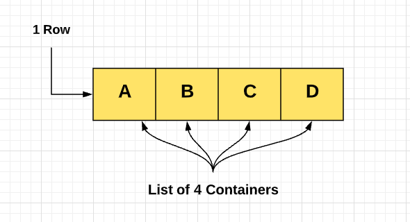
In the above code example, pay attention to usage of Row widget. The diagram below represents the structure of Row widget.

In the above diagram, you may notice that the Row (Row widget) is a list of Containers (Container widget) with each container consisting of one alphabet. In the code given below, note that Row comprises children which is a list of containers with the child widget as a Text widget. The container widget is decorated using BoxDecoration and other attributes such as height, width, and alignment. Make note of the usage of a Flexible widget to ensure equal spaces allocated to each of the containers. The code given below does the above magic is the following:
Row(
          children: List.generate(alphabets[0].length, (index) {
            return Flexible(
              flex: 2,
              child: Container(
                height: cellheight,
                alignment: cellalignment,
                decoration: const BoxDecoration(
                  color:  Color(0xFFFFEE58),
                  border: Border(
                    right: BorderSide(width: 1.0, color: Color(0xFFFF000000)),
                    bottom: BorderSide(width: 1.0, color: Color(0xFFFF000000)),
                  )),
                child: Text(
                  alphabets[0][index],
                  textScaleFactor: tsFactor,
                )),
            );
          }),
        ),
In the following posts, we will look at Flutter Column with code examples.
- The Watermelon Effect: When Green Metrics Lie - January 25, 2026
- Coefficient of Variation in Regression Modelling: Example - November 9, 2025
- Chunking Strategies for RAG with Examples - November 2, 2025

I found it very helpful. However the differences are not too understandable for me