Plotting the decision boundary is a valuable tool for understanding, debugging, and improving machine learning classification models, especially for Logistic Regression. Plotting the decision boundary provides a visual assessment of model complexity, fit, and class separation capability. It enables identifying overfitting and underfitting based on gaps between boundary and data. Comparing decision boundary plots of different models allows direct visual evaluation of their relative performance in separating classes when working with classification problems. For linear models like logistic regression, it specifically helps tune regularization and model complexity to prevent overfitting the training data. Simple linear models like logistic regression will have linear decision boundaries. More complex models like SVM may show nonlinear patterns.
In this blog, you will learn about how to create decision plots using Python Sklearn library, for binary and multiclass classification models with models trained using Logistic regression algorithm. You will also learn about key aspects to be kept in mind when creating the decision plots for logistic regression models.
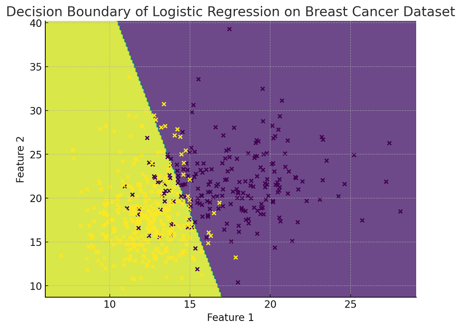
The following is the Python implementation for plotting decision boundary for the logistic regression binary classifier while using the Breast Cancer Wisconsin (Diagnostic) Dataset . The plot visualizes the decision boundary, showing how the model classifies the data into two categories: malignant and benign. In this example, only the first two features of the dataset are used for visualization purposes. The data points are color-coded based on their actual classification (malignant or benign), providing a clear view of the decision boundary’s effectiveness in separating the two classes.
from sklearn.datasets import load_breast_cancer
from sklearn.linear_model import LogisticRegression
import matplotlib.pyplot as plt
import numpy as np

# Load the Breast Cancer Wisconsin (Diagnostic) Dataset
X, y = load_breast_cancer(return_X_y=True)

# Select only the first two features for visualization
X = X[:, :2]

# Fit the logistic regression model
model = LogisticRegression()
model.fit(X, y)

# Create a mesh to plot in
x_min, x_max = X[:, 0].min() - 1, X[:, 0].max() + 1
y_min, y_max = X[:, 1].min() - 1, X[:, 1].max() + 1
xx, yy = np.meshgrid(np.arange(x_min, x_max, 0.1),
                     np.arange(y_min, y_max, 0.1))

# Predict the function value for the whole grid
Z = model.predict(np.c_[xx.ravel(), yy.ravel()])
Z = Z.reshape(xx.shape)

# Plot the contour and training examples
plt.figure(figsize=(8, 6))
plt.contourf(xx, yy, Z, alpha=0.8)
plt.scatter(X[:, 0], X[:, 1], c=y, edgecolors='k', s=20)
plt.xlabel('Feature 1')
plt.ylabel('Feature 2')
plt.title('Decision Boundary of Logistic Regression on Breast Cancer Dataset')
plt.show()
Here is how the plot representing decision boundary for logistic regression binary classification model would look like:
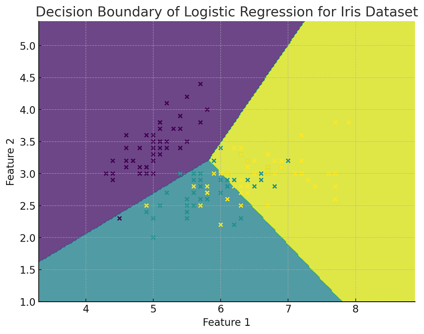
The following Python implementation for plotting decision boundary has been adapted for multiclass classification using the IRIS dataset and a logistic regression model. The model is trained to classify the data into the three different species of IRIS flowers. In this visualization, only the first two features of the dataset are used. The plot shows the decision boundaries between the different classes, with each region colored differently according to the predicted class. The actual data points from the dataset are also plotted, color-coded based on their true class labels, providing a clear view of how well the model separates the different classes.
from sklearn.datasets import load_iris
from sklearn.linear_model import LogisticRegression
import matplotlib.pyplot as plt
import numpy as np

# Load the Iris dataset
X, y = load_iris(return_X_y=True)

# Select only the first two features for visualization
X = X[:, :2]

# Fit the logistic regression model for multi-class classification
model = LogisticRegression(multi_class='ovr')  # 'ovr' stands for One-vs-Rest
model.fit(X, y)

# Create a mesh to plot in
x_min, x_max = X[:, 0].min() - 1, X[:, 0].max() + 1
y_min, y_max = X[:, 1].min() - 1, X[:, 1].max() + 1
xx, yy = np.meshgrid(np.arange(x_min, x_max, 0.02),
                     np.arange(y_min, y_max, 0.02))

# Predict the function value for the whole grid
Z = model.predict(np.c_[xx.ravel(), yy.ravel()])
Z = Z.reshape(xx.shape)

# Plot the contour and training examples
plt.figure(figsize=(8, 6))
plt.contourf(xx, yy, Z, alpha=0.8)
plt.scatter(X[:, 0], X[:, 1], c=y, edgecolors='k', s=20)
plt.xlabel('Feature 1')
plt.ylabel('Feature 2')
plt.title('Decision Boundary of Logistic Regression for Iris Dataset')
plt.show()
Here is how the plot representing decision boundary for logistic regression multiclass classification model would look like
In both Python implementation examples, where we plotted the decision boundaries for logistic regression classifiers (first for binary classification with the Breast Cancer Wisconsin dataset and then for multiclass classification with the Iris dataset), there are several key learning points:
When plotting decision boundaries using logistic regression, the following are some of the best practices to keep in mind:
We’ve all been in that meeting. The dashboard on the boardroom screen is a sea…
When building a regression model or performing regression analysis to predict a target variable, understanding…
If you've built a "Naive" RAG pipeline, you've probably hit a wall. You've indexed your…
If you're starting with large language models, you must have heard of RAG (Retrieval-Augmented Generation).…
If you've spent any time with Python, you've likely heard the term "Pythonic." It refers…
Large language models (LLMs) have fundamentally transformed our digital landscape, powering everything from chatbots and…