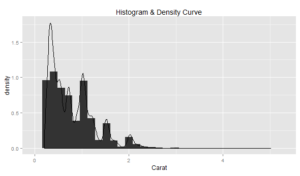
In the code examples below, diamonds data set belonging to ggplot2 package is used. One must load the ggplot2 package (require(“ggplot2”)) before executing the code samples given below.
# Most simplistic density curve
ggplot(diamonds, aes(x=carat)) + geom_histogram(aes(y=..density..)) +
  geom_density() +
  labs(title="Histogram & Density Curve", x="Carat")
Following diagram would get displayed by executing the above code.
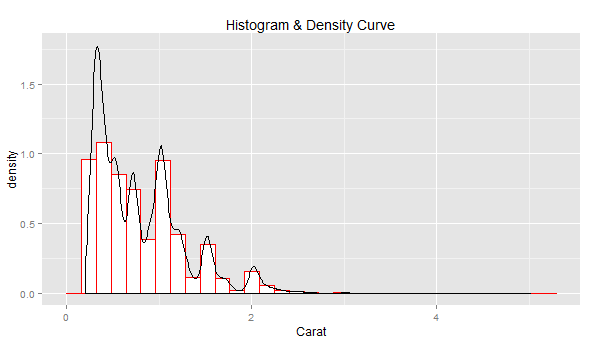
# Density curve with histogram painted using body color as white and
# border color as red
ggplot(diamonds, aes(x=carat)) + geom_histogram(col="red", fill="white", aes(y=..density..)) +
  geom_density() +
  labs(title="Histogram & Density Curve", x="Carat")
Following diagram would get displayed by executing the above code.
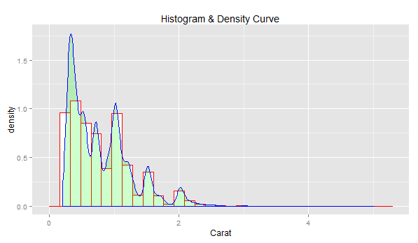
# Density curve with border color as blue, body color as green and
# transparency index as 0.2;
ggplot(diamonds, aes(x=carat)) + geom_histogram(col="red", fill="white", aes(y=..density..)) +
  geom_density(col="blue", fill="green", alpha=0.2) +
  labs(title="Histogram & Density Curve", x="Carat")
Following diagram would get displayed by executing the above code.
Last updated: 28th April, 2024 As a data scientist, understanding the nuances of various cost…
Last updated: 28th April, 2024 In this post, you will learn the concepts related to…
Last updated: 26th April, 2024 In this blog post, we will discuss the logistic regression…
Last updated: 22nd April, 2024 As data scientists, we navigate a sea of metrics to…
Last updated: 22nd April, 2024 This post will teach you about the gradient descent algorithm…
Last updated: 19th April, 2024 Among the terminologies used in training machine learning models, the…