The code samples given below works for “diamonds” dataset which is loaded as part of ggplot2 package. Following are two different types of plots shown below:
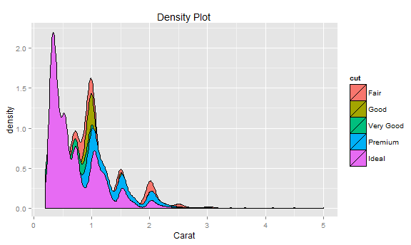
# Create density plots for single variable filtered by fill condition
# In example below, fill is assigned to cut
ggplot(diamonds, aes(x=carat, fill=cut)) + geom_density() +
  labs(title="Density Plot", x="Carat")
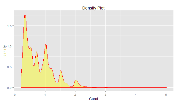
# Create density plot for single variable
ggplot(diamonds, aes(x=carat)) + geom_density(col="red", fill="yellow", alpha=0.4) +
  labs(title="Density Plot", x="Carat")
Last updated: 3rd May, 2024 Have you ever wondered why some machine learning models perform…
Last updated: 2nd May, 2024 The success of machine learning models often depends on the…
When working on a machine learning project, one of the key challenges faced by data…
Last updated: 1st May, 2024 The bias-variance trade-off is a fundamental concept in machine learning…
Last updated: 1st May, 2024 As a data scientist, understanding the nuances of various cost…
Last updated: 1st May, 2024 In this post, you will learn the concepts related to…