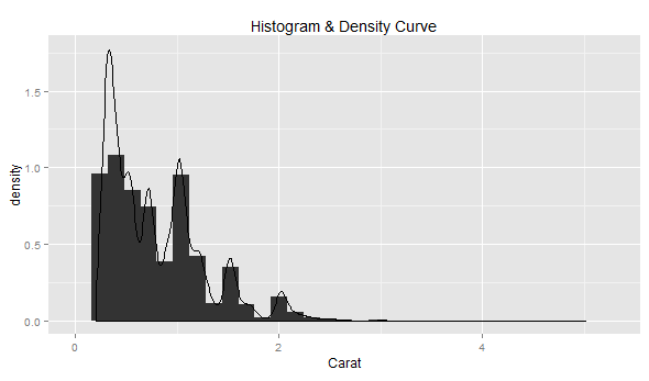
In the code examples below, diamonds data set belonging to ggplot2 package is used. One must load the ggplot2 package (require(“ggplot2”)) before executing the code samples given below.
# Most simplistic density curve
ggplot(diamonds, aes(x=carat)) + geom_histogram(aes(y=..density..)) +
  geom_density() +
  labs(title="Histogram & Density Curve", x="Carat")
Following diagram would get displayed by executing the above code.
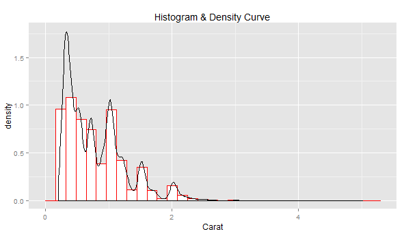
# Density curve with histogram painted using body color as white and
# border color as red
ggplot(diamonds, aes(x=carat)) + geom_histogram(col="red", fill="white", aes(y=..density..)) +
  geom_density() +
  labs(title="Histogram & Density Curve", x="Carat")
Following diagram would get displayed by executing the above code.
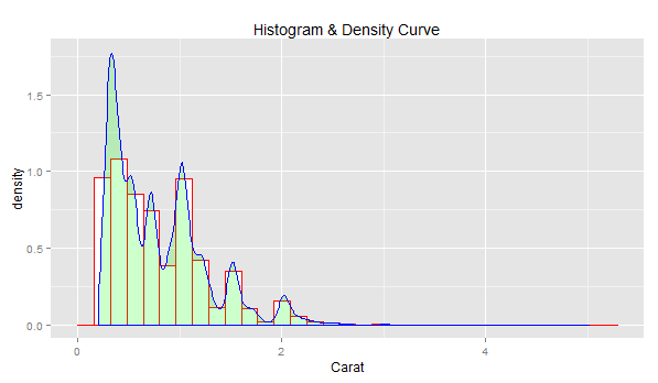
# Density curve with border color as blue, body color as green and
# transparency index as 0.2;
ggplot(diamonds, aes(x=carat)) + geom_histogram(col="red", fill="white", aes(y=..density..)) +
  geom_density(col="blue", fill="green", alpha=0.2) +
  labs(title="Histogram & Density Curve", x="Carat")
Following diagram would get displayed by executing the above code.
We’ve all been in that meeting. The dashboard on the boardroom screen is a sea…
When building a regression model or performing regression analysis to predict a target variable, understanding…
If you've built a "Naive" RAG pipeline, you've probably hit a wall. You've indexed your…
If you're starting with large language models, you must have heard of RAG (Retrieval-Augmented Generation).…
If you've spent any time with Python, you've likely heard the term "Pythonic." It refers…
Large language models (LLMs) have fundamentally transformed our digital landscape, powering everything from chatbots and…