Last updated: 8th Sep, 2024
Confusion among data scientists regarding whether to use ROC Curve / AUC, or, Accuracy / precision / recall metrics for evaluating classification models often stems from misunderstanding ROC Curve / AUC concepts. The ROC Curve visualizes true positive vs false positive rates at various thresholds, while AUC quantifies the overall ability of a model to discriminate between classes, with higher values indicating better performance. In this post, you will learn about ROC Curve and AUC concepts along with related concepts such as True positive and false positive rate with the help of Python examples. It is very important to learn ROC, AUC and related concepts as it helps in selecting the most appropriate machine learning classification models based on the model performance.
Receiver operating characteristic (ROC) Curve plots the true-positive rate (TPR) against the false-positive rate (FPR) at various probability thresholds. TPR & FPR metrics are computed by shifting the decision threshold of the classifier. TPR is also known as Recall or Sensitivity, and FPR can be understood as the ratio of negative instances that are incorrectly classified as positive ones. FPR can also be represented as (1 – Specificity).
ROC curve is used for selecting the most appropriate classification models that are also probabilistics models that predic the probabilities of the class. Note that while accuracy score, precision, recall, and F1 score apply to binary classification and multiclass classification models, ROC curve metric only applies to binary classification models.
Here is a great paper to read and learn about ROC curve and AUC – A Relationship between the Average Precision and the Area Under the ROC Curve by Su, W., Yuan, Y., and Zhu, M
Let’s look at a sample ROC curve given below:
In the above ROC curve diagram, pay attention to some of the following:
Scikit provides a class named RocCurveDisplay for plotting ROC curves, and a function named roc_auc_score for retrieving ROC AUC scores. Scores returned by this function are values from 0.0 to 1.0. The higher the score, the more accurate the model.
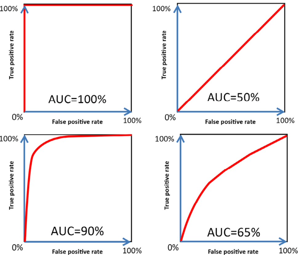
Here is an example of different ROC Curves and AUCs. The ROC-AUC between 0.9 to 1.0 (Top and bottom left) is considered very good.
Let’s understand why ideal decision thresholds is about TPR close to 1 and FPR close to 0.
True Positive Rate (TPR) = True Positive (TP) / (TP + FN) = TP / Positives
False Positive Rate (FPR) = False Positive (FP) / (FP + TN) = FP / Negatives
Higher value of TPR would mean that the value of false negative is very low which would mean almost all positives are predicted correctly.
Lower value of FPR would mean that the value of false positive is very low which means almost all negatives are predicted correctly.
Going by the above, the decision threshold near top left of ROC curve would result in the model having optimal performance. In the above diagram, the point is represented using “Perfect Classifier”
ROC Curve and AUC have been found to be used as classification models evaluation metrics in several Kaggle competitions. Here is a list of some of them:
In this section, you will learn to use roc_curve and auc method of sklearn.metrics. Sklearn breast cancer dataset is used for illustrating ROC curve and AUC. Pay attention to some of the following in the code given below.
from sklearn import datasets
from sklearn.model_selection import train_test_split
from sklearn.preprocessing import StandardScaler
from sklearn.linear_model import LogisticRegression
from sklearn.metrics import roc_curve, auc
import matplotlib.pyplot as plt
from sklearn.pipeline import make_pipeline
#
# Load the breast cancer data set
#
bc = datasets.load_breast_cancer()
X, y = bc.data, bc.target
#
# Create training and test split
#
X_train, X_test, y_train, y_test = train_test_split(X, y, test_size=0.30, random_state=1, stratify=y)
#
# Create the estimator - pipeline
#
pipeline = make_pipeline(StandardScaler(), LogisticRegression(random_state=1))
#
# Create training test splits using two features
#
pipeline.fit(X_train[:,[2, 13]],y_train)
probs = pipeline.predict_proba(X_test[:,[2, 13]])
fpr1, tpr1, thresholds = roc_curve(y_test, probs[:, 1], pos_label=1)
roc_auc1 = auc(fpr1, tpr1)
#
# Create training test splits using two different features
#
pipeline.fit(X_train[:,[4, 14]],y_train)
probs2 = pipeline.predict_proba(X_test[:,[4, 14]])
fpr2, tpr2, thresholds = roc_curve(y_test, probs2[:, 1], pos_label=1)
roc_auc2 = auc(fpr2, tpr2)
#
# Create training test splits using all features
#
pipeline.fit(X_train,y_train)
probs3 = pipeline.predict_proba(X_test)
fpr3, tpr3, thresholds = roc_curve(y_test, probs3[:, 1], pos_label=1)
roc_auc3 = auc(fpr3, tpr3)

fig, ax = plt.subplots(figsize=(7.5, 7.5))

plt.plot(fpr1, tpr1, label='ROC Curve 1 (AUC = %0.2f)' % (roc_auc1))
plt.plot(fpr2, tpr2, label='ROC Curve 2 (AUC = %0.2f)' % (roc_auc2))
plt.plot(fpr3, tpr3, label='ROC Curve 3 (AUC = %0.2f)' % (roc_auc3))
plt.plot([0, 1], [0, 1], linestyle='--', color='red', label='Random Classifier')
plt.plot([0, 0, 1], [0, 1, 1], linestyle=':', color='green', label='Perfect Classifier')
plt.xlim([-0.05, 1.05])
plt.ylim([-0.05, 1.05])
plt.xlabel('False positive rate')
plt.ylabel('True positive rate')
plt.legend(loc="lower right")
plt.show()
Here is how the ROC curve plot will look like. Pay attention to some of the following in the plot:
Here is what you learned in this post in relation to ROC curve and AUC:
This blog represents a list of questions you can ask when thinking like a product…
AI agents are autonomous systems combining three core components: a reasoning engine (powered by LLM),…
Artificial Intelligence (AI) has evolved significantly, from its early days of symbolic reasoning to the…
Last updated: 25th Jan, 2025 Have you ever wondered how to seamlessly integrate the vast…
Hey there! As I venture into building agentic MEAN apps with LangChain.js, I wanted to…
Software-as-a-Service (SaaS) providers have long relied on traditional chatbot solutions like AWS Lex and Google…