ggplot is one of statistical package that facilitates the easy creation of different plots. One of the key concept related to ggplot is that ggplot is built up layer by layer. This means that one could start by initializing the ggplot using ggplot(data) command and then, keep adding on plot functions as another layer in order to finally draw the plot/chart. The layers are separated by “+” sign. Following is a sample ggplot command created using diamonds data that gets loaded by default when loading ggplot.
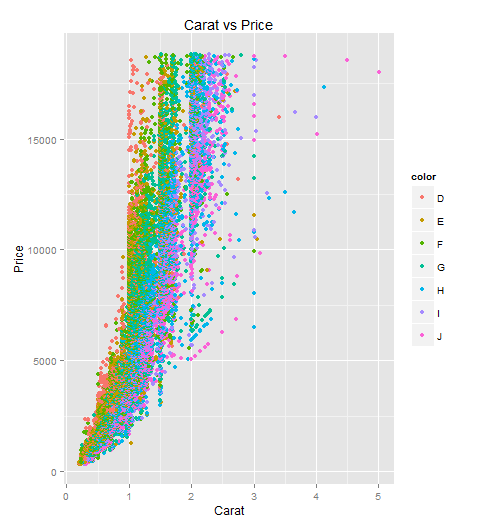
ggplot(data=diamonds, aes(x=carat, y=price)) + geom_point(aes(color=color)) + xlab("Carat") + ylab("Price") + ggtitle("Carat vs Price")
Following is the plot for above command:
Before going further, lets quickly see what would it take to install and load ggplot2 package.
Following are some key concepts to know when starting with ggplot:
ggplot(data=diamonds)
aes(x,y)
One must note that aes function could either go in ggplot function such as following or in one of the geom functions.
# aes function within ggplot function
ggplot(data=diamonds, aes(x=carat, y=price)) + geom_point() + xlab("Carat") + ylab("Price") + ggtitle("Carat vs Price")
# aes function within geom function
ggplot(data=diamonds) + geom_point(aes(x=carat, y=price)) + xlab("Carat") + ylab("Price") + ggtitle("Carat vs Price")
We’ve all been in that meeting. The dashboard on the boardroom screen is a sea…
When building a regression model or performing regression analysis to predict a target variable, understanding…
If you've built a "Naive" RAG pipeline, you've probably hit a wall. You've indexed your…
If you're starting with large language models, you must have heard of RAG (Retrieval-Augmented Generation).…
If you've spent any time with Python, you've likely heard the term "Pythonic." It refers…
Large language models (LLMs) have fundamentally transformed our digital landscape, powering everything from chatbots and…