Following are the key plots described later in this article:
Following is the description for above mentioned plots along with code examples based on base R package. Note that each of the these plots could be done using different commands when using ggplot2 package.
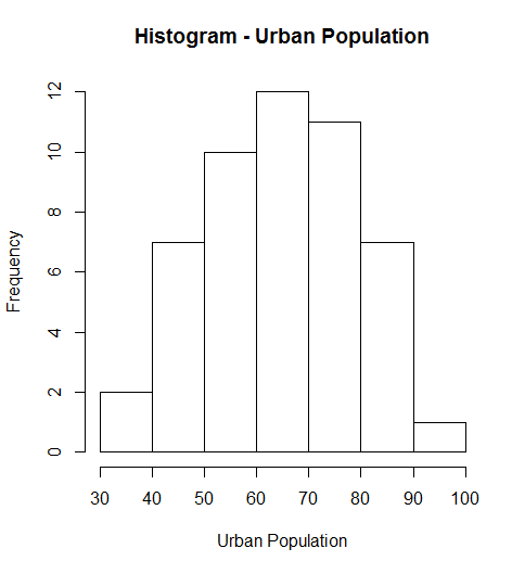
hist(USArrests$UrbanPop, main="Histogram - Urban Population", xlab="Urban Population")
plot( variableAlongXAxis, variableAlongYAxis, data="DataSet", main="Plot Title", xlab="Label for X-Axis", ylab="Label for Y Axis" )

# Following command can as well be used

plot( responseParameter ~ predictorParameter, data="DataSet", main="Plot Title", xlab="Label for X-Axis", ylab="Label for Y Axis" )
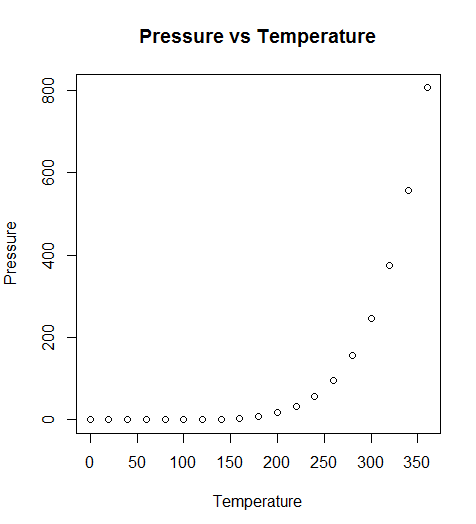
Lets take an example from default data available in R package. Following R command prints the Scatterplot shown below:
plot( pressure ~ temperature, data=pressure, main="Pressure vs Temperature", xlab="Temperature", ylab="Pressure")
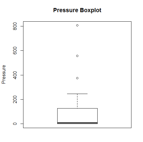
boxplot(pressure$pressure, main="Pressure Boxplot", ylab="Pressure")
In this blog, you would get to know the essential mathematical topics you need to…
This blog represents a list of questions you can ask when thinking like a product…
AI agents are autonomous systems combining three core components: a reasoning engine (powered by LLM),…
Artificial Intelligence (AI) has evolved significantly, from its early days of symbolic reasoning to the…
Last updated: 25th Jan, 2025 Have you ever wondered how to seamlessly integrate the vast…
Hey there! As I venture into building agentic MEAN apps with LangChain.js, I wanted to…