This blog post will walk you through the steps needed to install Altair graphical libraries in Jupyter Notebook. For data scientists, Altair visualization library can prove to very useful. In this blog, we’ll look at how to download and install Altair, as well as some examples of using Altair capabilities for data visualization.
Altair is a free statistical visualization library that can be used with python (2 or 3). It provides high-quality interactive graphics via an integrated plotting function ́plot() that produces publication-quality figures in a variety of hardcopy formats and interactive environments across platforms. Altair is also easy to learn, with intuitive commands like ‘plot’, ‘hist’ etc., which are simple enough for undergraduate students to use yet powerful enough for research and development use. Check out some great examples of Altair visualization on this page – Altair visualizatione examples
You can create different kinds of plots such as the following:
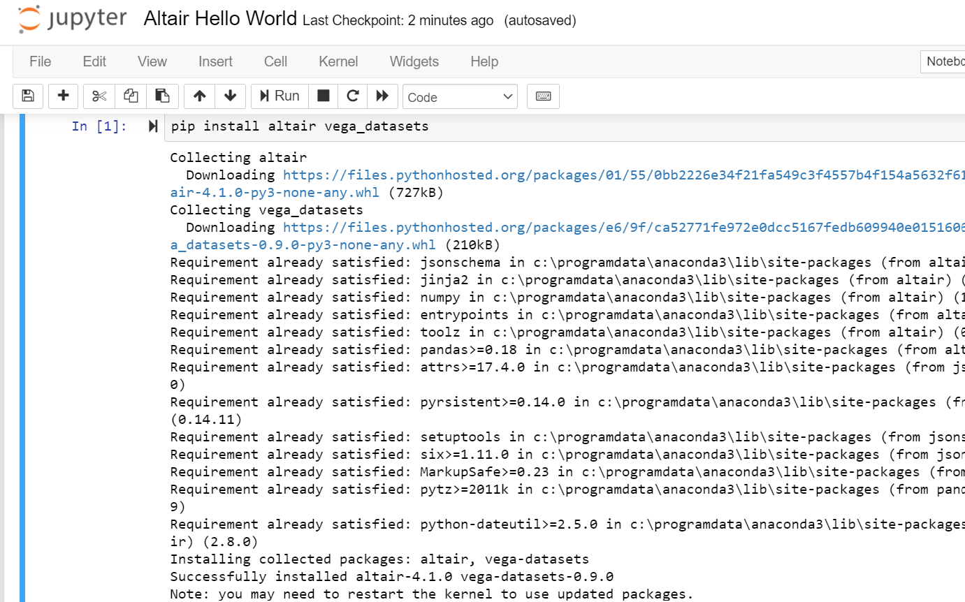
Here are the steps to install Altair for python in Jupyter notebook:
Here is a sample hello world code you could use to get started:
import altair as alt
# load a simple dataset as a pandas DataFrame
#
from vega_datasets import data
#
# Get cars data
#
cars = data.cars()
#
# Create a scatter plot
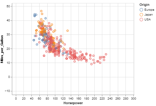
# Plot Miles per gallon against the horsepower across different region
#
alt.Chart(cars).mark_point().encode(
x='Horsepower',
y='Miles_per_Gallon',
color='Origin',
).interactive()
The main point is that you’re connecting data columns with visual encodings, such as the x-axis, y-axis, color, and so on. The rest of the plot is handled automatically. Here is how the plot will look like:
Here are some basic details in relation to the Altair visualization library
import altair as alt
chart = alt.Chart(data)
We’ve all been in that meeting. The dashboard on the boardroom screen is a sea…
When building a regression model or performing regression analysis to predict a target variable, understanding…
If you've built a "Naive" RAG pipeline, you've probably hit a wall. You've indexed your…
If you're starting with large language models, you must have heard of RAG (Retrieval-Augmented Generation).…
If you've spent any time with Python, you've likely heard the term "Pythonic." It refers…
Large language models (LLMs) have fundamentally transformed our digital landscape, powering everything from chatbots and…