Unemployment figures often flood the news, painting a broad picture of economic stability or crisis. But have you ever wondered how these rates break down at the local level? Do certain counties (or cities) in different states fare better or worse than the national average, and if so, why? Unemployment is a critical indicator of economic health and social well-being. While national or state-level unemployment rates often make headlines, diving deeper into county-level or city level data can offer valuable insights for local governments, policymakers, and social organizations. In this blog, we will explore a dataset that provides unemployment rates for various U.S. counties in June 2023. Along the way, we’ll highlight actionable insights that can be gleaned from this data. We will use Python code for demonstration purpose.
The dataset comprises unemployment rates for 3,139 U.S. counties for the month of June 2023. It features the following columns:
Before diving into the dataset, it’s essential to understand the data’s general landscape through summary statistics:
These statistics show that while most counties have stable employment conditions, there are areas with significantly high unemployment rates requiring immediate attention.
The following Python code can be used to get the above summary statistics:
import pandas as pd

# Load the CSV file into a DataFrame
file_path = '/path/2023 June Unemployment Rate by County (Percent).csv'
df = pd.read_csv(file_path)


# Generate summary statistics for the numerical columns
summary_stats = df.describe()

summary_stats
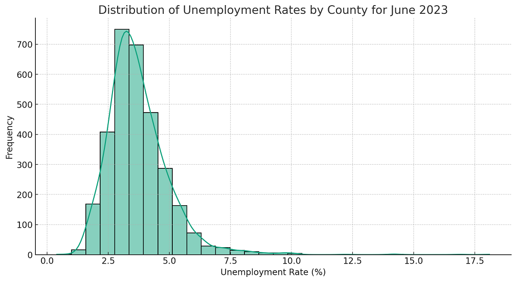
A histogram depicting the distribution of unemployment rates reveals a somewhat positively skewed distribution. Most counties have unemployment rates between 2% and 5%, but there are outliers with alarmingly high rates. The following Python code can be used to view the data distribution of unemployment rates.
First and foremost, we perform the data cleaning.
# Rename the columns based on the first row and drop the first row
df.columns = df.iloc[0]
df = df.drop(df.index[0])

# Reset the index
df.reset_index(drop=True, inplace=True)

# Convert the '01-06-2023' column to numeric, as it contains the unemployment rate
df['01-06-2023'] = pd.to_numeric(df['01-06-2023'], errors='coerce')
Once the data is cleaned, we go for plotting the distribution plot.
import matplotlib.pyplot as plt
import seaborn as sns

# Set the style for the visualization
sns.set(style="whitegrid")

# Create a histogram to visualize the distribution of the unemployment rates
plt.figure(figsize=(12, 6))
sns.histplot(df['01-06-2023'], bins=30, kde=True)
plt.title('Distribution of Unemployment Rates by Country for June 2023')
plt.xlabel('Unemployment Rate (%)')
plt.ylabel('Frequency')
plt.show()
From the distribution plot, we can observe that:
County-level unemployment data can offer a wealth of insights for creating more effective employment policies and social programs. By focusing on areas with particularly high or low unemployment rates, and by tailoring strategies to the specific needs of each region, policymakers and community leaders can make more informed decisions that benefit everyone.
And there you have it! A deep dive into a real-world unemployment dataset and the actionable insights that can be drawn from it. With data-driven approaches, we can not only understand the present landscape but also shape future strategies for economic and social well-being.
Last updated: 08th May, 2024 In the world of generative AI models, autoencoders (AE) and…
Last updated: 7th May, 2024 Linear regression is a popular statistical method used to model…
Last updated: 3rd May, 2024 Have you ever wondered why some machine learning models perform…
Last updated: 2nd May, 2024 The success of machine learning models often depends on the…
When working on a machine learning project, one of the key challenges faced by data…
Last updated: 1st May, 2024 The bias-variance trade-off is a fundamental concept in machine learning…