Following are the key plots described later in this article:
Following is the description for above mentioned plots along with code examples based on base R package. Note that each of the these plots could be done using different commands when using ggplot2 package.
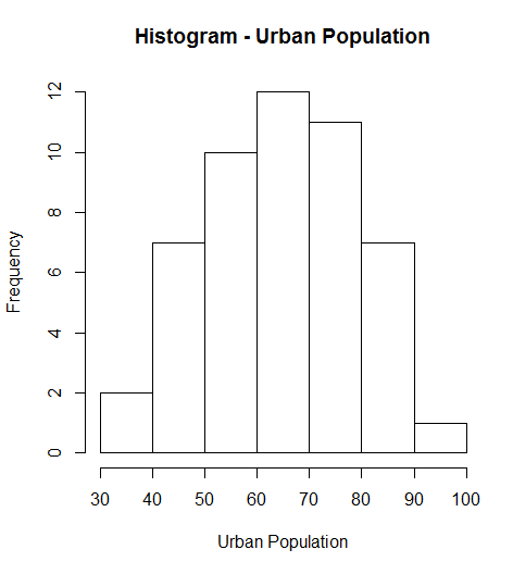
hist(USArrests$UrbanPop, main="Histogram - Urban Population", xlab="Urban Population")
plot( variableAlongXAxis, variableAlongYAxis, data="DataSet", main="Plot Title", xlab="Label for X-Axis", ylab="Label for Y Axis" )

# Following command can as well be used

plot( responseParameter ~ predictorParameter, data="DataSet", main="Plot Title", xlab="Label for X-Axis", ylab="Label for Y Axis" )
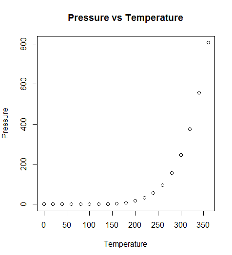
Lets take an example from default data available in R package. Following R command prints the Scatterplot shown below:
plot( pressure ~ temperature, data=pressure, main="Pressure vs Temperature", xlab="Temperature", ylab="Pressure")
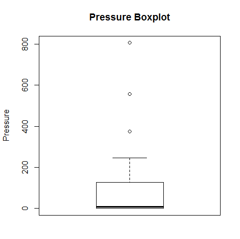
boxplot(pressure$pressure, main="Pressure Boxplot", ylab="Pressure")
We’ve all been in that meeting. The dashboard on the boardroom screen is a sea…
When building a regression model or performing regression analysis to predict a target variable, understanding…
If you've built a "Naive" RAG pipeline, you've probably hit a wall. You've indexed your…
If you're starting with large language models, you must have heard of RAG (Retrieval-Augmented Generation).…
If you've spent any time with Python, you've likely heard the term "Pythonic." It refers…
Large language models (LLMs) have fundamentally transformed our digital landscape, powering everything from chatbots and…