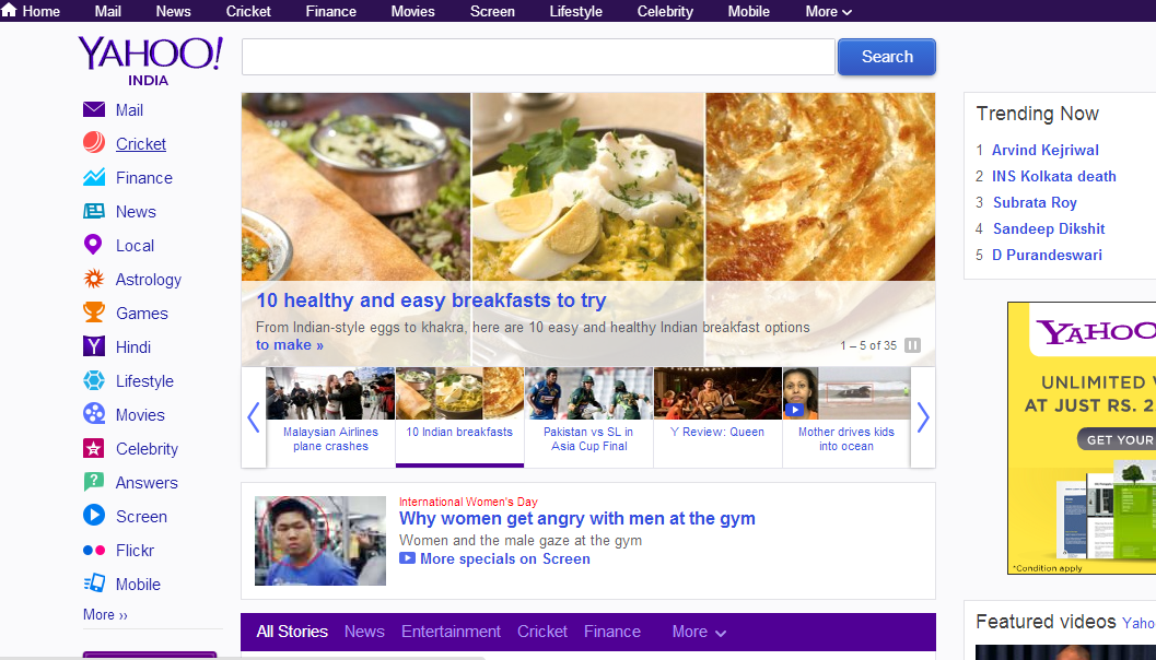
The article represents the UI lessons that one could learn from newly launched Yahoo homepage. Please share your opinion and help me add more points. Take a look at screenshot of the new, revamped homepage below:
fig: revamped yahoo homepage for indian users
The objective behind the revamped homepage design is to offer users more smooth and adaptable experience and makes it easier for the users to discover content.
Following are some key characteristics of revamped homepage with focus on enhanced usability:
- Simpler navigation with the ability of one doing following in easy manner:
- Browse top stories
- Checking email
- Access stocks, photos, or weather.
- Cleaner design that’s easy to navigate
- Ease of use with the familiar search box, quick links
- Fresh stream of content offering most popular stories across news, sports, celebrity stories, entertainment and lifestyle, personalized view of your content stream and utility apps.
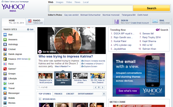
Lets look at how it used to look like last month around January, this year. Following is the screenshot:
fig: yahoo old homepage in January 2014
Following are some of the striking differences that could be found between old and the new homepage:
- Usage of horizontal navigation menu at the top of the page in the new page: Check for yourself in the above page, the links such as Home, Mail, News, Cricket, Finance etc. This is same as you would see on Google sites.
- Left navigation menu consisting of less elements thus looking neat, and readable than the old homepage.
- Mega-navigation menus, one at the top, one at the left and one right below the search text field once the user starts scrolling. This is also an interesting pattern.
- Usage of middle space for streaming content, and larger images in new homepage in alignment with current Web UI trends.
- Brighter colors used on homepage for making it more attractive. The older homepage looked to be very dull, in my opinion.
- Fixed menu bar at the top of the page. This is in line with current UI trends.
- Infinite scrolling displaying the news items, although left and right navigation remain constant. This is something I found new although infinite scrolling has been there for sometime.
Nidhi RaiNidhi has been been actively blogging in different technologies such as AI / machine learning and internet technologies. Her field of interest includes AI / ML, Java, mobile technologies, UI programming such as HTML, CSS, Javascript (Angular/ReactJS etc), open-source and other related technologies.